Character Formatting Options
This section looks at the basic options available in the Character Formatting Controls on the Control Palette or on the Character Palette. Figure 3.17. The Character Palette.
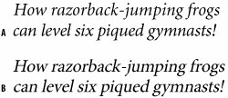
Font and Font StyleBecause InDesign is a type snob (in a good way), it won't allow you to make "faux" type styles. There's no I or B icon you can click to make your text italic or bold. Instead you need to choose the real italic or real bold weights of that font from the Type Style pull down. Alternatively, the shortcuts: Cmd+Shift+I (Ctrl+Shift+I) or Cmd+Shift+B (Ctrl+Shift+B) will select the real italic or bold weights for youso long as you have the real italic or bold weight of the font installed. Using Italic TypeItalic typesso named because they evolved in Italy (in early 16th Century Venice)are designed to complement their roman siblings. They are distinct fonts in their own right and not just slanted versions of the roman. Italics are typically used to clarify a word, differentiating it from the rest of the text. Italics are commonly used for the titles of films, book, magazines, or for foreign phrases or terms, and often to indicate emphasis. Tip To quickly access the font menu on the Control palette press Cmd/Ctrl+6. From there, you can type the first few letters of the font you're after to go directly to it, or at least close to it, on the font menu. Figure 3.18. Real italics vs. slanted type. A is Minion Pro italic; B is Minion Regular slanted to 12°. Note the difference between the a, e, and f.
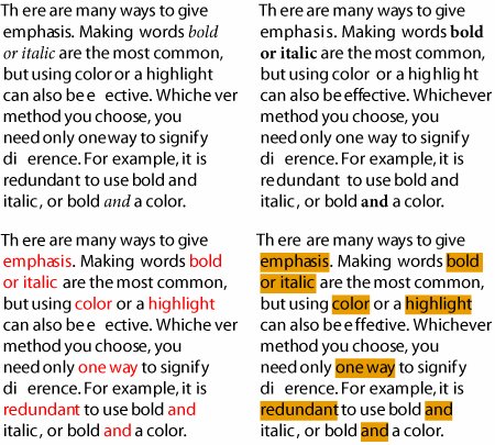
Italics are lighter than their roman counterparts, and their slant can make the type look hurried. Because the characters are more decorative, they can also draw too much attention to themselves. For these reasons, avoid long passages set in italics. Italics are unique but if overused that uniqueness is lost. Using Bold TypeBold weights are typically applied to headings, subheads, and running heads to establish hierarchy. In many booksthis one, for examplebold is also used for referring to figures. If you are using bold weights for emphasis in body text, do so sparingly. Bold text can attract too much attention, breaking up the continuity of your text. Figure 3.19. Different ways to add emphasis. Clockwise from top: Italic, Bold, Highlight (In Underline Options an 11 pt yellow "underline" offset 2.5pt to sit behind the type), and using color.
Small CapsSmall caps have the following uses:
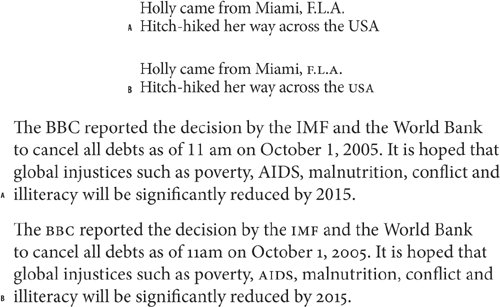
The problem with Small Caps is that unless you are using an OpenType font or an Expert Set (a font of supplementary characters), you'll end up with fake small caps. Fake small caps are regular caps that have been scaled down in size, rather than redrawn characters designed to work in proportion with the regular caps. Because all their proportions are reduced, their weight tends to look too light and spindly and their strokes will not be the same thickness when set alongside regular caps. Figures 3.20A and 3.20B. Small Caps. A has the abbreviations in small capsslightly higher than the x-height; B has them at full-caps size.
Figure 3.21. Small Caps: real vs. fake. Example A uses real small capsthe weight of the character strokes is uniform. Example B uses "fake" small capsregular caps sized at 70 percent.
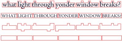
All CapsYou know those people who type their emails in ALL CAPS? Annoying, aren't they? Continuous text set in all caps is hard to read because the shapes of the words all look alike and are differentiated only by their length. We recognize words as shapesthe descenders and the ascenders of upper and lowercase text are essential to our ability to identify letters. Also, text set in all caps within body text tends to look disproportionately large when set among upper and lowercase text; hence the need for Small Caps. Just as shouting doesn't make your message any clearer, setting text in all caps doesn't make your message any more compelling. None of this is to say don't use All Capsjust use them thoughtfully. All Caps can be effective in headlines and subheads. Because there are no descenders, you should tighten the leading. Depending on the typeface, you may want to loosen the tracking for a sophisticated and understated look or tighten the tracking for a more solid, contrasty look. Figure 3.22. All Caps Treatments. The lack of serifs in the sans serif examples allows tighter tracking of the letters, which, in combination with the blockiness of the letter shapes, gives a more solid look, suitable in some instances but not in others. Loose tracking makes the serif versions more elegant. Context is everything.
Figure 3.22A. Text set in ALL CAPS is more difficult to read because, without ascenders and descenders, all of the word shapes are the same. Compare the more interesting word shapes created by upper and lowercase to the rectangles created by using ALL CAPS.
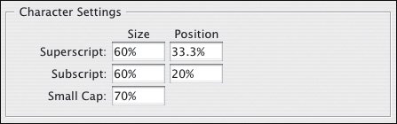
Superscript and SubscriptSuperscript is typically used for ordinals in numbers or for footnotes. Subscript is used in chemical formulae. In Text Preferences, you can change the size of both relative to the point size of your text. You can also changetheir position relative to the baseline of the text. For best results set the Super/Subscript size to 60 percent, the Superscript position to 33 percent and the Subscript position to 0 percent. Figure 3.23. Superscript/Subscript Preferences.
Figure 3.24. Uses of Superscript and Subscript.
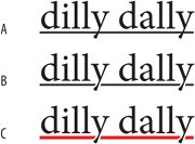
UnderliningIn days of yore, when records came on vinyl and people typed on machines called typewriters, underlining was de rigueur for giving emphasis. But that was only because typewriters couldn't do it any other way. Underlining, as every type manual will tell you, should not, in these days of typographic sophistication, be used for emphasis. The underline collides with the descenders of the word and looks downright ugly. However, underlining has become more sophisticated and is, dare I say it, perhaps making a comeback. These days you can change the weight of the underline and its distance from the baseline. Even so, underlined textno matter how fancy the underlineis always going to be mutton dressed as lamb. That said, there are some nifty tricks you can do with underlining when applied as part of a style definition. But that's another storysee Chapter 13, "Stylin' with Paragraph and Character Styles." Tip Really can't resist underlining? Try adding a paper colored stroke to the underlined type. This prevents the underline from slicing through the descender shapes. Figure 3.25. Underlining Options: Example A uses a generic underline; in example B, the type has a 0.75 pt paper-colored stroke, which keeps the underline away from the descender of the "y." In example C, in addition to the paper-colored stroke, the color and weight of the underline have been adjusted. Choose Underline Options from the Control palette menu in the Character Formats.
StrikethroughYou might use strikethrough to indicate which text will be deleted as a document moves through revision cycles, or once in a blue moon if you're working on a legal document that requires you to indicate revisions. Alternatively, you might want to make a "highlight" character stylesee Chapter 13, "Stylin' with Paragraph and Character Styles." Tip Switch between the Character and Paragraph formatting views of the Control Palette by pressing Cmd+Option+7 (Ctrl+Alt+7). Baseline ShiftWhat can one say about the humble and oft-misunderstood baseline shift? First, here's what it should not be used for: Never, under any circumstances, use Baseline Shift to adjust inter-paragraph spacingthat is the function of leading and/or paragraph spacing.
Baseline shift can be used for the following:
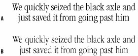
Tip You can quickly access the preferences for these styles by Option/Alt-clicking their icon, which will take you to the Text Preferences dialog box. Figure 3.26. Using Baseline Shift to "illustrate" a word.
Horizontal and Vertical ScaleGet caught using these options, and the Type Police will come knocking on your door. Mess with the proportions of your typeface and you are trampling roughshod over the life's work of some of the world's finest artisans. OK, so maybe I'm being a bit dramatic, but faking a condensed typeface (one with a narrower horizontal scale) or an expanded typeface (one with a wider horizontal scale) will make the character shapes look spindly and the overall effect look amateurish. It's better to choose a real condensed or real expanded typeface. It's like the difference between My Way sung by Frank Sinatra or by some random bloke doing a karaoke version after a few too many pints. Condensed faces include Times Roman and Garamond Condensed. Expanded faces are more typically used for display instead of body type, and are more likely to be sans seriflike Helvetica Neue Expanded or Univers Extended. Figure 3.27. A real condensed font vs. a fake condensed font. ITC Garamond Light Condensed (A), and ITC Garamond Light (B) with horizontal scale set to 72 percentnote the lighter weight of the letters due to the scaling.
Having said all that in such a dogmatic way, I'll now put in a disclaimer about retaining the right to contradict myself. For every rule, there will be examples of ways it can be creatively broken, and distorting type is no exception. The point I'm making is if you want to break this or any typographic "rule," then do so consciouslyand carry a big stick.
|