Keep It Consistent, Except. . .
Leading like so much in typography is all about rhythm, and you want your rhythm to be steady. The best way to do this is to set your leading value as part of a style-sheet definition; should you need to change the leading value, edit the style definition rather than work on the paragraph locally. When it comes to fixing widows and orphans, don't mess with the leading. You have other tricks up your sleevetracking, discretionary hyphens, forced line breaksto fix such problems (see Chapter 5: " Kern, Baby, Kern" and Chapter 11: " Don't Fear the Hyphen"). Tempting though it may be to tighten the leading a little bit here and there, your document will look like a dog's dinner if you do. Always keep your body text leading consistent, otherwise the rhythm of your type will falter. Also, don't be tempted to go for the soft option of vertical alignment, which adjusts the leading to make multiple columns bottom out, i.e., end on the same baseline. (See Chapter 8: Align your Type.) Working with display type, you may need to relax the consistency rule in favor of optical leadingtweaking the leading of individual lines to make the leading appear more consistent. Such a situation may arise in display type if one line doesn't have descendersanother example of trusting your eye rather than the math. Figures 4.12A and 4.12B. An extreme example of the what can happen with vertical justification: the leading in column 3 is opened up in order to make all three columns "bottom out."[View full size image] 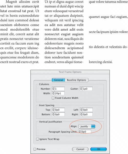
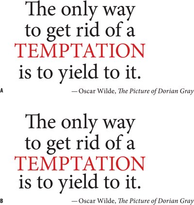
Figure 4.13. Optical Leading. The leading beneath "Temptation" appears too large in example A because there are no descenders. In example B, the leading for the last line has been reduced to compensate.
|