How Much to Kern
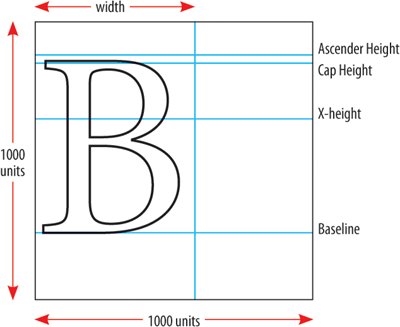
PostScript fonts are designed in an em squarea box that is 1000 units x 1000 units. An em is a relative unit the same size as your type and InDesign kerns (and tracks) in increments of 1/1000 of an em. Place your Type cursor between any pair of characters to see how much kerning is appliedthe Kerning field displays the amount in parentheses in 1000s of an em. Tip When making kerning adjustments, zoom in to a large enough view size to be able to truly evaluate your resultsand then zoom out again to 100 percent view to make sure your changes look appropriate. Don't overdo it. Along with the ease of kerning comes a tendency to want to fix things that ain't broke in the first place. Most of the letter shapes we knowand have been reading all our liveswere designed so that well-distributed weight would compensate for their odd shapes. Consequently, they fit well with nearly all of their possible neighbors. It takes time to develop an eye for kerning; until you feel confident, be cautious and make only slight adjustments. And make sure you're consistent: If you decide that certain letter combinations require kerning at display sizes, then make sure you kern all the instances of those letter combinations. Figure 5.8. The Em Square.
|