Optical Kerning
Optical Kerning adjusts the spacing between adjacent characters based on their shapes and pays no mind to the kerning pairs. Theoretically, Optical kerning will give you more consistent character spacing, because every character pair, even the most unlikely ones like zh or xw or gk, is kerned based on its character shapes. It's a matter of preference, but here are some things to consider:
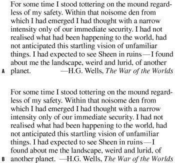
Figure 5.3. Comparison of Metrics kerning (example A) and Optical kerning (example B) using Times. The amount of difference will vary from font to font.
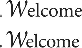
Figure 5.4. Metrics Kerning (example A) vs. Optical Kerning (example B) when using mixed fonts.
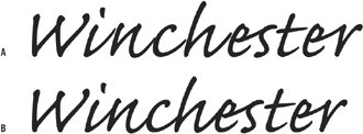
Figure 5.5. Metrics Kerning (example A) fares better than Optical Kerning (example B) when using script faces.
|