Ligatures
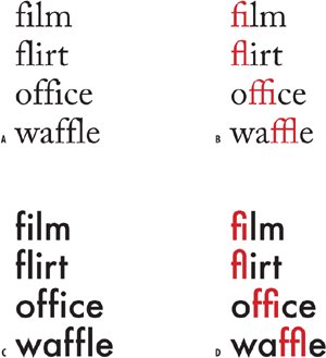
Ligatures are two or more characters fused into a single character. An example of a character that has evolved from a ligature into a character in its own right is the ampersand (&), which is a stylized abbreviation of et, the Latin word for "and." Today we use ligatures to avoid collisions between different parts of the characters as well as to add sophistication to type. InDesign allows you to substitute standard ligatures for the lowercase fi and fl combinations whether you are using OpenType, PostScript, or TrueType fonts. Whether you do so depends on the font you're using. First try setting the type without ligatures, if the characters collide, then turn on Ligatures. If the characters do not collide, wellif it ain't broke, don't fix it, especially since using ligatures in such instances may make these letter combinations appear tighter set than the rest of your type. OpenType fonts extend the range of standard ligatures. InDesign's Check Spelling is smart enough to recognize ligatures and not flag as misspelled any word that contains them. Figure 7.2. The need for ligatures: Depending on the font you are using, you may or may not want to use ligatures A. Adobe Caslon without ligatures: Note the collision of the f and i and f and l. B. Adobe Caslon with ligatures turned on. C. Futura doesn't require ligatures because of its character shapes, so using them (D) is redundant.
Figure 7.3. Ligatures can be incorporated into a Style definition (top) or turned on locally using the Character palette.[View full size image] 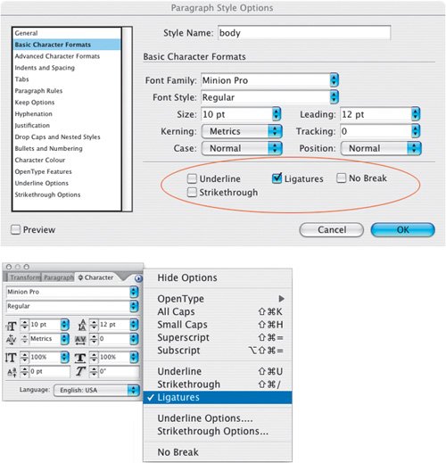
Figure 7.4. Standard Ligatures.
Figure 7.5. OpenType Features.[View full size image] 
|