Chapter 10. First Impressions: Creating Great Opening Paragraphs
|
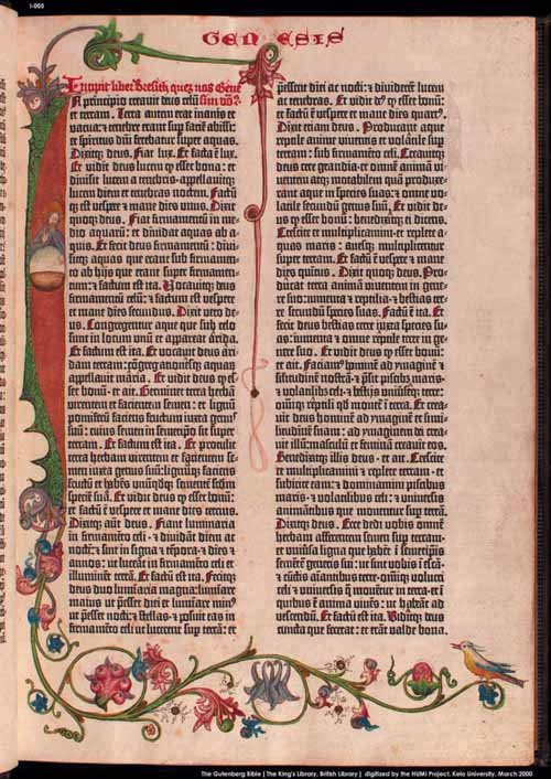
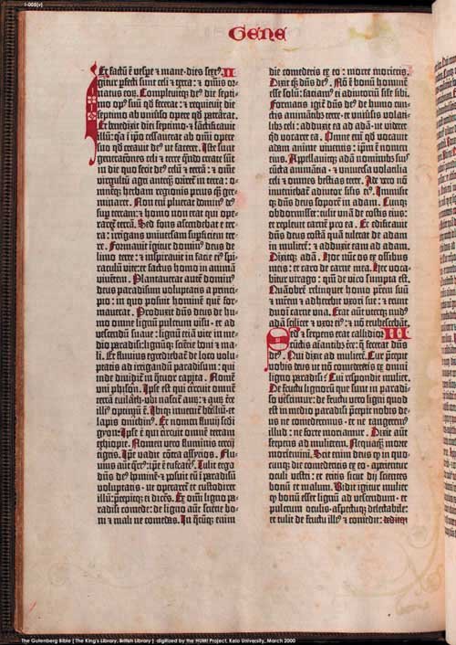
THE APPEARANCE OF AN OPENING PARAGRAPH is almost as important as its content for hooking the reader, or, if you are marking a section break, for providing visual relief from a continuous body of text. This chapter looks at initial capitals, specifically drop capsthose created manually and those created automatically using InDesign's Drop Caps feature. Drop caps are part of a long tradition of decorative first letters stretching back to before the invention of the printing press. Before printing, books were dictated to, and subsequently copied by, scribes and each book was regarded as a unique treasure. The scribes incorporated individual flourishes to distinguish their work from others. In medieval times the ornamentation of manuscripts was a monastic discipline; each major section of a book usually began with an illuminated letter made with metallic, mineral, or vegetable pigments, which were bound by glue or gum to the paper or parchment. Figures 10-1A and 10.1B. Two pages from the Gutenberg Bible (1455), the first (this page) showing an illuminated first character painted by a scribe, the second (page 135) showing smaller initial characters in red to indicate new sections.
By the fourteenth century, initial letters or versals had evolved from enlarged heavy letters into elaborate illustrated works of art, most often used to decorate religious texts. An illuminated versal might flow down the whole side of a page, or extend up and around the top of the page. Sometimes they included illustrations and took over the entire page. In 1455, when Gutenberg printed his 42-line-per-page Biblethe first book to be printed in the western world with moveable typehe acknowledged the importance of this tradition by leaving space in the printed text for the scribe to add a decorative first letter. |