Drop Cap Aesthetics
There are no hard and fast rules concerning how big a drop cap should be, but common sense should prevail. Size matters, although in this context bigger isn't always better. The purpose of the drop cap is to signal to the reader where to begin. To do so, the drop cap doesn't need to scream at the reader and shouldn't overwhelm any headline that precedes it. The drop cap comes below the headline in terms of page hierarchy; usually, though not always, it will be smaller than the headline. Also, don't repeat the letter you use as the drop cap at the beginning of the body text. Too Much of a Good Thing?In addition to the initial drop cap for the first paragraph of a chapter or article, designers often use smaller drop caps as section markersset up as a style sheet based on the parent drop cap style. This is visually effective, necessary even, if the text doesn't have illustrations, subheads, or other graphic elements to break up the monotony of columns of type. That said, if you sprinkle your drop caps too liberally throughout your document, they cease to be an elegant and functional graphic device and start to become a repetitive annoyance. One drop cap per length of copy or long section is enough.
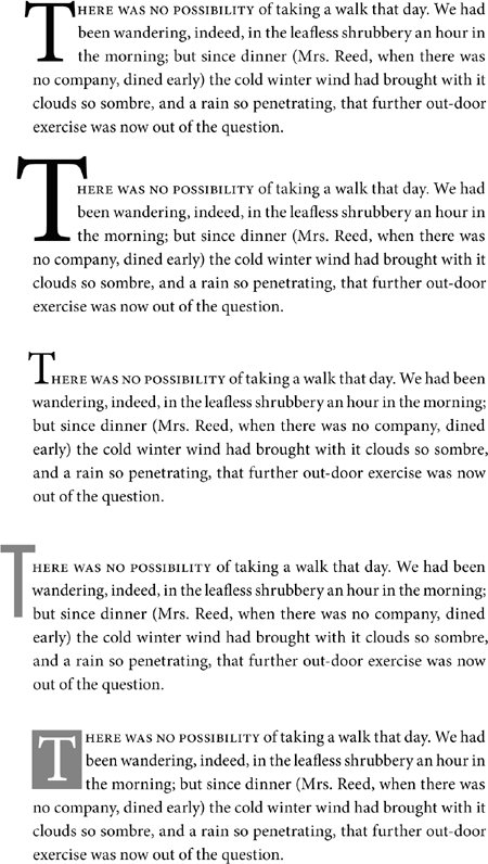
Figure 10.4. Some different approaches to a drop cap.
Kerning Drop CapsA common problem with automatically generated drop caps is that the big first character may collide with the body text that follows. Where necessary, you'll need to kern to avoid such problems. Note that when you kern between the drop cap and the first character of the text, kerning is applied to all the lines adjacent to the drop cap. Figure 10.5. Kerning a drop cap. Example A shows the result of applying a 4-line drop cap in Adobe Caslon Pro. Note, the serif of the W collides with the "h." Insert your type cursor between the two letters and press Option+Right Arrow/Alt+Right Arrow to kern the letters, inserting space between the W and the "h" (example B).[View full size image] 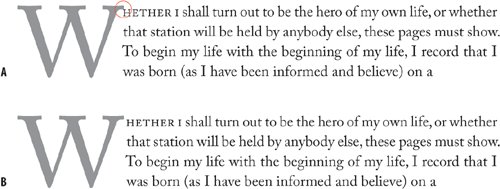
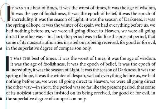
Using Optical Margin AlignmentCertain letters will not look optically aligned because the left sidebearing (space to the left of the character shape that is incorporated into the letter's design) can cause the letter to appear slightly indented. There are two potential solutions:
Figures 10.6A and 10.6B. Optical Margin Alignment. Turned off (example A). Turned on and set to 12 point (example B).[View full size image] 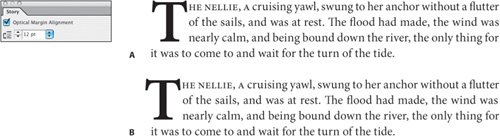
Figure 10.7. Before kerning the space in front of the drop cap (example A) and after (example B) to optically align the first letter.
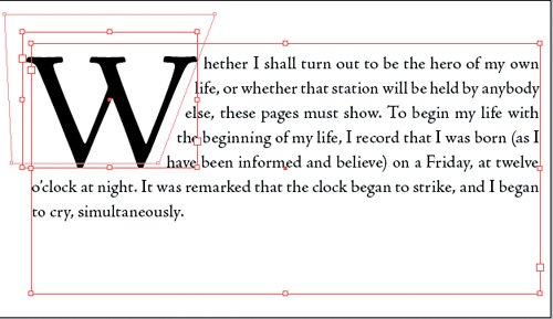
Creating a Contoured Drop CapPutting your drop cap character in its own text frame gives you the option of contouring the text to the shape of the drop cap. Apply a text wrap to the drop cap text frame, then use the Direct Selection tool to sculpt the text wrap outline to conform to the diagonal of the W. Make sure that the space around the drop cap is optically the same on the side as it is on the bottom. Note that using this technique will change the location of the start of successive lines of text, which can impede readability. Figure 10.8. Contoured drop cap. The W is in its own text frame. A text wrap is applied and then adjusted to correspond to the letter shape.
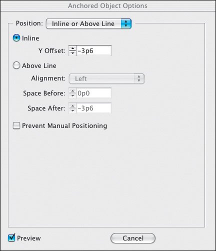
If you are working with a document that contains several custom drop caps you can take things a step further by turning the drop cap into an anchored object. That way, if your text reflows, the drop cap moves with itno wasting time chasing after missing text blocks. Here's how:
Figure 10.9. Anchored Object Options. Defining the custom drop cap as an anchored object ensure that it will move as part of the text flow. For more on anchored objects see Chapter 16: Text Wraps: The Good, the Bad, and the Ugly.
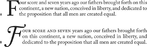
Adding Small CapsAn often-used device to create a visual bridge between the drop cap and the text is to put the words following the drop cap in small caps. This creates a transition from the large decorative character into the upper- and lowercase of the body text without which the drop cap may look like an isolated graphic. Just how many characters are put into small caps is a matter for discretionit may be just the first word, the first phrase, a specified number of words, or the first line. Whatever you choose, make sure you are consistent throughout your publication. Back in the old dayspre-2003adding small caps after a drop cap was fiddly and time consuming, especially when working on long documents with many chapter or article heads. You would find yourself applying character styles locally all the while thinking that there had to a better way. And now there is: As I've already mentioned, if you want a drop cap character to have a different color and/or font than the rest of the paragraph, you can define a character style with these attributes then nest the character style in a paragraph style. You can also use Nested Styles to automatically apply a character style to a specified number of words after the drop cap. InDesign lets you incorporate a character style inside a paragraph style. This way, your small caps character style is added to your first paragraph style definition and applied with a single mouse click. The possibilities here are mind-bogglingenough to distract a type and automation geek for the better part of a Friday nightand we'll look at nested styles in more detail in Chapter 14: Mo' Style. Figure 10.10. Adding Small Caps: No small caps (example A); small caps applied through four words (example B) to ease the transition from big first character to the upper and lowercase text. (The drop cap is also changed to an italic swash and the kerning between drop cap and text adjusted.)
Figure 10.11. Nested Styles: Choose a character style to apply to a specified number of words.[View full size image] 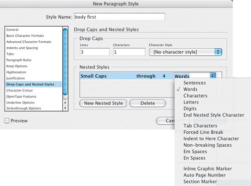
Nesting Small Caps
Figure 10.12. Using OpenType Small Caps.[View full size image] 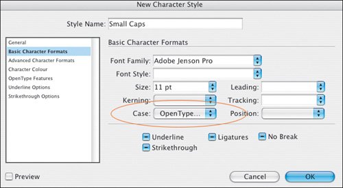
Currently there is no way of automating the application of small caps to a single line. You can insert an End Nested Styles character (Type > Insert Special Character) at any point in the text so that the character style is applied up to that point, but this requires the discretion of manual input on a case-by-case basis. |