Balancing Ragged Lines
It is often necessary to break display type: either at logical places for meaning and/or to achieve a visual balance. InDesign's Balance Ragged Lines feature goes some way towards achieving the latter and is useful to include as part of the style definition of headings, pull-quotes, and centered paragraphs. Using Balance Ragged Lines will reduce the amount of manual intervention (in the form of forced line breaks, or nonbreaking spaces), but you're still going to need to check your display type carefully for meaning. Figure 8.15. Balance Ragged Lines applied locally from the Control palette and incorporated into a Paragraph Style definition.[View full size image] 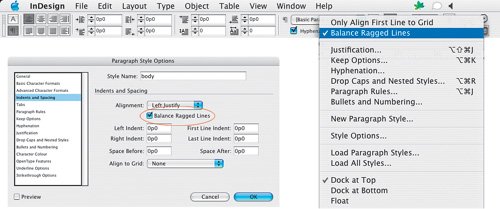
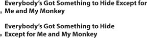
Figure 8.16. Unbalanced (example A); balanced (example B).
Balance Ragged Lines can also be used to adjust the line endings in left-aligned body text to produce a more even ragwhat you're aiming for is a gentle ripple down the edge of your page. Note that Hyphenation settings also play an important role in determining the way a paragraph rags (see Chapter 11: "Don't Fear the Hyphen") as does your chosen method of composition: Adobe Paragraph Composer or Adobe Single-line Composer. Balance Ragged Lines has no effect in justified text. The line lengths in ragged type should be clearly irregular, i.e., they shouldn't look like carelessly set justified type. On the other hand, they shouldn't be so irregular that they create distracting shapes that impede fast reading. Figure 8.17. Balance Ragged Lines in body text. Both paragraphs are composed using the Adobe Paragraph Composer, and both permit hyphenation. Example A is without Balance Ragged Lines; example B has Balance Ragged Lines applied. Using Balance Ragged Lines for body text can yield unpredictable resultsit is best applied locally, or, if incorporated into a Paragraph Style definition, to paragraphs that typically run only a few lines.
|