How InDesign Justifies Type
Justification is achieved by varying the size of the word spaces on the lineor in the entire paragraphin an attempt to get even word and letter spacing, or at least word and letter spacing that looks even. If justification can't be achieved by adjusting the Word Spacing alone, then InDesign will adjust the Letter Spacing according to your minimum, desired, and maximum settings. After that, it moves on to your Glyph Scaling settings. Too much variation in word or letter spacing will cause the tight lines to look darker than the rest of your text and disturb the paragraph's rhythm. At the other extreme, if the word spacing is too big, you will get unsightly "rivers" of white running through your lines. This is particularly problematic when the columns are narrow and/or when the word spacing exceeds the leading, because the eye is tempted to read down through the gaps rather than from left to right. Good type color is essential regardless of what alignment you are using, but it's harder to achieve in justified text, because the space left over at the end of the line has to be redistributed across the line to give you a smooth right margin. The more words you have in a line the easier it will be to get even word spacing. You get more words either by making your type smaller or your column wider. It's a balancing act because if you make your column too wide relative to your type size, you'll be swapping one evil for another (see Chapter 15: "Set Up"). Tip To check for rivers, turn your page upside downwithout the distraction of actually reading the words, any problems should shout themselves out. InDesign's Justification options can seem intimidating, but ultimately they are extremely logical. Using them well will make a dramatic difference in the appearance of your type. Figure 8.7. Many rivers to cross. Word spacing and Letter Spacing too tight (example A) and too loose (example B).
Figure 8.8. The Justification options specified as part of a style sheet definition.[View full size image] 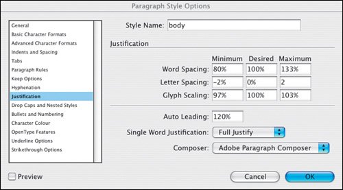
Word SpacingNo prizes for guessing that this refers to the space between words, i.e., the width of space you get when you press the spacebar. If you make your word spacing too tight, words will blend together making it hard for the eye to distinguish one from the next. At the other extreme, word spacing that's too loose creates unsightly blocks of white space between words, which makes reading groups of words more difficult. Determining word spacing is more of an aesthetic consideration than an exact science. A good starting point is 100 percentthe width of the spaceband designed by the font designer. However, you may want to reduce this from 60 to 80 percent in the following circumstances:
Figure 8.9. Tight word spacing (example A) and using the default values (example B). (ITC Garamond Book Condensed).[View full size image] 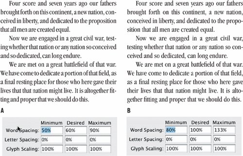
Letter SpacingThis is the distance between letters and includes any kerning or tracking values you may have applied. A character's width is determined not just by the character itself, but also by the space that the font designer adds around the characterknown as the side bearing. A purist will tell you that come hell or high water all three values should be set to 0. That is, under no circumstances is any variation in letter spacing permissible. However, if you are working with a narrow measure you'll need to be more liberal with these settings. Depending on the font, you might try reducing the Desired Letter Spacing to 3, and set the minimum and maximum can be set to 5 and 0, respectively. Figure 8.10. Letter Spacing: A slight adjustment to the Letter Spacing (example A) significantly improves the type color over example B, where InDesign has to rely solely upon the Word Spacing values to justify the type.[View full size image] 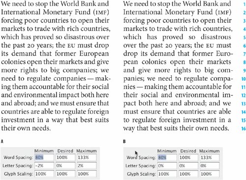
With both Word and Letter Spacing you need to find a balance between being strict and being reasonable. There's no point in specifying restrictive settings if your text-to-column width ratio makes it impossible for InDesign to honor these settings. Glyph ScalingGlyph Scaling is the process of adjusting the width of characters in order to achieve even justificationand a little glyph scaling goes a long way. Entering a value other than 100 percent for your Desired Glyph Scaling when working with ragged text is the same as entering a value for Horizontal Scaling. In other words, it's a bad idea. Glyph scaling might sound like the kind of crime that the Type Police will bust you for in an instant. But in reality, moderate amounts of glyph scaling cancombined with your other justification settingsimprove type color significantly. Moderation is the key: Keep your glyph scaling to 97, 100, 103 for Minimum, Desired, and Maximum, respectively. No one will ever know that you varied the horizontal scale of your type. They will, however, appreciate the splendidly even word spacing. Mum's the word. Figure 8.11. Glyph Scaling: Allowing glyphs to scale to a small degree (example B) allows for more even justification.[View full size image] 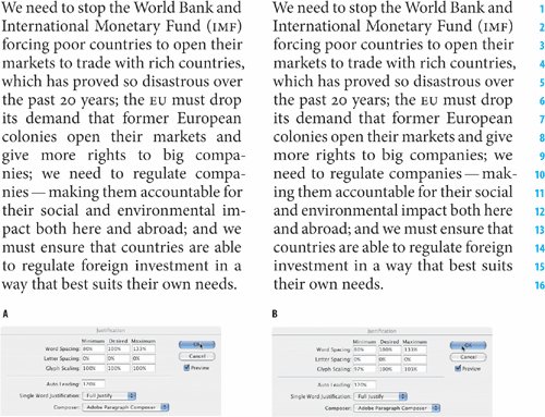
Figure 8.12. In example B, Letter Spacing and Glyph Scaling are combined with Word Spacing to produce an even type color.
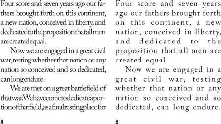
The Adobe Paragraph ComposerThe Adobe Paragraph Composer is the jewel in the crown of InDesign's typographic features. Before InDesign came along, page layout programs would compose paragraphs line by line. Because there was only a limited number of word spaces across which the extra space at the end of the line could be distributed, this often caused bad type color. Using the Adobe Paragraph Composer (it is the default choice of Composer), InDesign analyzes the word spaces across a whole paragraph, considering the possible line breaks, and optimizing earlier lines in the paragraph to prevent bad breaks later on. Not only does this mean fewer hyphens and better breaks where hyphens do occur, it also means better spacing. Because InDesign looks in the whole paragraph, there are more places where it can add or subtract an imperceptible amount of space. The default values of 80, 100, 133 for the Minimum, Desired, and Maximum word space allow the program enough latitude to distribute the space over a range of lines. The Adobe Paragraph Composer works for both ragged and justified type, but it's with the latter that you really see its benefits. Figure 8.13. Adobe Paragraph Composer
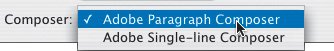
Figure 8.14. Show H&J Violations.
Note It's important to bear in mind that InDesign's Justification and Hyphenation features work in conjunction with each other. Good word spacing will not be achieved by the Adobe Paragraph Composer alone, but rather by combining it with the other justification features in InDesign's toolkit. Adobe Single-Line ComposerIf you're going for that retro look of bad word spacing circa 1994, then this is the option to choose. Otherwise it's second best to the Adobe Paragraph Composer. |