
Here are a few simple precautions:
Avoid text wraps in a single column where the text wraps around all four corners (or the entire shape) of the bounding box or graphic. Such text wraps disrupt the horizontal flow of the text, and readers may be confused about whether to jump the graphic or continue reading down the left side of the column. Text wraps work best with justified type. Ragged type undermines the purpose of the text wrapthe interesting shape of the text margin when text wraps around a bounding box or the contours of an image. If you must use ragged type, then reduce the amount of text wrap offset on the left of the wrap object so that the gaps from the left alignment are optically similar to the space on the other side. Avoid having the left edge of lines in a paragraph start at different horizontal locations (apart from a first line indent). When you do this, the reader's eye has to search for the start of the line and may lose the rhythm of the text, ending up on the wrong line. Here's a recurring theme: It's all about optical spacing. And with text wraps, it's essential to optically balance the space around the graphic. This is about more than just selecting equal values for all the text offsets. The vertical space around the wrapped object depends on where it sits relative to the baselines of the type around it.
[View full size image] 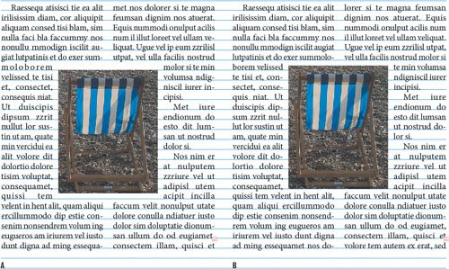
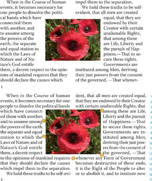
When working with text wraps on rectangular images, align the top of the picture frame to the ascender line, cap height, or x-height of the text. Whichever you choose, be consistent. Align the bottom of the picture frame with the baseline of the text. Tip
To nudge your objects in smaller increments reduce your Cursor Key increment.
Carefully check all lines affected by the wrap and, where necessary, fix composition problems with a combination of tracking, hyphenation, and rewriting. When using more than one text wrap in your document, keep the offset amount consistent. Don't attempt the impossible. If the shape of your wrap object is too irregular, the result will be too many different line lengths, too much hyphenation, and great gaping holes in the text.
[View full size image] 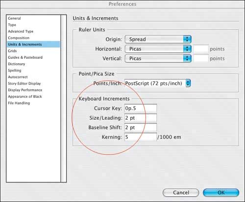
|


