Transparency Effects
|
Using InDesign's Transparency palette is so easy it feels like cheating. Blend Modes determines how the colors of overlapping objects are affected and are applied on a frame-by-frame basis. If you want one piece of type to overlap another and create a transparency effect, it must be in its own text frame. Figure 18.19A. Each letter is in its own text frame, which has been rotated and positioned so that it overlaps another text frame. Experiment with different combinations of Blend Mode and opacity to get the effect you likeMultiply and Color Burn usually work well, but the results will depend on the colors you are using.
Figure 18.19B. Four-color printing misalignment is simulated by placing four identical text frames (one in cyan, one magenta, one yellow, one black 70 percent) on top of each other and then nudging the position of each to misregister the frames. The blend mode of each is set to Multiply.
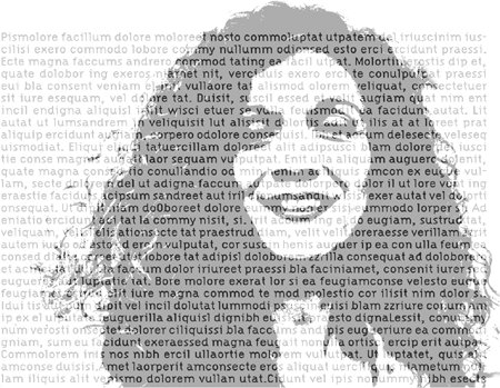
Figure 18.20. A grayscale image is placed on a layer above the type layer. The image color is 50 percent black. The Blend Mode of the image layer is Hard Light and the Opacity is 75 percent. This effect works best when the type is intended more as a textural element rather than designed to read.
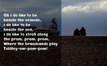
Ghosted PanelsIn general, putting type over an image is a bad idea: You dilute the message of the image and you reduce the readability of the typea worst-of-both-worlds scenario. However, when used sparingly, it can be an effective technique. Combining it with Transparency can help integrate the two elements, while preventing the type from becoming unreadable. Figure 18.21. Ghosted Panel. A black panel with a blend mode of Hard Light and an opacity of 50% sits on top of the image. Note the text frame and the color panel must be separate objects so that you can adjust their opacity independently. Using this technique you have several variables, which, combined, offer a wealth of possibilities: type color, image color, image detail, the color, blend mode and opacity of the top panel.
|


