Complex Charts and Graphs, Oh My!
This time, I'll show you how you can take the data that you enter into your spreadsheets and transform it into a slick little chart. These charts can be linear, pie, bar, and a number of other choices. They can also be two- or three-dimensional, with various effects applied for that professional look.
To start, create another spreadsheet. We'll call this one Quarterly Sales Reports. With it, we will track the performance of a hypothetical company.
In cell A1, write the title (Quarterly Sales Reports) and in cell A2, write the description of the data (in thousands of dollars). Now in cell A4, write the heading Period, then enter Q1 in cell A6, Q2 in cell A7, Q3 in cell A8, and Q4 in cell A9. Finally, enter some headings for the years. In cell B4, enter 1998, then enter 1999 in cell C4, and continue on in row 4 right up to 2002. You should have five years running across row 4, with four quarters listed.
Time to have some virtual fun. For each period, enter a fictitious sales figure (or a real one if you are serious about this). For example, the data for 1999, Q2 would be entered in cell C7, and the sales figure for 2001, Q3 would be in cell E8. If you are still with me, finish entering the data, and we'll do a few things.
Magical Totals
Let's start with a quick and easy total of each column.
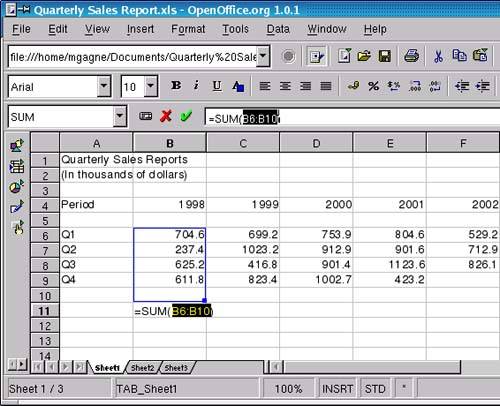
If you used the same layout as I did, you should have a 1998 column that ends at B9. Click on cell B11. Now look at the icon in the middle of the sheet area and the input line on the Formula bar. It looks like the Greek letter Epsilon. Hold your mouse pointer over it, and you'll see a tooltip that says Sum. Are you excited yet? Click the icon, and the formula to sum up the totals of that line, =SUM(B6:B10 ), will automatically appear (see Figure 14-6). All you need to do to finalize the totals is click the green checkmark that appears next to the input line.
Figure 14-6. Select a series of cells, and Calc will automatically generate totals for you.
Because a sum calculation is the most common function used, it is kept handy. You can now do the same thing for each of the other yearly columns to get your totals. Click on the sum icon, then click your beginning column and drag the mouse to include the cells you want. Click the green checkmark, and move on to the next yearly column.
Nice, Colorful, Impressive, and Dynamic Graphs
Creating a chart from the data you have just entered is really pretty easy. Start by selecting the cells that represent the information you want to see on your finished chart, including the headings. You can start with one corner of the chart and simply drag your mouse across to select all that you want.
Warning
If there are some empty cells in your table (in my example, row A3), you will want to deselect them. You can do this by holding down the <Ctrl> key and clicking those cells with the mouse. |
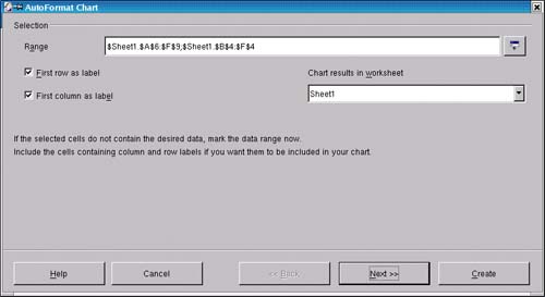
Once you have all the cells you want selected, click Insert on the menu bar, and select Chart. The first window that appears (Figure 14-7) gives you the opportunity of assigning certain rows and columns as labels. This is perfect because we have the quarter numbers running down the left side and the year labels running across the top. Check these on.
Figure 14-7. The AutoFormat chart dialog.
Before you move on, notice the drop-down list labeled Chart results in worksheet. By default, Calc creates three tabbed pages for every new worksheet, even though you are working on only one at this time. If you leave things as they are, your chart will be embedded into your current page, though you can always move it to different locations. You have a choice at this point to have the chart appear on a separate page (those tabs at the bottom of your worksheet). For my example, I'm going to leave the chart on the first page. Make your selection, then click Next.
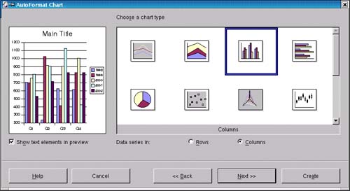
The next window (Figure 14-8) lets you choose from chart types (bar, pie, etc.) and provides a preview window to the left. That way, you can try the various chart options to see what best shows off your data. If you want to see the labels in your preview window, click on the check box for Show text elements in preview.
Figure 14-8. Lots of chart types to choose from.
You can continue to click Next for some additional fine-tuning on formatting (the last screen lets you change the title), but this is all the data you actually need to create your chart. When you are done, click the Create button, and your chart will appear on your page (Figure 14-9).
Figure 14-9. Just like that, your chart appears alongside your table.
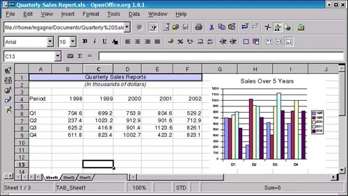
To lock the chart in place, click anywhere else on the worksheet. You may want to change the chart's title, as well?double-click on the title, then make your changes. I'm going to call mine Sales Over 5 Years. If the chart is in the wrong place, click on it, then drag it to where you want it to be. If it is too big, grab one of the corners and resize it.
What's cool about this chart is that it is dynamically linked to the data on the page. Change the data in a cell, press <Enter>, and the chart will automatically update!
Final Touches
If you select (highlight) the title text in cell A1 and click the "center" icon, the text position doesn't change. That's because A1 is already filled to capacity, and the text is essentially already centered. To get the effect you want, click on cell A1, hold the mouse button down, and drag to select all the cells up to F1. Now click Format on the menu bar and select Merge Cells, then click Define. All six cells will merge into one, after which you can select the text and center it.
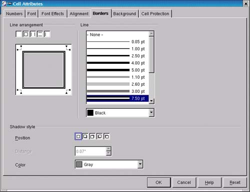
For more extensive formatting of cells, including borders, color, and so on, right-click on the cell, and select Format. (Try this with your title cell.) A Cell Attribute window (as in Figure 14-10) will appear, from which you can add a variety of formatting effects.
Figure 14-10. Adding borders and fill to cell.
A Beautiful Thing!
When you are through with your worksheet, it is time to print. Click File on the menu bar and select Print. Select your printer, click OK, and you'll have a product to impress even the most jaded bean counter.


