Welcome to the GIMP
The GIMP is one of those programs that has helped create an identity for Linux. Of course, there are plenty of programs out there, as I'm sure I have demonstrated by this point in the book, but the GIMP is special in some ways. The Linux community has used it to create images, buttons, desktop themes, window decorations, and more. Even the Linux mascot, Tux the Penguin, as created by Larry Ewing (the mascot's best-known incarnation) was a product of the GIMP.
The GIMP is an amazingly powerful piece of software, yet it is very simple, as well. With a little bit of work, a lot of fun, and a hint of experimentation, anyone can use the GIMP to turn out a fantastic piece of professional-quality art. You doubt my words? Then follow along with me, and in just a few minutes, you'll have created a slick-looking logo for your Web page or your desktop. That said, with time, you can also learn to wield the GIMP with the power of a Hollywood special effects master.
Ladies and gentlemen, start your GIMP. Click on the application starter (the big K), scroll up to the Graphics submenu, and click on the GIMP. You can also use your program quickstart by pressing <Alt+F2> and entering gimp into the command field.
The First Time
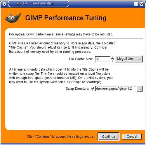
If you are starting up the GIMP for the very first time, the GIMP User Installation dialog will appear (Figure 16-11). You'll be asked a number of questions regarding the location of your personal GIMP directory (defaults to a directory called .gimp-version.no under your personal home directory), how much memory you wish to allocate for the GIMP to do its work, and so on. For the most part, you can just accept the defaults by clicking Continue through the various screens.
Figure 16-11. When you start the GIMP for the first time, you'll need to adjust a few settings.
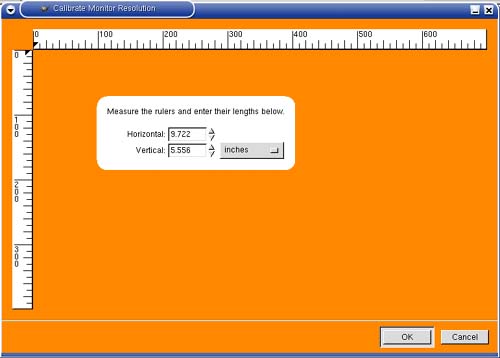
Immediately after the performance tuning screen, you'll be asked for your monitor's resolution. If you plan on doing particularly fine work and you would like the GIMP to display images in their natural sizes, you should adjust your monitor's resolution. If you know the resolution, you can enter it manually or accept the default of 72 dpi.
Your final option for absolute accuracy is to click on the Calibrate button. A ruler will appear on your screen (Figure 16-12). Measure that ruler with a physical ruler and enter the actual size into the fields provided. When you are happy, click OK. This method can yield very different results from the defaults. My settings came in at 84.848 pixels per inch for the x axis (horizontal) and 85.106 pixels per inch for the y axis (vertical).
Figure 16-12. Fine-tuning the GIMP to match your monitor resolution.
Once you have entered all this information, the GIMP proper will start up. You will probably get a number of panels aside from the GIMP's main screen. You will also likely get the GIMP Tip of the Day. As with all such tips, you can elect not to have them appear each time the program starts?just uncheck the Show tip next time GIMP starts button before you hit close, and you won't be bothered with them again. As for those additional windows (layers, tools options, and brush selection), closing them before you close the GIMP will make sure they don't come up by default.
The most important of those windows is the GIMP toolbox (Figure 16-13). Let us take a few moments to get familiar with it.
Figure 16-13. The GIMP toolbox.
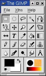
Along the top, directly below the title bar, is a familiar-looking menu bar labeled, quite simply, File, Xtns, and Help. Clicking on these will show you additional submenus. Below the menu bar is a grid of icons, each with an image representing one of the GIMP's tools. I will cover all of these things shortly, but first let's take the GIMP out for a spin.
Easy Logos with the GIMP
The nitty-gritty can wait. I think we should do something fun with the GIMP right now. I'm going to show you how to create a very cool-looking corporate or personal logo with just a few keystrokes. If you don't have the GIMP open yet, start the program now. From the main toolbox menu bar, select Xtns, scroll down to Script-Fu, and another menu will cascade from it.
Quick Tip
Notice that the menus have a dashed line at the top. These are menu tear-offs, and you have seen them before when working with the KDE menus. By clicking on the dashed line, you can detach the menu and put it somewhere on your desktop for convenient access to functions you use all the time. In fact, all the menus, including submenus, can be detached. |
From the Script-Fu menu, move your mouse to Logos. You should see a whole list of logo types, from 3D Outline to Cool Metal to Starscape and more. For this exercise, choose Cool Metal.
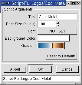
Every logo has different settings, so the one you see in Figure 16-14 is specific to Cool Metal. Particle Trace will have a completely different set of parameters. To create your Cool Metal logo, start by changing the Text field to something other than the logo style's name. I'll change mine to read Linux rocks! The font size is set to 100 pixels, and we can leave it at that for now.
Figure 16-14. Script-Fu logo settings.
The font has not yet been set, so click the NOT SET button, and pick a font style and size from the list that pops up. The font select window shows you the various fonts available on your system and lets you try different font types, styles, and sizes. A preview window gives you an idea of what the font looks like (Figure 16-15). If you want, you can even change the text in the preview window from the default abcdefghijk ABCDEFGHIJK to your own words so that you can really see what it will look like.
Figure 16-15. Script-Fu font selection dialog.
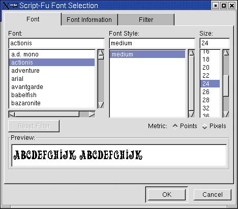
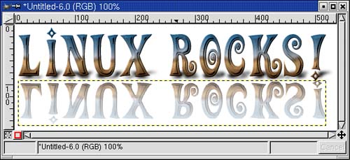
As I wrote this part of the book, I was working on a Mandrake test system and chose a font called actionis (actually, I used several distributions during the course of this book). You may choose whatever you like. When you have decided on a font, click OK. Then click OK again, this time in the Script-Fu:Logos/Cool Metal window. The result should be something similar to my own logo in Figure 16-16.
Figure 16-16. Just like that! A professional-looking logo.
If you don't like the results, close the image by clicking the close button in the corner (usually an X unless you have changed your desktop theme or style). A warning box will pop up, telling you that changes have been made and that perhaps you might want to save your work (more on that in a moment). Click Close and it goes away. Then start over with another logo. You might try changing the background color or the gradient this time. You might even want to try a different type of logo altogether.
Saving and Opening Your Work
Now it is time to preserve your masterpiece. To save your work, right-click anywhere on the generated logo, select File from the pop-up menu, then click Save As. From the Save Image dialog box that appears, double-click on the directory you wish to save in.
Before you type in a file name, pay some attention to the Save Options. The default is indicated as By Extension. What this means is that I can save an image as JPG format simply by typing a file name such as mylogo.jpg (Figure 16-17) or as PNG format by typing mylogo.png. Most will do this, but you can also select from a number of supported file types (and there are many) by clicking the By Extension button and selecting your file type.
Figure 16-17. Now it is time to save your work.
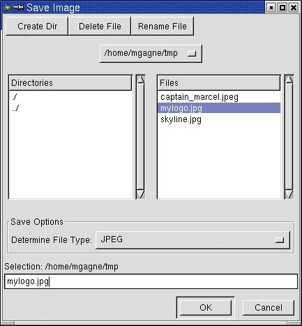
When you have entered your file name and selected a file type, click OK, and you are done.
Opening a file is similar. From the GIMP toolbox menu bar, select Open (or use the <Ctrl+O> shortcut) to bring up the Load Image dialog. The difference between this and the Save Image dialog is that when you click on a file name, you can also click on Generate Preview to display a small thumbnail preview in the Load Image dialog.


