Changing Chart Options
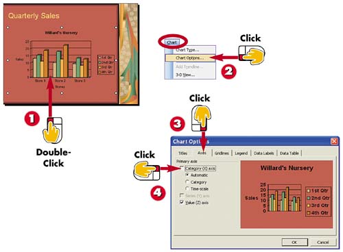

Double-click the chart.

Open the Chart menu and choose Chart Options.

The Chart Options dialog box opens. Click the Axes tab.

Click an axis check box to display or hide the axis label. A check mark indicates that the label is displayed, while no check mark indicates that the label is hidden.
INTRODUCTION
Using the Chart Options dialog box, you can display or hide axis labels, gridlines, and data labels; and control the placement of the legend. Each tab in the dialog box offers options for controlling what appears on your chart and lets you preview what the changes look like before applying them to the chart.
TIP
Which Axis Is Which?
The x axis is the horizontal axis on the chart. The y axis is the vertical axis on the chart.
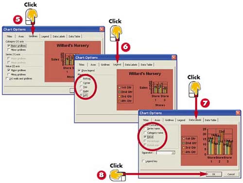

Click the Gridlines tab, and click the gridlines you want displayed or hidden.

Click the Legend tab, and click the placement option you want to apply.

Click the Data Labels tab, and click the labels you want displayed or hidden.

Click OK to close the dialog box and apply your changes.
TIPTurning Off Your Legend Legends explain the color scheme for the data in your chart, but you may decide to turn yours off to free up space or if the chart data is pretty self-explanatory. To do so, open the Chart Options dialog box to the Legend tab and deselect the Show Legend check box. |
TIPData Label Clutter By default, your chart's data labels are turned off because data labels tend to add clutter to charts. In addition, the more values you plot, the harder it is to read the labels. If your chart is simple, however, you can turn the labels on. |


