Changing the Chart Type
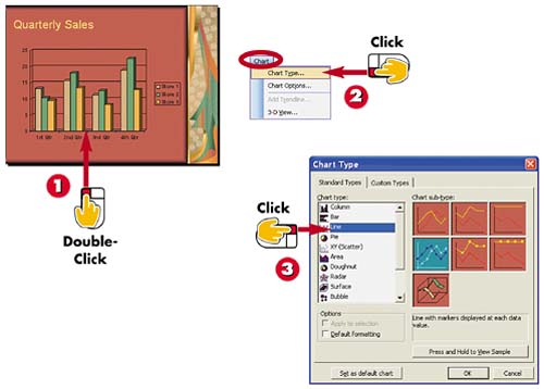

Double-click the chart.

Open the Chart menu and choose Chart Type.

The Chart Type dialog box opens. Click a chart type.
INTRODUCTION
By default, PowerPoint creates a column chart when you use the charting feature. You can, however, change the chart to another chart type, such as a pie chart or a line chart.
TIP
Which Chart Type Is Best?
The chart type you use depends on how you want to present the data. Use column, bar, and line charts to illustrate changes in values over time. Use pie charts to give percentage data a visual appearance.
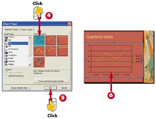

Click a chart sub-type.

Click OK.

PowerPoint changes the chart type on the slide.
TIPChart Shortcut When you double-click a chart, several chart-related buttons are added to the Standard toolbar; click the down arrow next to the Chart Type button to display a list of chart types, and then click the one you want to apply. |
TIPExiting Chart Edit Mode When you double-click a chart, PowerPoint switches you to Chart Edit mode and displays the chart along with the datasheet. To return to your slide, click anywhere outside the chart or datasheet. |
TIPHiding the Datasheet In Chart Edit mode, click the View Datasheet button on the Standard toolbar to hide or display the datasheet. |


