Formatting the Data Series
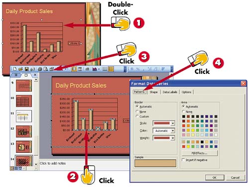

Double-click the chart.

Click the data series you want to change.

Click the Format Data Series button.

The Format Data Series dialog box opens. Click the Patterns tab.
INTRODUCTION
Another way in which you can customize your chart is to choose a different fill color for your chart data, also called the data series. For example, you might choose colors to go with your slide's color scheme or to make your data more legible to your audience.
TIP
Quick Color
You can also click the Fill Color button on the Formatting toolbar and select a color from the pop-up color palette to change the fill color of your data series.
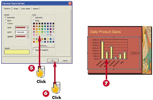

Click a fill color.

Click OK.

PowerPoint applies the new color to the data series.
TIPBorder Control You can use the Border options in the Format Data Series dialog box's Patterns tab to change the outline that surrounds the data series. You'll find options for setting a line color as well as line thickness. |
TIPFormatting Legend Colors You can format the colors used in your chart's legend using the Format Legend dialog box, which you open by double-clicking the legend. To apply a color to the legend's background, choose a color in the Patterns tab. To change the font, click the Font tab and select another. |


