Choosing Among Word's Extensive Selection of Charts
By default, Graph displays your information in its default chart format: a 3D column chart using standard colors against a gray background with gridlines and a legend. Graph's default chart makes sense in many situations, but you'll often want something else.
Graph gives you plenty of choices. For openers, you can choose from 14 different chart types, most with five to eight variations or subtypes. From there, you can modify every feature of the chart?titles, legends, grids, data series, size, placement, and wrapping?and you can use Word's powerful fill and color capabilities to include gradients, textures, and patterns.
Your first decision, however, must be to determine what kind of chart you want. Microsoft Graph chart types include
Column charts? Each data point corresponds to a vertical line; each series of data uses vertical lines of the same color.
Bar charts? This is probably the most popular type of chart. It shows data as a series of horizontal bars. Bar charts can be used effectively with three or four series of data over a period of time (such as monthly sales figures from four different regions).
Line charts? Line charts are almost always used to display changes in data over time. You can display the changes over time in one data series, or many. Several styles of line charts are available, including stacked and unstacked options. Stacked charts show the lines above one another; unstacked charts do not.
NOTE
A data point is a single piece of data, such as the sales associated with one product in one month. A data series is a set of related data, such as the sales associated with one product in each month of the current year.
Pie charts? This type of chart is particularly useful for showing the relationship or degree of relationship between numeric values in separate groups of data.
Scatter charts? These help you identify patterns or trends and determine whether variables depend on or affect one another.
Area charts? This chart shows data as areas filled with different colors or patterns. Area charts are best suited for charts that don't have large numbers of data points and that use several data series. They look particularly dramatic in 3D form.
Doughnut charts? This is basically a pie chart but with more flexibility?and a hole in the middle. Each ring of the doughnut chart represents a data series. Use this chart to compare the parts to the whole in one or more data categories.
Radar charts? This chart resembles a cobweb and shows changes in data or data frequency relative to a center point. Lines connect all the values in the same data series.
3D surface charts? This chart resembles a rubber sheet stretched over a 3D column chart. A 3D surface chart can help show relationships among large amounts of data. Colors or patterns delineate areas that share the same value. Use this chart for finding the best combinations between two sets of data.
Bubble charts? These are similar to an XY (scatter) chart. The bubble size is a third value type that is relative to the x-axis and y-axis data. Use this for depicting the relationship between two kinds of related data.
Word also provides three variants: cylinder charts, pyramid charts, and cone charts. You can use these just as you use bar or column charts, except that the data points are displayed as cylinders, pyramids, or cones.
NOTE
Not every set of data can be used with every chart type. Worse, in some cases, you can chart the data, but the results are misleading or incomprehensible. After you create a chart, read it carefully to make sure that it communicates what you have in mind.
If you have data that is continuous, such as time, or concentrated data, consider using a scatter or XY plot. If your data is categorical, such as the number of red cars versus the number of blue cars, you can use a larger variety of charts such as the bar chart and the column chart.
The main difference between the types of data is that if you have measurements on a continuous scale, the intervals between your measurements do not have to be equal and may even be impossible to make equal. The scatter or XY plot takes the variable intervals into account. The bar chart and column charts will plot the data using equal intervals.
Changing Chart Type with a Single Click
To select a different chart type from the one that Graph has used to build your chart, first make sure that Graph is open. The easiest way to tell which mode you're in (Word or Graph) is to check which toolbars you have active. If Word's menus and toolbars are active instead of Graph's, simply double-click anywhere in your chart to activate Graph.
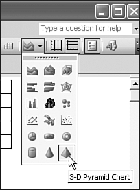
When in Graph, click on the down arrow to the right of the Chart Type button on the Standard toolbar. Next, choose one of the chart types that appear (see Figure 15.3). Word replaces your chart with its default version of the chart type you selected.
Figure 15.3. Choosing a new chart type from the Standard toolbar.
Previewing and Selecting Chart Types
Choosing a chart with the Chart Type toolbar button is quick?but what if you aren't satisfied with the chart it places in your document? Change it, with Word's extensive tools for selecting and adjusting chart types. To preview and choose a different chart, follow these steps:
Either choose Chart Type from the Chart menu, or (with Microsoft Graph open) right-click in a blank part of the chart area and choose Chart Type from the shortcut menu that appears. The Chart Type dialog box appears (see Figure 15.4).
Figure 15.4. Changing the type of standard chart you use.
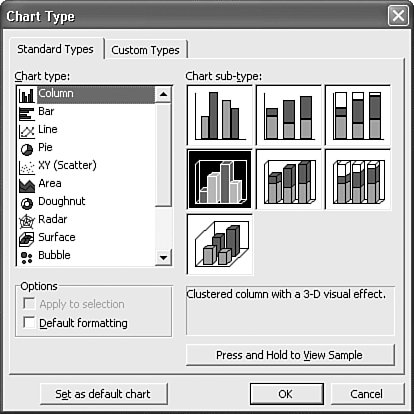
From the Standard Types tab of the Chart Type dialog box, click any of the Chart Types in the left column to see the corresponding Chart Sub-Types on the right. Use the scroll button to see additional selections. Select the desired subtype.
To see how your data looks using the chart type you've selected, click the Press and Hold to View Sample button.
When you're finished, click OK.
Changing Your Default Chart Type
As you've learned, Word's default chart type is a 3D bar chart. However, you might prefer to use a different standard or custom chart type as your default for all charts from now on.
CAUTION
Some users find that Microsoft Graph's 3D effect can distort their data, or that its charts do not reproduce well on low-end printers. In addition, most technical users avoid 3D charts if they're based on fewer than three sets of data.
To choose a different default chart, right-click on your chart and choose Chart Type from the shortcut menu. In the Standard Types tab of the Chart Type dialog box, select the chart type and subtype you want as your new default. Click the Set as Default Chart button near the bottom of the dialog box, and click OK.
Now every time you create a chart, Graph uses your new default.
Choosing from Word's Library of Custom Charts
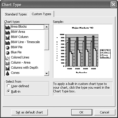
In addition to Word's standard charts, you can choose from 20 built-in custom charts. With these custom charts, Word provides not only a chart type (such as an area or pie chart), but also a set of consistent formatting. If you find one you like, using a built-in custom chart saves you the time and effort of formatting your charts one element at a time.
The Chart Types dialog box contains two tabs: the Standard Types tab you've already used, and a tab labeled Custom Types. To choose a custom chart from within Microsoft Graph, bring up the Chart Types dialog box by right-clicking on a chart and choosing Chart Type from the shortcut menu. Click the Custom Types tab, shown in Figure 15.5. Select the chart type you want. In the Sample box, Word displays a preview of how your data will appear if you choose this chart. Finally, click OK.
Figure 15.5. Word provides a broad range of custom chart types to complete the standard types discussed earlier.
 To create your own user-defined chart, see "Creating and Using Custom Chart Types," p. 535.


