Creating a Chart from Scratch
You don't have to have an existing table in your document to build a chart. You don't even need a preexisting data source. You can open Graph by using a set of dummy (fake) data that Word generates and then replace that data with your real data.
To do so, place your insertion point where you want the chart to appear. Then choose Insert, Picture, Chart. Word's default chart uses dummy values to create a two-series 3D column chart.
Working in the Datasheet Window
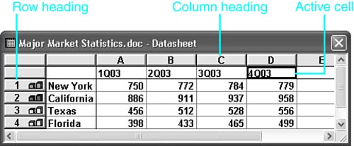
Alongside the chart is a datasheet window containing the dummy data, as shown in Figure 15.19. The datasheet looks much like a basic spreadsheet, except that you can enter only numbers and letters in it?it cannot handle formulas. The only purpose of the datasheet is to control the data that creates a chart in Microsoft Graph.
Figure 15.19. A datasheet accompanying a Microsoft Graph chart.
When you first insert a chart, the datasheet appears in a separate window near the chart. You can toggle the datasheet on or off by clicking the Datasheet button on Microsoft Graph's Standard toolbar.
If you create your chart from data in a Word document, that data appears in your datasheet when you open it. In this example, where we're creating the chart from scratch, the datasheet shows the dummy placeholder data. To change a value, click in its cell and enter the new value. When you change a value in the datasheet, the chart reflects the change immediately.
CAUTION
Remember that changes you make in the datasheet are not automatically reflected in the table or other data source from which you may have built the chart. To link the values in your document to the contents of your chart automatically, see "Establishing an OLE Link Between Word and Graph," later in this chapter.
Notice that each row of the datasheet also contains a data series graphic. This chart icon shows the color and pattern of the corresponding data series as it now appears in the chart.
If you've ever worked in a spreadsheet program such as Excel, you'll be comfortable working in the datasheet. Here are some brief pointers on datasheet editing:
To clear any section of the datasheet, select an area by clicking and dragging over it, and then press Delete.
You can quickly select the entire sheet by clicking the unmarked button at the upper-left corner of the columns and rows.
To overwrite any existing data, just click the cell and input your new value or label.
To edit existing data without removing and retyping it, double-click in the cell, or select the cell and press F2.
After entering any new values or labels, you must confirm them by pressing Enter, Tab, or any arrow key, or by clicking another cell, thereby moving out of the present cell.
Graph reserves the first column and row for data series labels (except in XY [scatter] and bubble charts, in which the first row or column contains values). No matter how far you scroll to the right, the first column remains visible; no matter how far you scroll down, the first row remains visible. This way, you can always see your headings.
If your label or data is too wide to fit in the width of the column, you can adjust the column by clicking and dragging the line on the right between the column headings. When your pointer is positioned correctly, it changes into a double-headed arrow. When a column is too narrow to properly display a value, Graph shows a series of symbols (for example, "#####") until the column is widened. (Datasheets do not support multiple-line labels.)
You can exclude a data series from the chart without erasing it by double-clicking the corresponding row or column heading. The row or column turns a light gray to indicate that it is inactive. To activate it again, double-click it.
If you need a hard copy of your datasheet, see "How to Print a Copy of Your Datasheet," in the "Troubleshooting" section of this chapter. |
Moving Data in the Datasheet
Datasheet contents can be cut and pasted like most other elements in Word. To highlight a cell on the datasheet, click it once. From there, Cut, Copy, and Paste work as in Word.
You can also drag and drop your cells to replace one value with another. To drag and drop a cell, position your pointer on the black border around a selected cell and then click and drag your cell to a new location. Release the mouse button. If the new location already contains a value, Graph asks you to confirm that you want to replace it.
CAUTION
If you find that the drag-and-drop feature is not working, it may have been disabled. With Graph open, choose Tools, Options, and click the Datasheet Options tab. Make sure that the Cell Drag-and-Drop check box is checked.
Formatting Data in the Datasheet
Graph enables you to apply formats in your datasheet. Most of these formats?including font format, cell alignments, and column width?are available simply to help make your datasheet more readable. They are not reflected in either your chart or your Word document. You can access these by choosing Format, Font or Format, Column Width, or by clicking buttons on Graph's Formatting toolbar.
However, there is one set of formatting options that is also reflected in your chart when set in your datasheet: number formats. You have two ways to specify how numbers are formatted in your charts. The quickest way is to use the five number-related toolbar buttons on Graph's Formatting toolbar:
Currency Style?
 This button adds a leading currency symbol. In the U.S., this means that the figure 1234 is shown as $1,234.00.
Percent Style?
 This button displays the value times 100, followed by a percent sign. To depict 50%, the value would need to be 0.5.
Comma Style?
 This button adds a thousands separator, a decimal separator, and decimals to two places. If applied to the value 1234, the number displays as 1,234.00.
Increase Decimals?
 This button is used with the previous styles. Each time you click this button, one additional decimal place is shown in your chart.
Decrease Decimals?
 This button is used with the previous styles. Each time you click this button, one fewer decimal place is shown in your chart.
For more complex number formatting, right-click on a number in an individual cell and choose Number from the shortcut menu. This opens the Format Number dialog box (see Figure 15.20).
Figure 15.20. Using the Format Number dialog box to control the formatting of numbers in a datasheet.
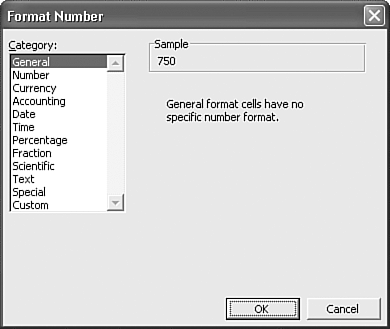
Here, you can choose from a dozen format categories, including Currency, Accounting, Date, Time, Percentage, and Scientific. In each category are numerous subcategories detailing different options involving negative numbers and other choices. You can also use a Custom category to construct your own formatting option. Click Custom in the Category scroll box; then enter your choice in the Type text box.


