Using Error Bars
Error bars show degrees of uncertainty relative to each data marker in a series. They're often used in engineering applications and also are common in polling and market research, where they're used to visually represent the potential error in a survey. (If you hear that a poll is accurate to within plus or minus 3%, you can represent that statistical statement with error bars.)
Error bars display as small T-shaped lines, upright to show error in the positive range and inverted to show error in the negative range. Error bars can be added to data series in area, bar, column, line, XY (scatter), and bubble charts. To add error bars to your chart, follow these steps:
Click on a data marker to select the data series to which you want to add error bars.
Choose Format, Data Series.
In the Format Data Series dialog box, click the Y Error Bars tab shown in Figure 15.24. (If you are working with XY [scatter] and bubble charts, your dialog box will also have an X Error Bar tab.)
Figure 15.24. Setting error bars in the Format Data Series dialog box.
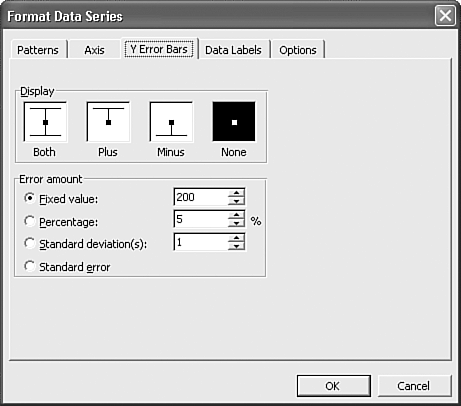
In the Display section, select a positive/negative range for the margin of error. You can choose from these options: Both, Plus, Minus, or None.
In the Error Amount section, choose from Fixed Value, Percentage, Standard Deviation(s), or Standard Error. You can enter values for all but Standard Error.
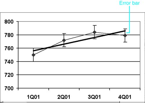
Click OK when you've completed your choices. The error bars appear in your chart, as shown in Figure 15.25.
Figure 15.25. Error bars depict the potential error amounts relative to each data marker.