Displayable
Displayable is the parent class of Screen and Canvas, which provide the foundations of each application's user interface. A Displayable can have a number of Commands, which are visual objects used to initiate some action in the application. A Command can be implemented in a variety of ways, including as a button or menu item. A Command has a label, a type, and a priority. The label is a string used to distinguish the Command on the user interface. The command type provides the MIDP implementation a hint as to how to treat this command. Command types are BACK, CANCEL, EXIT, HELP, ITEM, OK, SCREEN, and STOP. By giving a command a CANCEL type, for example, the developer can let the MIDP implementation know that the command represents the user indicating that they do not want to accept the information currently presented on the display. Note that for command types other than SCREEN, the MIDP implementation can override the label with a more appropriate label for the device.
The Command can also be given a priority, which provides another hint to the MIDP implementation, this time with regard to the order with which this command should be displayed in relation to other commands on the same display. A lower number indicates a higher priority.
For example, to create a new command that represents an action to exit the application, we would write the following:
Command exitCommand = new Command("Exit", Command.EXIT, 10);
As an application style, we have indicated that the exit button should appear last in the display's commands, and so we have assigned it a lower priority.
Once an application has created its command objects, an object that implements the interface CommandListener is assigned to listen for them to be activated. This is done with the setCommandListener method, invoked on an object whose class is a subclass of Displayable. The CommandListener interface specifies one method, commandAction, which is passed the Command being activated, and the Displayable object to which it belongs.
The difference between a Screen and a Canvas is that a Screen is used as the basis for building a typical form-based user interface, while a Canvas is used for drawing images, lines, and circles. In this chapter, we will mainly focus on user interfaces built with Screens.
There are four types of Screen: Alert, Form, List, and TextBox. Any one of them can have added Command objects, as well as be given a title. In the following code examples, we will use a Form to start off each example, so let's have a look at the Form first.
Form
A Form is a special type of Screen, in that it can accept Items. An Item is a simple user interface control, several of which can appear on the one Form. Subclasses of Item are multiple- or single-selection buttons, date and time selection controls, a gauge to show a value in a range, an image control, a string control, and a text entry control.
To create an empty form:
Form mainForm = new Form("BaseUIMIDlet");
Then, to create an exit command so that we can exit our MIDlet:
Command exitCommand = new Command("Exit", Command.EXIT, 10);
Because an application can have many Displayable objects (that is, many instances of Forms, Alerts, Lists, TextBoxes, and Canvases), and because only one Displayable can occupy the device's display at one time, we need a way to specify which Displayable should be visible. This is done with the Display class. With a Display object, we can find out which Displayable is currently visible, and we can set a Displayable to become visible. Each MIDlet has one Display. To obtain a reference to it, we use the static method getDisplay on the Display class, passing it a reference to the MIDlet object.
So, for our example, we'll need a Display object reference:
Display display = null;
In the MIDlet's constructor, we add the exit command and set the MIDlet to be the command listener:
mainForm.addCommand(exitCommand);
mainForm.setCommandListener(this);
In the startApp method, we obtain a reference to the MIDlet's display, and set the current display to our newly created form:
display = Display.getDisplay(this);
display.setCurrent(mainForm);
Because we have set the MIDlet to be the command listener for our exit command, we need to implement the commandAction method and to take some appropriate action when the exit command event occurs. For our simple example:
public void commandAction(Command c, Displayable d) {
  if (c == exitCommand) {
    destroyApp(false);
    notifyDestroyed();
  }
}
The following code shows how we put all this together. Because we would like all our examples to have the same basic behavior, the BaseUIMIDlet class will also provide the base class for all our user interface examples.
package com.javaonpdas.ui;

import javax.microedition.midlet.*;
import javax.microedition.lcdui.*;

public class BaseUIMIDlet extends MIDlet
  implements CommandListener {

  protected Form mainForm = new Form("BaseUIMIDlet");
  protected Command exitCommand = new Command("Exit",
    Command.EXIT, 10);
  protected Display display = null;
  protected static final String[] MOVIES = {"Gladiator",
                                            "The Patriot",
                                            "A Few Good Men"};
  protected Command okCommand = new Command("OK",
    Command.SCREEN, 1);
  protected Command backCommand = new Command("Back",
    Command.SCREEN, 2);

  public BaseUIMIDlet() {
    mainForm.addCommand(exitCommand);
    mainForm.setCommandListener(this);
  }

  public void startApp() {
    display = Display.getDisplay(this);
    display.setCurrent(mainForm);
  }

  public void pauseApp() {
  }

  public void destroyApp(boolean unconditional) {
  }

  public void commandAction(Command c, Displayable d) {
    if (c == exitCommand) {
      destroyApp(false);
      notifyDestroyed();
    }
  }
}
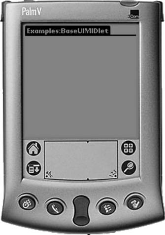
Figure 5.2 shows how the Form looks after starting up.
Figure 5.2. The startup screen of BaseUIMIDlet
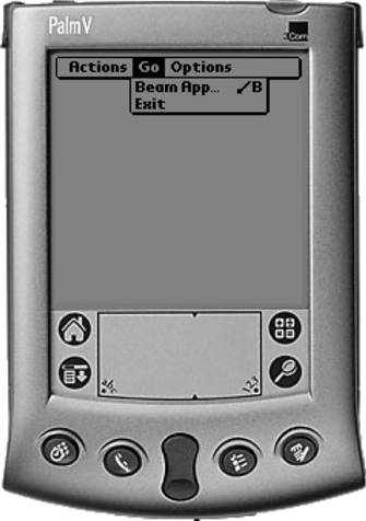
In this example, as shown in Figure 5.3, the exit command has been implemented not as a button on the screen, but as a menu item under the Go menu.
Figure 5.3. BaseUIMIDlet's exit command as a menu item
If we had specified the command type of the exit command to be SCREEN, it would have appeared as an exit button on the screen, as in Figure 5.4.
Figure 5.4. BaseUIMIDlet's exit command as a button on the screen

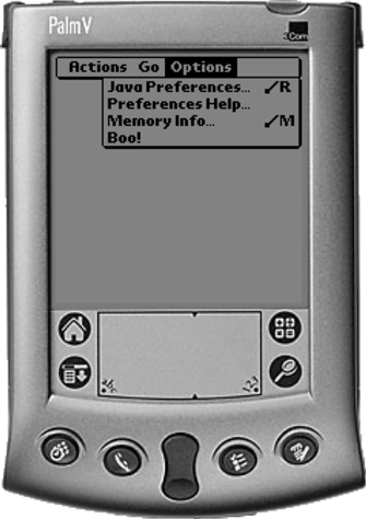
Although the MIDP implementation can override the label of a command, the Palm OS implementation tends not to do so. If we specified that the label of the exit command should be "Boo!" the label remains "Boo!". If we change the command type to HELP, the label remains "Boo!", but it is moved to the Options menu, as shown in Figure 5.5.
Figure 5.5. Changing the type to Command.HELP
As we discovered previously, the MIDP implementation determines how Command objects are rendered, according to the device's capabilities. On a Palm device using MIDP for Palm, Command objects with type SCREEN are rendered as buttons along the bottom of the screen. If there are too many Commands, or their labels make the buttons too large to fit along the bottom of the screen, the remaining Commands are rendered as menu items on the Actions menu.
In the following example, we will create six Commands, all of command type SCREEN, with equal priority, and add them to the form. Note that we are subclassing BaseUIMIDlet, as we will do for all our examples, so that we get the same fundamental behavior (and save some retyping work).
package com.javaonpdas.ui;

import javax.microedition.lcdui.*;

public class CommandMIDlet extends BaseUIMIDlet {

  private Command command1Command =
    new Command("1", Command.SCREEN, 1);
  private Command command2Command =
    new Command("2", Command.SCREEN, 1);
  private Command command3Command =
    new Command("3", Command.SCREEN, 1);
  private Command command4Command =
    new Command("4", Command.SCREEN, 1);
  private Command command5Command =
    new Command("5", Command.SCREEN, 1);
  private Command command6Command =
    new Command("6", Command.SCREEN, 1);
  public CommandMIDlet() {
    super();
    mainForm.setTitle("CommandMIDlet");
    mainForm.addCommand(command1Command);
    mainForm.addCommand(command2Command);
    mainForm.addCommand(command3Command);
    mainForm.addCommand(command4Command);
    mainForm.addCommand(command5Command);
    mainForm.addCommand(command6Command);
  }
}
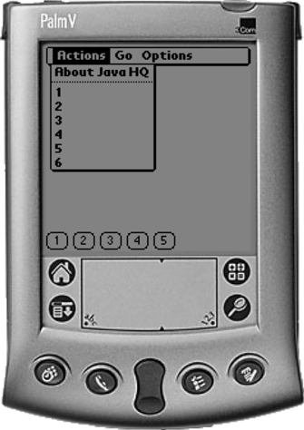
Figure 5.6 shows how the Commands have been rendered. Note that although the labels are quite short, only five of the six commands have been rendered on the screen as buttons.
Figure 5.6. Rendering commands

To see the full set of six commands, we need to go to the Actions menu, as seen in Figure 5.7.
Figure 5.7. The full set of commands
Another type of Screen is the Alert. Because we will use Alerts to display information in subsequent sections, let's have a look at Alerts now.
Alert
An Alert is a screen that displays text and optionally an image. Typically, an Alert is used to display some information for the user or to indicate that some urgent action needs to be taken. An Alert can time out automatically, or be displayed until the user acknowledges it.
To create an alert and set its time-out (to five seconds, for example), the following code is used:
Alert alert = new Alert("Alert");
alert.setTimeout(5000);
alert.setString("This is an alert that is displayed for 5 seconds");
To display the alert, and go back to the main form when the alert times out, we can use the setCurrent method that takes an Alert and Displayable as parameters.
display.setCurrent(alert, mainForm);
This simple alert is rendered on a Palm device as shown in Figure 5.8.
Figure 5.8. Rendering an alert
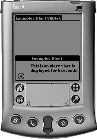
The numbers displayed in the circle in the lower left corner of the Alert indicate the number of seconds remaining until the Alert will time-out.
There are two ways that the alert will not be automatically acknowledged. The first is if the alert's string is too large to display on the screen. In this case, regardless of the alert's time-out value, the alert will stay on the screen until the user acknowledges it.
Such an alert is shown in Figure 5.9.
Figure 5.9. An alert with long text
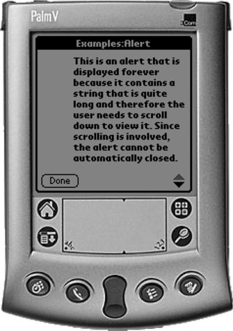
Note that the alert's time-out value is ignored.
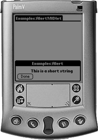
There is another way to display the alert so that it is manually acknowledged, using the time-out value FOREVER, as in the following code fragment:
Alert alert = new Alert("Alert");
alert.setTimeout(Alert.FOREVER);
alert.setString("This is a short string");
display.setCurrent(alert, mainForm);
For this alert, the MIDP implementation renders a Done button, as shown in Figure 5.10.
Figure 5.10. An alert with short text
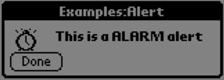
An Alert can also have an alert type, which indicates the nature of the alert. The choices are CONFIRMATION (Figure 5.11), WARNING (Figure 5.12), INFO (Figure 5.13), ERROR (Figure 5.14), and ALARM (Figure 5.15). The alert type effects the icon displayed in the Alert. The screen portion shots in Figures 5.11 through 5.15 show how these are rendered on a Palm device.
Figure 5.11. A confirmation alert
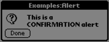
Figure 5.12. A warning alert
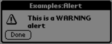
Figure 5.13. An information alert
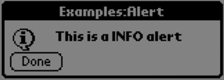
Figure 5.14. An error alert
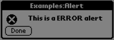
Figure 5.15. An alarm alert
The AlertType can also be used to play a sound to accompany the alert. The sound is limited to the capabilities of the device. To play the WARNING sound:
AlertType.WARNING.playSound(display);
An Alert is a useful way to display a small amount of information to the user, and we will use them in the following examples to build on our knowledge of Forms.
To create more sophisticated user interfaces, we have the ability to add objects of class Item to the Form. In the following sections, we will look at each Item available. Note that Items can only appear on Forms.
ChoiceGroup
A ChoiceGroup is used for obtaining a single selection or multiple selections from a group of choices. The MIDP implementation determines how the choice group is rendered. On a Palm device, single selection choice groups are rendered as drop down lists, while multiple selection choice groups are rendered as check boxes.
A single selection choice group is created like this:
protected static final String[] MEDIA = {"DVD", "VHS"};
protected Command choiceCommand =
  new Command("Choice", Command.SCREEN, 1);
For this example, we have chosen the constructor that allows the choice labels to be specified as an array of strings. We have chosen to not specify images to accompany the choices, indicated by setting the last parameter of the constructor to null. Note that there is also the IMPLICIT choice type. The only difference between EXCLUSIVE and IMPLICIT is that it is possible to register a CommandListener object for the IMPLICIT type, and the CommandListener is notified whenever the selection changes. There is no notification for the EXCLUSIVE type.
Then we can add the choice group to a form:
Form choiceForm = new Form("Movie Selection");
choiceForm.append(singleChoice);
In the command listener for the form and to obtain the selection when the user indicates that they are finished use the following:
int i = singleChoice.getSelectedIndex();
String mediaSelected = singleChoice.getString(i);
For choices where multiple selections are valid, the MULTIPLE choice group type is used:
ChoiceGroup multipleChoice =
  new ChoiceGroup("Movies", ChoiceGroup.MULTIPLE, MOVIES, null);
To obtain the selections, an array of Boolean flags is used by the getSelectedFlags method:
boolean[] selections = new boolean[multipleChoice.size()];
multipleChoice.getSelectedFlags(selections);
The Boolean flag corresponding to the choice is set to true if the user selected that choice. For example, to build up a string of the user's selections, we could use the following code fragment:
String movieSelected = new String();
boolean[] selections = new boolean[multipleChoice.size()];
multipleChoice.getSelectedFlags(selections);
for (int j=0; j<selections.length; j++)
  if (selections[j])
    movieSelected += multipleChoice.getString(j) +
      " on " + mediaSelected + "\n";
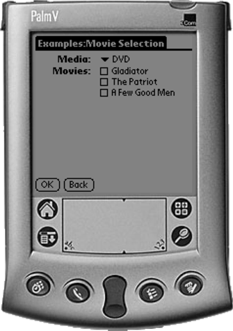
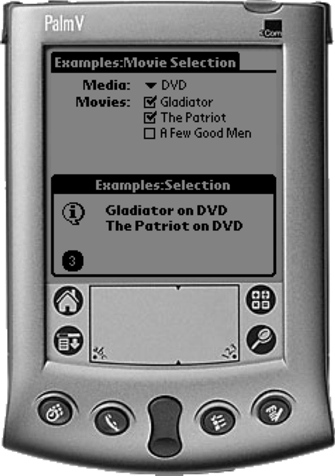
Putting all this together, the MIDlet ChoiceGroupMIDlet displays a form with a single selection choice group and a multiple selection choice group. When the user presses the OK button, an alert is displayed with the user's selections from the two groups.
package com.javaonpdas.ui;

import javax.microedition.lcdui.*;

public class ChoiceGroupMIDlet extends BaseUIMIDlet {

  protected static final String[] MEDIA = {"DVD", "VHS"};
  protected Command choiceCommand =
    new Command("Choice", Command.SCREEN, 1);

  public ChoiceGroupMIDlet() {
    super();
    mainForm.setTitle("ChoiceGroupMIDlet");
    mainForm.addCommand(choiceCommand);
  }
  public void commandAction(Command c, Displayable d) {
    if (c == choiceCommand) {
      Form choiceForm = new Form("Movie Selection");
      ChoiceGroup singleChoice = new ChoiceGroup("Media",
        ChoiceGroup.EXCLUSIVE, MEDIA, null);
      ChoiceGroup multipleChoice = new ChoiceGroup("Movies",
        ChoiceGroup.MULTIPLE, MOVIES, null);
      choiceForm.append(singleChoice);
      choiceForm.append(multipleChoice);
      choiceForm.addCommand(okCommand);
      choiceForm.addCommand(backCommand);
      choiceForm.addCommand(exitCommand);
      choiceForm.setCommandListener(this);
      display.setCurrent(choiceForm);
    }
    else if (c == okCommand) {
      Form choiceForm = (Form)d;
      ChoiceGroup singleChoice =
        (ChoiceGroup)(choiceForm.get(0));
      ChoiceGroup multipleChoice =
        (ChoiceGroup)(choiceForm.get(1));
      // get the media selection
      int i = singleChoice.getSelectedIndex();
      String mediaSelected = singleChoice.getString(i);
      // get the movie selection
      String movieSelected = new String();
      boolean[] selections = new boolean[multipleChoice.size()];
      multipleChoice.getSelectedFlags(selections);
      for (int j=0; j<selections.length; j++)
        if (selections[j])
          movieSelected += multipleChoice.getString(j) +
          " on " + mediaSelected + "\n";
      // display the result
      Alert alert = new Alert("Selection");
      alert.setString(movieSelected);
      alert.setTimeout(5000);
      alert.setType(AlertType.INFO);
      display.setCurrent(alert, mainForm);
    }
    else if (c == backCommand) {
      display.setCurrent(mainForm);
    }
    else {
      super.commandAction(c, d);
    }
  }
}
The choice group form is shown in Figure 5.16.
Figure 5.16. ChoiceGroupMIDlet
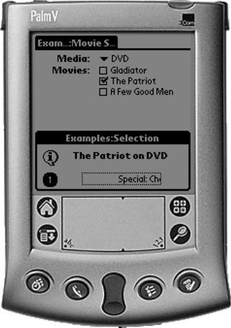
When the OK button is pressed, the MIDlet displays the alert with the selections (Figure 5.17).
Figure 5.17. Selections from the choice group
DateField
The DateField class provides a way for dates and times to be displayed and entered. The following code fragment shows how to display a DateField.
DateField startDateField =
  new DateField("Loan Date", DateField.DATE_TIME);
startDateField.setDate(new Date());
mainForm.append(startDateField);
The date and time displayed on the field is set with a Date object. In the example above, the current date and time is used. If we wanted to set the date field to, for example, tomorrow night at 10:00 P.M., we could do the following:
DateField returnDateField =
  new DateField("Return Date", DateField.DATE_TIME);
Calendar calendar = Calendar.getInstance();
calendar.setTime(tomorrow());
calendar.set(Calendar.HOUR, 10);
calendar.set(Calendar.MINUTE, 0);
calendar.set(Calendar.AM_PM, Calendar.PM);
returnDateField.setDate(calendar.getTime());
mainForm.append(returnDateField);
Because we don't have date calculations in MIDP, we need to work out the date for the following day like this:
private Date tomorrow() {
  Date today = new Date();
  Date tomorrow = new Date(today.getTime()+(24*60*60*1000));
  return tomorrow;
}
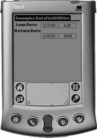
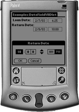
Figure 5.18 shows two DateFields on a Form.
Figure 5.18. DateFieldMIDlet
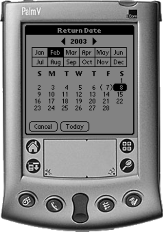
When the date field is selected, a date editing dialog is displayed, as shown in Figure 5.19. Note that the standard Palm OS date editor has been used by the MIDP implementation.
Figure 5.19. Selecting a date
When the DateField's time field is selected, the standard Palm time editor is displayed, as shown in Figure 5.20.
Figure 5.20. Selecting a time
Gauge
The Gauge class is used to display (and optionally edit) a value within a range. The following code fragment shows how to create and display a gauge:
Gauge gauge = new Gauge("Value", true, 20, 5);
gaugeForm.append(gauge);
The first parameter of the Gauge constructor specifies the gauge's label. The second is a Boolean to indicate whether the gauge should be editable. The third parameter is the maximum value of the range of values for the gauge, whereas the last parameter is the initial value.
Figure 5.21 shows how the gauge looks on the Palm device.
Figure 5.21. GaugeMIDlet
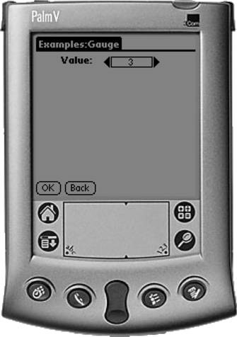
Clicking on the arrows at each end of the field will increase or decrease the value.
To retrieve the value set by the user, we use the getValue method on the gauge object.
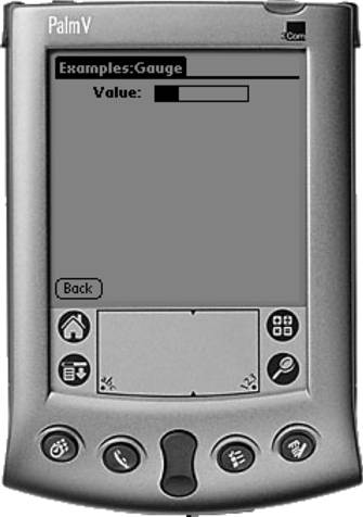
If the gauge is not editable (for example, if the flag was set to false in the constructor), the gauge is rendered like a bar graph, as Figure 5.22 shows.
Figure 5.22. A read-only gauge
StringItem
A StringItem is an Item for displaying static text on a Form. It consists of a label and the text itself. The text of a StringItem cannot be edited by the user.
The following code fragment shows how to create a StringItem and add it to a Form:
StringItem addressLine1 =
  new StringItem("Address Line 1", "10 Main Street");
stringItemForm.append(addressLine1);
The following code shows how a StringItem could be used in an application:
package com.javaonpdas.ui;

import javax.microedition.lcdui.*;

public class StringItemMIDlet extends BaseUIMIDlet {

  private Command stringItemCommand =
    new Command("StringItem", Command.SCREEN, 1);

  public StringItemMIDlet() {
    super();
    mainForm.setTitle("StringItemMIDlet");
    mainForm.addCommand(stringItemCommand);
  }

  public void commandAction(Command c, Displayable d) {
    if (c == stringItemCommand) {
      Form stringItemForm = new Form("Your address details");
      StringItem addressLine1 =
        new StringItem("Address Line 1", "10 Main Street");
      StringItem addressLine2 =
        new StringItem("Address Line 2", "Townsville");
      StringItem postcode = new StringItem("Postcode", "7423");
      stringItemForm.append(addressLine1);
      stringItemForm.append(addressLine2);
      stringItemForm.append(postcode);
      stringItemForm.addCommand(backCommand);
      stringItemForm.addCommand(exitCommand);
      stringItemForm.setCommandListener(this);
      display.setCurrent(stringItemForm);
    }
    else if (c == backCommand) {
      display.setCurrent(mainForm);
    }
    else {
      super.commandAction(c, d);
    }
  }
}
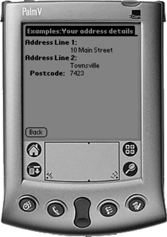
Figure 5.23 shows how the StringItemForm is displayed.
Figure 5.23. StringItemMIDlet
TextField
A TextField item is similar in appearance to a StringItem, except that a TextField is used for allowing the user to modify or enter text. A TextField can also filter the text that is entered into the field; the filter is called an input constraint.
To create a TextField with the text content initialized, the following constructor is used:
TextField addressLine1 =
  new TextField("Address Line 1", "10 Main Street",
                20, TextField.ANY);
The last parameter of the constructor is where the input constraints can be specified. The available constraints are ANY, EMAILADDR, NUMERIC, PASSWORD, PHONENUMBER, and URL. In each case, only the input indicated by the constraint will be accepted by the field.
When the user has finished modifying or entering the text, the field's text can be retrieved by calling the getString method.
The following code shows how a TextField could be used in an application:
package com.javaonpdas.ui;

import javax.microedition.lcdui.*;

public class TextFieldMIDlet extends BaseUIMIDlet {

  private Command textFieldCommand =
    new Command("TextField", Command.SCREEN, 1);

  public TextFieldMIDlet() {
    super();
    mainForm.setTitle("TextFieldMIDlet");
    mainForm.addCommand(textFieldCommand);
  }

  public void commandAction(Command c, Displayable d) {
    if (c == textFieldCommand) {
      Form textFieldForm = new Form("Confirm your address");
      TextField addressLine1 = new TextField("Address Line 1",
                                             "10 Main Street",
                                             20,
                                             TextField.ANY);
      TextField addressLine2 = new TextField("Address Line 2",
                                             "Townsville",
                                             20,
                                             TextField.ANY);
      TextField postcode = new TextField("Postcode", "7423",
                                         4, TextField.NUMERIC);
      textFieldForm.append(addressLine1);
      textFieldForm.append(addressLine2);
      textFieldForm.append(postcode);
      textFieldForm.addCommand(okCommand);
      textFieldForm.addCommand(backCommand);
      textFieldForm.addCommand(exitCommand);
      textFieldForm.setCommandListener(this);
      display.setCurrent(textFieldForm);
    }
    else if (c == okCommand) {
      Form textFieldForm = (Form)d;
      TextField addressLine1 =
        (TextField)(textFieldForm.get(0));
      TextField addressLine2 =
        (TextField)(textFieldForm.get(1));
      TextField postcode = (TextField)(textFieldForm.get(2));
      // display the result
      Alert alert = new Alert("Address Entered");
      alert.setString("The address is:\n" +
                      addressLine1.getString() + "\n" +
                      addressLine2.getString() + "\n" +
                      postcode.getString());
      alert.setTimeout(5000);
      alert.setType(AlertType.INFO);
      display.setCurrent(alert, mainForm);
    }
    else if (c == backCommand) {
      display.setCurrent(mainForm);
    }
    else {
      super.commandAction(c, d);
    }
  }
}
So far we have looked at two types of Screen: the Alert and the Form. Now we will have a look at the other two types: the List and the TextBox.
List
The List is a type of Screen that enables the user to select single or multiple items in a list. It supports the same Choice interface as the ChoiceGroup item we looked at previously. The List supports the same choice types: IMPLICIT, EXCLUSIVE, and MULTIPLE.
The following code fragment shows the creation of a List, again using the MOVIES static array of strings to set up the choices:
List list = new List("Movies", List.EXCLUSIVE, MOVIES, null);
Just as in the ChoiceGroup, the selection is retrieved from the List using the getSelectedIndex and getString methods:
int i = list.getSelectedIndex();
String movieSelected = list.getString(i);
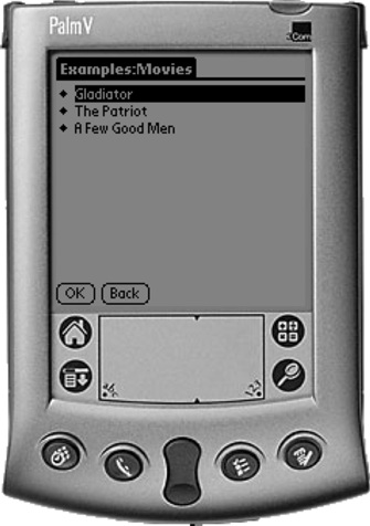
Figure 5.24 shows an EXCLUSIVE List.
Figure 5.24. An exclusive list
A MULTIPLE List is created in a similar fashion, and the selections are retrieved in the same way as multiple selections for a ChoiceGroup.
List list = new List("Movies", List.MULTIPLE, MOVIES, null);

...

String movieSelected = new String();
boolean[] selections = new boolean[list.size()];
list.getSelectedFlags(selections);
for (int i=0; i<selections.length; i++)
    if (selections[i])
        movieSelected += list.getString(i) + "\n";
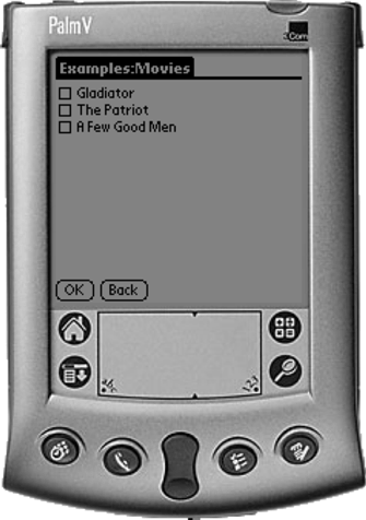
The MULTIPLE List is rendered as a list of check boxes, as shown in Figure 5.25.
Figure 5.25. A multiple selection list
TextBox
The TextBox is a type of Screen that allows free-form text entry. On a Palm device, it is rendered as a standard Memo screen. The TextBox uses the same input constraints concept as the TextField.
To create a TextBox use the following:
TextBox textBox = new TextBox("Movies", "", 20, TextField.ANY);
And to retrieve the string entered:
String movieSelected = textBox.getString();
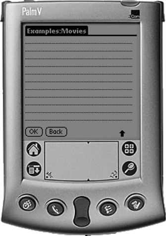
Figure 5.26 shows a TextBox on a Palm device.
Figure 5.26. TextBoxMIDlet
Ticker
One other interesting thing about the Screen subclasses is that they can have a Ticker. A Ticker is like a ticker-tape display, where a string of text is repeatedly scrolled horizontally across the screen.
A Ticker object is created like this:
Ticker ticker = new Ticker("Special: Choose 2 movies for $6...");
The Ticker is displayed on any Screen object, using the setTicker method. The following MIDlet is the same as the ChoiceGroupMIDlet, except that this one has a Ticker on each Screen in the application. Figure 5.27 shows the Ticker on a main form. Figure 5.28 shows a ticker on the choice form we used previously. Figure 5.29 shows a ticker on an alert.
Figure 5.27. A ticker on the main form
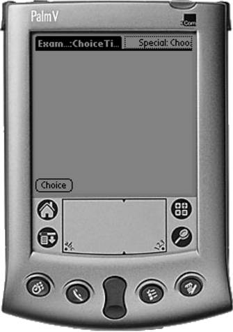
Figure 5.28. Ticker on the choice form
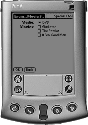
Figure 5.29. Ticker on an alert