7.3 Custom Property Types
The Visual Studio .NET property grid (which, incidentally, is available for use in your own applications as the System.Windows.Forms.PropertyGrid control) is able to deal with a wide range of different property types. It can supply appropriately specialized user interfaces for the types commonly used for control properties, such as Color and Size. But what if your component has a property of some custom type?
Even with custom types, the property grid can display the value of your property. In the absence of other information, it will simple call the ToString method and display the results. However, the property will be grayed out, so users will not be able to edit it. Also, ToString may not produce the desired resultby default, this simply returns the name of the type.
You can enable editing of properties with custom types in two ways. Both involve writing special support classesyou cannot support custom types with attributes alone. You can enable full text-based editing by supplying a custom type converter. You can also provide a graphical user interface for editing the property by writing a custom UI type editor.
7.3.1 Type Converters
A type converter is a class derived from TypeConverter, which is defined in the System.ComponentModel namespace. (Despite the similar name, this class is in no way connected to the System.Convert class.) Its job is to convert between types, usually between a custom type and a string. If a custom type has an associated type converter, Visual Studio .NET will use that to convert properties of that type to strings in the property grid. And if the user modifies the properties in the grid, the type converter will be used to convert the modified strings back to property values. The framework class libraries supply type converters for many widely used types, such as Point and Rectangle. You will usually need to supply converters only for your own custom types.
We tell Visual Studio .NET that a custom type converter is available with the TypeConverter attribute. This attribute can be applied either to the custom type itself or to the property itself, shown respectively in Example 7-6 and Example 7-7. A converter specified for a property will take precedence over one specified for the type. So, although ThreeDPoint is associated with the MyThreeDPointConverter type converter in Example 7-6, the property in Example 7-7 has elected to use the ExpandableObjectConverter type converter instead.
Example 7-6. Associating a type converter with a type
[TypeConverter(typeof(MyThreeDPointConverter))]

public class ThreeDPoint

{

    public ThreeDPoint(int x, int y, int z)

    {

        this.x = x; this.y = y; this.z = z;

    }


    public ThreeDPoint(  )

    {

    }


    public int X { get { return x; } set { x = value; } }

    public int Y { get { return y; } set { y = value; } }

    public int Z { get { return z; } set { z = value; } }

    private int x, y, z;

}
Example 7-7. Associating a type converter with a property
public class HasPoint

{

    [TypeConverter(typeof(ExpandableObjectConverter))]

    public ThreeDPoint P1 { get { return p1; } set { p1 = value; } }

    private ThreeDPoint p1;

}
The type converter itself is just a class derived from TypeConverter. We typically overload four methods. Visual Studio .NET uses two of these to discover which conversions we support. It will call CanConvertTo to discover if we can convert to a particular type and CanConvertFrom to see if we can transform a particular type into the custom type. These are called when a property is displayed in the property grid. In both cases, VS.NET asks about support for conversion to and from strings.
The other two methods we overload are ConvertTo and ConvertFrom. These are called when Visual Studio .NET needs to perform a conversion. ConvertTo will be called (with a target type of string) when the property grid is being displayed. ConvertFrom is called (with a source type of string) when the user edits a property in the grid.
Example 7-8 shows a sample type converter for the three-dimensional point class, shown in Example 7-6. Its CanConvertTo and CanConvertFrom methods support conversions to and from strings.
Example 7-8. A type converter
using System;

using System.ComponentModel;


public class MyThreeDPointConverter : TypeConverter

{

    public override bool CanConvertTo(ITypeDescriptorContext context,

        Type destinationType)

    {

        if (destinationType ==  typeof(string)) return true;

        return base.CanConvertTo(context, destinationType);

    }


    public override bool CanConvertFrom(ITypeDescriptorContext context,

        Type sourceType)

    {

        if (sourceType ==  typeof(string)) return true;

        return base.CanConvertFrom(context, sourceType);

    }


    public override object ConvertTo(ITypeDescriptorContext context,

        System.Globalization.CultureInfo culture, object value,

        Type destinationType)

    {

        if (destinationType = =  typeof(string))

        {

            ThreeDPoint point = (ThreeDPoint) value;

            return string.Format("{0},{1},{2}", point.X, point.Y, point.Z);

        }

        return base.ConvertTo(context, culture, value, destinationType);

    }


    public override object ConvertFrom(ITypeDescriptorContext context,

        System.Globalization.CultureInfo culture, object value)

    {

        if (value.GetType(  ) ==   typeof(string))

        {

            string src = (string) value;

            string[  ] points = src.Split(",");

            if (points.Length != 3)

                throw new ArgumentException("String must be formatted as "x,y,z"",

                  "value");


            return new ThreeDPoint(int.Parse(points[0]),

                int.Parse(points[1]), int.Parse(points[2]));

        }

        return base.ConvertFrom(context, culture, value);

    }


}
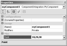
The actual conversions are done in ConvertTo and ConvertFrom. They convert the string to and from a comma-separated list of the three coordinate values. Figure 7-4 shows this type converter in action on a property grid. It displays a component with a single property, Point, of type ThreeDPoint. (The full source code for these types is shown in Example 7-6 and Example 7-7. If you compile this code into a Class Library project, you will then be able to add it to your toolbox using the toolbox context menu's Customize Toolbox item: select the .NET Framework Components tab and then Browse for your component. Alternatively, you can drag your compiled DLL from a Windows Explorer window onto the toolbox.)
Figure 7-4. A type converter in action
|

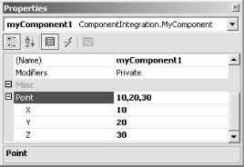
We can go one better than this and provide the same expandable editing that built-in classes such as Size and Point have. If we change the type converter in Example 7-8 so that its base class is ExpandableObjectConverter, the property grid will display an expandable version of the property, as Figure 7-5 shows.
Figure 7-5. An expandable property
Unfortunately, if you try to use this type converter in Visual Studio .NET, you will discover that it has a serious shortcoming. The designer fails to save the edited values in the InitializeComponent method. Every time you reopen the form containing a component that uses this type, the property will have forgotten its value. The reason for this is that Visual Studio .NET does not know how to initialize new instances of our ThreeDPoint class. We must tell it how to do this by adding code serialization support to our type converter.
7.3.1.1 Code serialization
For Visual Studio .NET to persist properties of a custom type in the InitializeComponent method, we must support an extra conversion in our type converter. The CanConvertTo and ConvertTo methods must support conversion to InstanceDescriptor (defined in the System.ComponentModel.Design.Serialization namespace).
The InstanceDescriptor class encapsulates instructions on how to create an instance of a particular type. We can use it in our type converter to tell Visual Studio .NET how to generate code to create a ThreeDPoint object. (We need to supply conversion only to InstanceDescriptor. Converting from an InstanceDescriptor back to our type is not neededVisual Studio .NET just constructs the object according to the instructions in InstanceDescriptor.)
Example 7-9 shows the modified CanConvertTo and ConvertTo methods. When asked to convert to an InstanceDescriptor, the converter builds one, supplying a ConstructorInfo object (from the System.Reflection namespace) to indicate which constructor to use. It also supplies the parameters required by this constructor. With the type converter thus modified, Visual Studio .NET can now generate code for properties of type ThreeDPoint.
Example 7-9. Type converter code serialization support
public override bool CanConvertTo(ITypeDescriptorContext context,

    Type destinationType)

{

    if (destinationType =  = typeof(InstanceDescriptor)) return true;

    if (destinationType =  = typeof(string)) return true;

    return base.CanConvertTo(context, destinationType);

}


public override object ConvertTo(ITypeDescriptorContext context,

    System.Globalization.CultureInfo culture, object value,

    Type destinationType)

{

    if (destinationType =  = typeof(InstanceDescriptor))

    {

        Type[  ] ctorParamTypes = new Type[  ]

            { typeof(int), typeof(int), typeof(int) };

        ConstructorInfo ctor = typeof(ThreeDPoint).GetConstructor(ctorParamTypes);


        ThreeDPoint p = (ThreeDPoint) value;

        object[  ] ctorParams = { p.X, p.Y, p.Z };


        return new InstanceDescriptor(ctor, ctorParams);

    }

    if (destinationType =  = typeof(string))

    {

        ThreeDPoint point = (ThreeDPoint) value;

        return string.Format("{0},{1},{2}", point.X, point.Y, point.Z);

    }

    return base.ConvertTo(context, culture, value, destinationType);

}
Example 7-10 shows some generated code from an InitializeComponent method.
Example 7-10. Code generated based on an InstanceDescriptor
//

// componentWith3D1

//

this.componentWith3D1.Point = new ThreeDPoint(10, 20, 30);
7.3.2 Custom UI Type Editors
Visual Studio .NET will use type converters only for text-based property editing and code serialization. Some built-in types, such as Color or DockStyle, get a specialized user interface in the property grid as well as text support. If you would like to supply a graphical editing interface for your own property types, you can do so by supplying a UI type editor.
|
A UI type editor is similar to a type converterit is a class associated with a custom type via an attribute and used by Visual Studio .NET in the property grid. The attribute for a UI type editor is the Editor attribute, defined in the System.ComponentModel namespace. As with a type converter, you may apply this attribute either to the custom type or to a property itself. If you apply this attribute to a property, the property"s type doesn"t even need to be a custom typeyou can supply a custom editing UI for a built-in type if you want, as Example 7-11 shows.
Example 7-11. A property with a custom UI type editor
[Editor(typeof(ContrastEditor), typeof(UITypeEditor))]

public int Contrast

{

    get { return myContrast; }

    set { myContrast = value; }

}

private int myContrast;
As Example 7-11 shows, the Editor attribute requires you to indicate what sort of editor you are specifying as well as the editor's classit is designed to allow multiple different kinds of editors to be associated with a property or type. In this case, we are specifying UITypeEditor. (In fact, with Visual Studio .NET 2003, custom UI type editors are the only kind of editor supported.) UI type editors must derive from the UITypeEditor class, which is defined in the System.Drawing.Design namespace. (The ContrastEditor is a fictional editor. Two possible implementations are shown later in Example 7-12 and Example 7-13.)
When we write the UI editor class itself, we have a choice as to the kind of user interface we can supply. We can either open a modal dialog or supply a pop-up user interface that will appear in the property grid itself. We indicate this by overriding the GetEditStyle method. This method returns a value from the UITypeEditorEditStyle enumeration, either Modal or DropDown. For either type of user interface, we must also override the EditValue method, which will be called when the user tries to edit the value.
Example 7-12. A dialog custom UI type editor
using System.Drawing.Design;

using System.Windows.Forms;


public class ContrastEditor : UITypeEditor

{

    public override UITypeEditorEditStyle GetEditStyle(

        ITypeDescriptorContext context)

    {

        return UITypeEditorEditStyle.Modal;

    }


    public override object EditValue(ITypeDescriptorContext context,

        IServiceProvider provider, object value)

    {

        DialogResult rc = MessageBox.Show("Maximum contrast?",

            "Contrast", MessageBoxButtons.YesNoCancel);

        if (rc =  = DialogResult.Yes)

            return 100;

        if (rc =  = DialogResult.No)

            return 50;

        return value;

    }

}
Example 7-12 shows a custom UI type editor that displays a simple message box. (Any modal dialog would do.) The value returned from EditValue will be written back to the property. The property grid indicates that a modal editor is available for the property by putting a button with a ... label on the grid when the property is selected, as Figure 7-6 shows. It will call EditValue when the button is clicked.
Figure 7-6. A property with a modal custom UI type editor
If you want to provide a drop-down editor user interface (such as the one supplied for the built-in Color type), the technique is slightly different. You must get Visual Studio .NET to open the window for you, so that it can be placed and sized correctly. The code for doing this is shown in Example 7-13.
Example 7-13. A drop-down custom UI type editor
using System.Drawing.Design;

using System.Windows.Forms;

using System.Windows.Forms.Design;


public class ContrastEditor : UITypeEditor

{

    public override UITypeEditorEditStyle GetEditStyle(

        ITypeDescriptorContext context)

    {

        return UITypeEditorEditStyle.DropDown;

    }


    public override object EditValue(ITypeDescriptorContext context,

        IServiceProvider provider, object value)

    {

        IWindowsFormsEditorService wfes = provider.GetService(

            typeof(IWindowsFormsEditorService)) as

            IWindowsFormsEditorService;

        if (wfes != null)

        {

            TrackBar tb = new TrackBar(  );

            tb.Minimum = 0;

            tb.Maximum = 100;

            tb.Value = (int) value;

            tb.TickFrequency = 10;

            wfes.DropDownControl(tb);

            value = tb.Value;

        }

        return value;

    }

}
This code uses the IServiceProvider passed to EditValue. It asks it for the IWindowsFormsEditorService interface (which is defined in the System.Windows.Forms.Design namespace). This service provides the facility for opening a drop-down editorwe simply call the DropDownControl method on it, and it will open whichever control we pass. It sets the size and location of the control so that it appears directly below the property when the drop-down arrow is clicked, as Figure 7-7 shows. (It will modify the control's width to be the same as the property grid's value column, but it will use whatever height you specify. Since we have not set the height in this example, we are simply getting the TrackBar control's default height.)
Figure 7-7. A drop-down UI type editor in action
|
Custom UI type editors can also add a small graphic to the property grid, which will be displayed in the value field whether the user opens the custom editor or not. Several of the built-in types use this facility. For example, properties of type Color always show a small rectangle of the currently selected color in the grid. To supply a similar graphic of your own, you must override two methods: GetPaintValueSupported and PaintValue.
As Example 7-14 shows, the GetPaintValueSupported method is very simple. This will be called when the property is shown in the property grid and we return true to indicate that we would like to supply a graphic for the property. Visual Studio .NET will then call the PaintValue method, in which we draw the graphical representation of the value. The PaintValueEventArgs object supplies a Graphics object into which we draw the representation and a Bounds rectangle indicating how large the drawing should be.
Example 7-14. Adding a value graphic
// Add these using statements to Example 7-13.

using System.Drawing;

using System.Drawing.Drawing2D;


// Add these methods to the ContrastEditor class from Example 7-13.

//

public override bool GetPaintValueSupported(ITypeDescriptorContext context)

{

    return true;

}


public override void PaintValue(System.Drawing.Design.PaintValueEventArgs e)

{

    Graphics g = e.Graphics;

    int contrast = (int) e.Value;


    int darkValue = ((100-contrast) * 127) / 100;

    int lightValue = 255 - darkValue;

    Color darkColor = Color.FromArgb(darkValue, darkValue, darkValue);

    Color lightColor = Color.FromArgb(lightValue, lightValue, lightValue);


    using (Brush fill = new LinearGradientBrush(

                           e.Bounds, darkColor, lightColor,

                           LinearGradientMode.BackwardDiagonal))

    {

        g.FillRectangle(fill, e.Bounds);

    }

}
|
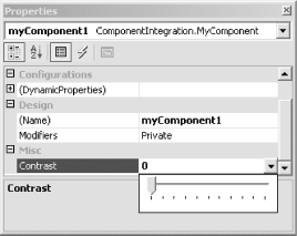
Example 7-14 simply fills the available space with a rectangle painted with a gradient fill. When the property (which in this case is the Contrast property from Example 7-11) is at 100%, the fill will be high-contrast, ranging from black to white, as Figure 7-8 shows. When the contrast is 0%, the fill will be a uniform shade of gray.
Figure 7-8. A property with a custom value graphic


