Using the Button Classes
The following classes fall into the button category:
-
Button
-
RadioButton
-
CheckBox
Each of these classes is used to represent one of the standard types of buttons offered by Windows. In addition, each of these classes inherits its basic behavior from a common base class: the ButtonBase class.
Many of the methods and properties available in the Button, RadioButton, and CheckBox classes are actually inherited from the ButtonBase class. Although you rarely interact with the ButtonBase class directly, the concrete Button, RadioButton, and CheckBox classes depend on the ButtonBase class to provide basic behavior that’s common to all three classes. If you’re new to Windows programming, you might be surprised that the radio button and check box controls are considered buttons, but they do share some characteristics with common buttons:
-
They can be clicked.
-
They have labels.
Radio buttons and check boxes are really just monostable buttons. You can think of a radio button or check box control as a button that stays depressed when you click it.
The Button class represents a Windows push button control and includes properties, methods, and events that simplify the task of interacting with the button. The Button class exposes properties and methods that make it easy to provide advanced behavior, which can be difficult in other languages, such as C++. In this section, we’ll look at how the Button class is used to manage push button controls.
As you saw in Chapter 11, the Windows Forms Designer is used to create the forms that make up a Windows Forms application. When a form is open in the Windows Forms Designer, the Toolbox will include a tab that contains available controls, as shown in Figure 12-1.
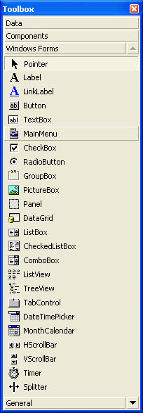 Figure 12-1.
You can add buttons and other controls to a form using any of the following techniques:
-
Draw a control on a form by clicking the control in the Toolbox and then clicking and dragging a rectangle in the control’s desired location on the form.
-
Drag a control onto a form by clicking the control in the Toolbox and dragging it to the desired position on the form.
-
Add a control to the upper left corner of a form by double-clicking the control’s icon in the Toolbox. You can then reposition the control as needed.
Every control has a set of default properties that are generated automatically. In addition, some properties are created by the Forms Designer, such as the default name of the control. When you add a control to your form, the Windows Forms Designer serializes information about the control into your form’s source file, including the control’s default name, size, and position. As you update properties for a control using the Properties window, the code necessary to update the properties is added to your form.
The Button class exposes several properties that enable you to manage the appearance of a control. The most commonly used properties that affect the appearance of push buttons are listed here:
-
FlatStyle Defines how the control’s edges are drawn
-
BackColor Specifies the color for the control’s background
-
ForeColor Specifies the text color for the control
-
Text Controls the caption displayed in the control
The FlatStyle property enables you to change the appearance of buttons and other controls to match the Web look offered by products such as recent versions of Microsoft Money. You also can create buttons and other controls that are initially displayed as flat but become three-dimensional as the mouse pointer moves over them. The FlatStyle property must be set to a value from the FlatStyle enumeration, provided in Table 12-1.
Figure 12-2 shows a series of push buttons with their FlatStyle property set to Flat, Popup, and Standard.
 Figure 12-2.
Like other properties, the FlatStyle property for a control can be set programmatically, as shown in the following code, or through the Properties window. Because the style of a control rarely changes at run time, it’s usually more convenient to set the style using the Properties window.
closeButton.FlatStyle = FlatStyle.Flat;
 |
 |
 |
Although it might be unusual to change the style of a control at run time, you can still do so with Windows Forms controls. All Windows Forms controls are stateless, which makes it possible to change properties that affect the appearance or behavior of the control at run time. The ability to change properties dynamically enables you to create very flexible user interfaces. Later in this chapter, in the section “Using the ComboBox Class,” we’ll look at an example program that allows a combo box to dynamically change its drop-down style. |
 |
 |
The BackColor property is used to set the background color for the control. By default, this property is set to KnownColor.Control, which is the system-wide default color for controls defined by the operating system. The following code sets the background color of a button to dark red:
okButton.BackColor = Color.DarkRed;
Recall that in Chapter 11 we used similar code to specify the background color for a form. Because forms and all controls share Control as a common base class, the technique for manipulating common properties is exactly the same.
The ForeColor property for a control is used to specify the color used to draw the caption text. For button controls, this property is by default set to KnownColor.ControlText, which is the system-wide color defined by the operating system and used for control captions. To change the color of the caption text for a button, use code such as this:
okButton.ForeColor = Color.AntiqueWhite;
|
|
 |
It’s easy to manipulate the colors of Windows Forms objects such as forms and controls. Keep in mind, however, that the user might not share your love of alternative color schemes. It’s a good idea to consider respecting the default background and foreground control colors, as these colors can be configured by users. Projecting your own color scheme might cause difficulties when users try to run your application. |
|
|
Sometimes it’s useful to change a button’s caption. For example, a button that opens a window might have the caption Open Window. After the window has been opened, it’s reasonable to change the function of the button to close the open window and change the button’s caption to Close Window, using code such as this:
private void ToggleWindow()
{
    if(openButton.Text == "Open Window")
    {
        reservationForm = new ReservationForm();
        reservationForm.Show();
        openButton.Text = "Close Window";
    }
    else
    {
        reservationForm.Close();
        openButton.Text = "Open Window";
    }
}
As shown in the preceding code, the caption displayed by a button control is managed through the control’s Text property. All forms and controls that include a label or caption expose the Text property to enable you to provide a new caption. To allow a user to use the keyboard to select a button, prefix one of the characters with an ampersand (&), as shown here:
openButton.Text = "&Close Window";
When a character in the caption text is prefixed with an ampersand, the user can click the button by pressing the ALT key in conjunction with the character. It’s customary to provide this type of shortcut with all push button controls except the OK and Cancel buttons.
The Button class also includes properties that control the behavior of a push button control. The properties discussed in this section aren’t unique to the Button class. These properties are inherited from the Control base class and are exposed by all Windows Forms controls.
When it’s not appropriate for a control such as a button to be selected by a user in the current context, the control should be disabled. A disabled control provides a visual cue to the user that the control can’t be used, which is a more user-friendly approach than enabling the control only to display an error message after the button is clicked. Controls expose the Enabled property, which is used to enable or disable the button or other Windows Forms controls. When disabled, button controls can’t be selected by the user, and the button label is drawn using the system’s disabled text color. The following code illustrates how to disable a button control:
removeItem.Enabled = false;
To enable a control that’s currently disabled, set its Enabled property to true, as shown here:
removeItem.Enabled = true;
Sometimes it’s more appropriate to completely hide a control instead of simply disabling it. Controls are typically hidden when it’s unlikely that they’ll be used. For example, controls used only for special cases can be hidden and displayed only when the special case occurs. Hiding controls that aren’t likely to be used reduces clutter on your forms and makes the forms easier to use.
To hide a control such as a push button, set its Visible property to false, as shown here:
removeItem.Visible = false;
Alternatively, you can hide the control using the Hide method, like this:
removeItem.Hide();
To display a control that’s currently hidden, set its Visible property to true, as shown here:
removeItem.Visible = true;
Or, if you prefer to invoke a method rather than set a property, you can use the Show method, like this:
removeItem.Show();
As you saw in Chapter 11, a form’s DialogResult property provides a way to determine how a modal form was dismissed by the user. When a form is used as a dialog box, a DialogResult value should be associated with the form before the form is closed. This value is available as a property after the dialog box has been dismissed, and it’s also returned as a result when ShowDialog is called, as shown here:
private void newItem_Click(object sender, System.EventArgs e)
{
    AddComboItemForm dlg = new AddComboItemForm();
    DialogResult result = dlg.ShowDialog(this);
    if(result == DialogResult.OK)
    {


    }
}
}
}
There are two ways to set the DialogResult property for a form. One way is to set the property explicitly while processing events in the form, as shown here:
private void CloseButton_Click(object sender, System.EventArgs e)
{
    DialogResult = DialogResult.OK;
    Close();
}
Another approach is to set the DialogResult property for a button control used to close the form. Each push button control has a DialogResult property; the value of DialogResult will be passed through to the form if the button is used to close the form. Although the DialogResult property for a push button control can be set in code, as shown here, it’s most often set declaratively using the Properties window:
closeButton.DialogResult = DialogResult.OK;
The RadioButton class is used to create a radio button control. A radio button control is used when the user must make one selection from multiple options—for this reason, the radio button control is sometimes referred to as the option button control. When multiple radio button controls exist in the same group on a form, the control will automatically enforce mutual exclusion, meaning that when the user selects one radio button, all other radio buttons are guaranteed to be cleared.
The radio button control shares many properties with the push button control, including the FlatStyle, BackColor, ForeColor, and Text properties discussed earlier in this chapter, in the section “Controlling Button Appearance with Properties.” In addition, the Checked property is used to determine whether a radio button is selected, as shown here:
if(standardRadio.Checked == true)
{


}
You can also use the Checked property to select a radio button, like this:
standardRadio.Checked = true;
When the user selects a radio button, a Click event is raised. To handle the Click event, you must provide an event handler; this technique is discussed later in this chapter, in the section “Basic Event Handling.”
An unusual property exposed by the RadioButton class is the Appearance property. The Appearance property has two possible values, which are taken from the Appearance enumeration, shown in Table 12-2.
|
Value |
Description |
|
Button |
The radio button is drawn as a push button. |
|
Normal |
The radio button is drawn normally. |
When the Appearance property is set to Appearance.Button, radio button controls look like those shown in Figure 12-3. The Red, Blue, and Green buttons are actually radio buttons, and in this case, the Blue button is checked, so it’s drawn like a button that’s pressed. The Red and Green radio buttons aren’t selected, so they’re drawn as normal push buttons.
 Figure 12-3.
The CheckBox class is used to create a check box control. The check box control is similar to the radio button control except that no mutual exclusion is enforced by check box controls—meaning that the user can select several or none of the check boxes on a form.
The CheckBox class shares many characteristics with the RadioButton class. Like RadioButton, the CheckBox class exposes the BackColor, ForeColor, FlatStyle, Text, and Checked properties. Like the RadioButton class, the CheckBox class exposes the Appearance property, which can be used to force the check box control to be drawn as a button. Also, as with other button controls, when the user selects a check box, a Click event is generated and can be handled by supplying an event handler delegate.
As with the radio button control, you can use the Checked property to retrieve or set the value of a two-state check box. Unlike the radio button control, a check box control can optionally support three states rather than just two. The third state is useful when a check box must reflect a state that’s neither true nor false. This ability to reflect three states isn’t enabled by default; you must set the control’s ThreeState property to true, as shown here:
subscribeCheckBox.ThreeState = true;
Once the ThreeState property is enabled, you should use the CheckState property to determine or set the state of the control. The CheckState property must be set to one of the values from the CheckState enumeration, shown in Table 12-3.
When the check box control is drawn as a button, the indeterminate state is rendered as a flat push button, the checked state appears as a depressed push button, and the unchecked state appears as a raised push button.


