Using Brushes
As mentioned, brushes are used to fill areas with a color or a pattern. The Brush class is a base class for the following five concrete brush classes in the .NET Framework:
-
SolidBrush Fills an area with a solid color
-
TextureBrush Fills an area with an image
-
HatchBrush Fills an area with one of the predefined hatch patterns
-
LinearGradientBrush Fills an area with a linear gradient
-
PathGradientBrush Fills an area with a path gradient
The two most basic brushes, SolidBrush and TextureBrush, are found in the System.Drawing namespace. The remaining brushes are used for more advanced effects and are found in the System.Drawing.Drawing2D namespace.
The abstract Brush class serves as a base class for all Brush classes in the .NET Framework. Other classes that work with brushes generally accept parameters of the Brush type, allowing for a great deal of flexibility when you’re filling a figure or a region.
Two classes serve as repositories for commonly used, prebuilt brushes: SystemBrushes and Brushes. The SystemBrushes class returns references to brushes matching the colors of specific components in the user interface as well as named colors. This class consists of a number of static methods that each return a Brush reference. In earlier examples in this chapter, references to Brush objects were created that were compatible with the colors selected by the user for the window client area. You can also create Brush references that follow other user preferences, as shown here:
Brush highlightBrush = SystemBrushes.Highlight;
This example creates a reference to a Brush object that’s initialized to the user’s preferred color for a highlighted background.
A complete list of the static SystemBrushes properties that are used to obtain brush references based on user color selections is provided in Table 14-4.
The properties from the SystemBrushes class in Table 14-4 are a subset of the properties available in the SystemColors class listed in Table 14-3. Specifically, colors that are rarely used to fill areas, such as Color.InfoText, aren’t included. This doesn’t prevent you from using these colors with brushes—it just means that you must take the extra step of creating a Color value and then using it to create the brush.
To create a reference to a brush based on a Color value, use the FromSystemColor method, as shown here:
Brush infoBrush = SystemBrushes.FromSystemColor(SystemColors.InfoText);
An alternative to passing a named color to the SystemBrushes class is to use the Brushes class. The Brushes class is organized much like the SystemBrushes and Color classes, in that it exposes a large number of static methods that are used to obtain Brush references. For example, if you need a red brush, you call the static Brushes.Red method, like this:
Brush stopBrush = Brushes.Red;
Because there’s one static method in the Brushes class for each named color, there isn’t space to list all the methods here. However, the Brushes class follows the same naming convention as the Color class, so if you know the named color, you can always obtain a reference to a Brush object directly, without extracting the color first.
You’ve seen how references to the Brush class can be used along with the Brushes and SystemBrushes classes to fill rectangles and other areas. Although this is a good approach when creating brushes that are based on named colors or brushes that are consistent with the user’s color preferences, it doesn’t provide a way to create a brush that fills an area with the full range of possible colors. If you need to create a brush that has some degree of transparency or if you need a color other than the choices offered by the Brushes class, you’ll need to use the SolidBrush class. There’s just one constructor used to create SolidBrush objects, as shown here:
SolidBrush skyBrush = new SolidBrush(Color.FromArgb(99, 200, 210, 255));
The SolidBrush class exposes a single property, Color, that’s used to get or set the brush’s color.
// Make the brush more transparent.
skyBrush.Color = Color.FromArgb(50, 200, 210, 255);
Because the brushes returned from the Brushes and SystemBrushes classes are really SolidBrush objects, you can safely cast the returned reference to a SolidBrush object, as shown here:
SolidBrush skyBrush = (SolidBrush)Brushes.PowderBlue;
Color newColor = Color.FromArgb(100, skyBrush.Color);
skyBrush.Color = newColor;
In this case, the skyBrush object starts as a powder blue solid brush. The color is extracted, and the alpha component is changed to a more transparent value. After the skyBrush.Color property is set to the new color, the brush can be used to provide a sky blue wash effect over an area.
The TextureBrush class is used to represent a brush that fills an area with a pattern from an image. The brush can be constructed using the entire image or just a subset of the image; the image can also be rotated and scaled to suit your needs.
There are seven versions of the TextureBrush constructor, but several of these differ only because they accept RectangleF instead of Rectangle parameters. The simplest version of the constructor accepts a single parameter—the image to be used for the brush—as shown here:
Image logo = Image.FromFile("C:\\windows\\winnt256.bmp");
TextureBrush br = new TextureBrush(logo);
As shown here, an Image object can be created by loading the image directly from a file. The Image class supports images in the Windows bitmap format as well as other common formats, such as GIF, TIFF, JPEG, and PNG.
Another version of the constructor is used to control how a space larger than the brush is filled. This behavior is controlled by a value from the WrapMode enumeration that’s passed as a parameter, as shown here:
TextureBrush br = new TextureBrush(logo, WrapMode.TileFlipXY);
The WrapMode enumeration values are listed in Table 14-5. These values are also used to control the behavior of PathGradientBrush constructors, which are discussed later in this chapter, in the section “Using the PathGradientBrush Class.”
|
Value |
Description |
|
Clamp |
No tiling. The image is displayed only once. |
|
Tile |
The default value. Tiles the brush image to fill the area. |
|
TileFlipX |
Tiles the brush image to fill the area, reversing the image horizontally in every second column. |
|
TileFlipY |
Tiles the brush image to fill the area, reversing the image vertically in every second row. |
|
TileFlipXY |
Combines the behavior of TileFlipX and TileFlipY. The image in every second column and every second row is reversed. |
Often your brush needs only a subset of a larger image. Instead of cropping an image specifically for use with a TextureBrush object, you can simply select a subset of the image during construction. Two additional constructors are used to select a rectangular subset of the image—one constructor accepts a Rectangle parameter, and the other accepts a RectangleF parameter:
TextureBrush br = new TextureBrush(logo, new Rectangle(0,0,95,100));
TextureBrush br2 = new TextureBrush(logo, new RectangleF(0.0f,
                                                         0.0f,
                                                         95.0f,
                                                         100.0f));
A TextureBrush object created with either of these constructors will have its WrapMode property set to WrapMode.Tile. Although you can change the wrap mode through a property, it’s usually easier to construct a brush with the proper characteristics from the beginning.
Two of the remaining constructors for the TextureBrush class enable you to select a rectangular subset of the image and define a wrap mode. The following code uses a Rectangle parameter to define the selected area of the image. A similar version accepts a parameter of type RectangleF.
TextureBrush br = new TextureBrush(logo, new Rectangle(0, 0, 95, 100));
The final pair of TextureBrush constructors are used with an ImageAttributes object that controls how the image is rendered.
The TextureBrush class exposes a number of methods and properties that can be used to manage a TextureBrush object. The commonly used properties exposed by the TextureBrush class include the following:
-
Image Returns a reference to the Image object associated with the brush
-
WrapMode Specifies the wrap mode for the brush
The TextureBrush class also includes a number of methods that are used to manage a TextureBrush object. Two commonly used methods are used to rotate or scale the associated image.
-
RotateTransform Enables you to rotate the image by a specific amounts
-
ScaleTransform Enables you to scale the image to a smaller or larger size
The following example loads one of the standard bitmaps shipped with Windows XP Professional, applies two transforms to it, and displays the image in the client area:
private void MainForm_Paint(object sender,
                            System.Windows.Forms.PaintEventArgs e)
{
    Image logo = Image.FromFile("C:\\windows\\winnt256.bmp");
    TextureBrush br = new TextureBrush(logo);
    br.RotateTransform(30.0f);
    br.ScaleTransform(.5f, .5f);
    br.WrapMode = WrapMode.TileFlipXY;
    e.Graphics.FillRectangle(br, ClientRectangle);
}
The results of running this code on a computer equipped with Windows XP Professional are shown in Figure 14-4.
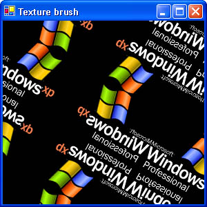 Figure 14-4.
The HatchBrush class is used to fill a region with one of 56 hatch patterns. Each hatch pattern is made from two colors: the background color and the foreground color. The HatchBrush class enables you to define these two colors and the style of the hatch pattern.
There are two ways to construct HatchBrush objects. The first constructor enables you to specify the style of the hatch pattern and the foreground color used to draw lines in the hatch bitmap, as shown here:
HatchBrush crossBrush = new HatchBrush(HatchStyle.Cross,
                                       Color.AliceBlue);
The second version of the constructor accepts an additional parameter that’s used to specify the background color used when drawing the hatch pattern.
HatchBrush crossBrush = new HatchBrush(HatchStyle.Cross,
                                       Color.AliceBlue,
                                       Color.DarkOliveGreen);
In the following code, a HatchBrush object is created using the HatchStyle.Cross hatch style and is then used to fill the client area of the form:
HatchBrush crossBrush = new HatchBrush(HatchStyle.Cross,
                                       Color.AliceBlue,
                                       Color.DarkOliveGreen);
e.Graphics.FillRectangle(crossBrush, ClientRectangle);
Figure 14-5 shows a simple Windows Forms application that uses this code to fill the client area.
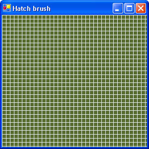 Figure 14-5.
The companion CD includes a simple Windows Forms application called HatchSelection that enables you to select from all the hatch patterns. The main form from the HatchSelection application is shown in Figure 14-6.
 Figure 14-6.
The main form in the HatchSelection application fills a combo box with the names of hatch patterns from the HatchStyle enumeration. When the name of a hatch style is selected, a HatchBrush object is created based on the selection and the panel that covers the lower half of the form has its client area invalidated, as shown below.
private void hatchStyleCombo_SelectionChangeCommitted(object sender,
    System.EventArgs e)
{
    if(_panelBrush != null)
        _panelBrush.Dispose();
    switch((string)hatchStyleCombo.SelectedItem)
    {
        case "BackwardDiagonal":
            _panelBrush = new HatchBrush(HatchStyle.BackwardDiagonal,
                                         Color.White,
                                         Color.Black);
            break;

        case "Cross":
            _panelBrush = new HatchBrush(HatchStyle.Cross,
                                         Color.White,
                                         Color.Black);
            break;


    }
    panel.Invalidate();
}
}
panel.Invalidate();
}
The Paint event handler for the panel then uses the brush to fill its client area, as shown here:
private void panel_Paint(object sender,
                         System.Windows.Forms.PaintEventArgs e)
{
    if(_panelBrush != null)
        e.Graphics.FillRectangle(_panelBrush, panel.ClientRectangle);
}
The LinearGradientBrush class creates brushes that fill an area with colors that transition from one hue to another. There are always two colors associated with a linear brush—these colors are found at the edges of the gradient, and the transition area is located between them.
There are several ways to create a LinearGradientBrush object. One approach is to create a LinearGradientBrush object that’s exactly the size of the area to be filled. This will result in an area filled with a single gradient transition. Another approach is to create a LinearGradientBrush instance that’s somewhat smaller than the area to be filled and then use the WrapMode enumeration to define how the brush will be tiled within the filled-in area.
There are eight versions of the LinearGradientBrush constructor. Many of these constructors are similar and differ only in accepting the PointF or RectangleF parameters instead of Point or Rectangle parameters, so conceptually there are only four ways to build a LinearGradientBrush object. The first two constructors accept two points that define the edges of the gradient boundary. Here Point structures are used to define the gradient edges:
// Create a gradient using Point structures.
LinearGradientBrush gradient = new LinearGradientBrush(new Point(0, 0),
                                                       new Point(0, 5),
                                                       Color.Red,
                                                       Color.Bisque);
e.Graphics.FillRectangle(gradient, ClientRectangle);
Alternatively, you can use PointF structures, as shown here:
// Create a gradient using Point structures.
LinearGradientBrush br = new LinearGradientBrush(new PointF(0.0f, 0.0f),
                                                 new PointF(0.0f, 5.0f),
                                                 Color.Red,
                                                 Color.Bisque);
e.Graphics.FillRectangle(br, ClientRectangle);
When you define the extent of the gradient in terms of Point or PointF structures, the defined points of the gradient are drawn in the pure colors and the area located between the points is drawn with a gradually changing color. Each color band in the gradient extends at right angles to a line drawn between the points. Using either of the constructors in the preceding code examples, a vertical line would connect the two points because they have the same first coordinate, so the gradient extends horizontally, as shown in Figure 14-7.
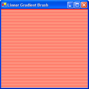 Figure 14-7.
To create a gradient that extends at an angle, simply specify gradient edges that lie on the desired angle, as shown here:
LinearGradientBrush fader = new LinearGradientBrush(new Point(10, 10),
                                                    new Point(20, 20),
                                                    Color.Salmon,
                                                    Color.Bisque);
e.Graphics.FillRectangle(fader, ClientRectangle);
This code creates a LinearGradientBrush object that extends at a 45-degree angle.
The transition between gradient bands in these examples is fairly pronounced because the default WrapMode setting for LinearGradientBrush instances is WrapMode.Tile. There are a couple of ways to achieve a smoother effect. The first is simply to change WrapMode.Tile to WrapMode.TileFlipXY, as shown here:
fader.WrapMode = WrapMode.TileFlipXY;
The resulting gradient blends smoothly through as many iterations as required to fill the rectangle, as shown in Figure 14-8.
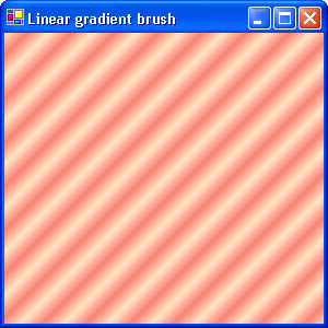 Figure 14-8.
Another option for creating a smoother gradient is to create a gradient that has the same dimensions as the area you’re filling. The next two LinearGradientBrush constructors accept Rectangle or RectangleF structures that define the edges of the gradient. The version that uses a Rectangle structure is shown here:
LinearGradientBrush gradient = new LinearGradientBrush(ClientRectangle,
                                                       Color.Red,
                                                       Color.Bisque,
                                                       90.0f);
e.Graphics.FillRectangle(gradient, ClientRectangle);
The last parameter, 90.0f, specifies the orientation of the gradient transition—in this example, the gradient extends horizontally, or 90 degrees. This code results in a client area that’s filled with a single gradient transition from top to bottom, as shown in Figure 14-9.
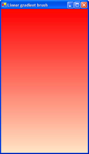 Figure 14-9.
The final two constructors for the LinearGradientBrush class enable you to specify the orientation of the gradient with the LinearGradientMode enumeration. These two constructors accept either Rectangle or RectangleF structures that define the gradient’s boundaries. In this example, a Rectangle structure is used to create a gradient brush that extends horizontally:
LinearGradientBrush gradient = new LinearGradientBrush(ClientRectangle,
                                           Color.Red,
                                           Color.Bisque,
                                           LinearGradientMode.Vertical);
e.Graphics.FillRectangle(gradient, ClientRectangle);
The LinearGradientMode enumeration values are listed in Table 14-6.
Like LinearGradientBrush objects, instances of the PathGradientBrush class are used to fill areas with a range of gradating colors. Unlike the LinearGradientBrush class, however, the PathGradientBrush class offers more flexibility in the shape of the gradient brush. For example, a PathGradientBrush object can be used to create filled text patterns and other complex shapes built with graphics paths.
A PathGradientBrush object starts with a graphics path that’s defined as either a GraphicsPath object or an array of points (either Point or PointF) that describe a polygon. The GraphicsPath class isn’t covered in detail in this book—for our purposes, all you need to know about this class is that it stores a sequence of lines, curves, and shapes. Refer to the MSDN online help for more information about this class.
There are four constructors that create PathGradientBrush objects based on polygons defined by arrays of Point or PointF. For example, the following array of Point defines a triangle:
Point [] trianglePoints = new Point[] {  new Point(0, 0),
                                         new Point(0, 60),
                                         new Point(80, 60)};
The trianglePoints array can be passed to a PathGradientBrush constructor to create a brush based on the triangle, as shown here:
PathGradientBrush triBrush = new PathGradientBrush(trianglePoints);
No color information is defined in the constructor for the brush. By default, the brush will have a black center, with a gradient toward white at every point in the polygon. Another unique aspect of the PathGradientBrush class is that, unlike the behavior of the TextureBrush and LinearGradientBrush classes, its default WrapMode setting is WrapMode.Clamp. Figure 14-10 shows a form that has had its client area filled with the triBrush object created in the preceding code example.
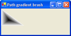 Figure 14-10.
As with other brushes, the wrap mode for a PathGradientBrush can be adjusted with the WrapMode property, as shown here:
triBrush.WrapMode = WrapMode.TileFlipXY;
By default, the center of the polygon is determined automatically by the PathGradientBrush class; this is the location that contains one of the colors in the gradient. You can adjust the location of the center gradient point with the CenterPoint property, which is typed as a PointF structure, as shown here:
triBrush.CenterPoint = new PointF(5.0f, 30.0f);
The color of the center gradient point is specified with the CenterColor property, as shown here:
triBrush.CenterColor = Color.AntiqueWhite;
Each point used to define the brush’s polygon can have a different color defined for its gradient. The edge gradients are specified with the SurroundColors property, which accepts an array of Color values. The following code creates a rectangular PathGradientBrush object and specifies a different color for each corner:
Point [] quadPoints = new Point[] {  new Point(0, 0),
                                     new Point(0, 60),
                                     new Point(80, 60),
                                     new Point(80, 0)
                                  };
PathGradientBrush quadBrush = new PathGradientBrush(quadPoints);
quadBrush.WrapMode = WrapMode.TileFlipXY;
quadBrush.CenterColor = Color.Black;
quadBrush.SurroundColors = new Color[] {
                                        Color.Black,
                                        Color.White,
                                        Color.Gray,
                                        Color.AntiqueWhite
                                        };
e.Graphics.FillRectangle(quadBrush, ClientRectangle);
Figure 14-11 shows a form that’s had its client area filled with a PathGradientBrush object built using this code.
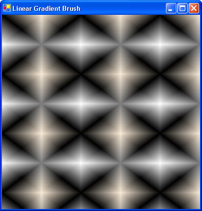 Figure 14-11.


