Using TabControl Controls
A common way to conserve space in a dialog box or a form is to use the TabControl control. The TabControl control enables you to stack multiple TabPage objects in a single shared location; navigation between pages is performed by clicking the tab associated with each page. An example of a dialog box that uses this type of user interface is the Windows Display Properties dialog box, shown in Figure 15-1.
 Figure 15-1.
The TabPage class represents a single tabbed page in a TabControl control. A TabPage object is like a virtual form surface—when its tab is selected, controls contained in the TabPage object are displayed and will remain visible until a different tab is selected.
There are two approaches you can use to create an instance of a TabPage object. In this section, we’ll go through the steps used to create a TabPage object programmatically. Later in this chapter, in the section, “Creating TabControl Controls with the Windows Forms Designer,” you’ll learn how to use the Windows Forms Designer to create TabPage objects.
The TabPage class has two constructors. The following code uses the default constructor, which creates a TabPage object without a caption:
TabPage hobbiesTab = new TabPage();
The second version of the TabPage constructor accepts a string parameter that’s used as the tab caption, as shown here:
TabPage phoneTab = new TabPage("Phones");
As mentioned, the TabControl control serves as the container for all tabbed pages, and each tab is represented by a TabPage object. The TabControl class exposes its collection of TabPage objects through its TabPages property, which returns a reference to an instance of TabPageCollection, as shown here:
TabControl.TabPageCollection collection = tabControl.TabPages;
foreach(TabPage page in collection)
{


}
}
As with similar classes discussed earlier in Part III, you rarely need to refer to the TabPageCollection class directly. Instead, you can simply write your code as if the TabPages property was the collection, which results in more compact code, as shown here:
foreach(TabPage page in tabControl.TabPages)
{


}
Because the TabPageCollection class provides an indexer, you can access TabPage objects stored in the collection just as if they were in an array, like this:
tabControl.TabPages[0].Text = "Location";
To add a TabPage object to a TabControl programmatically, you use the Add or AddRange method. The Add method accepts a reference to the TabPage object to be added, as shown here:
TabPage phoneTab = new TabPage("Phones");
tabControl.TabPages.Add(phoneTab);
The AddRange method is used to add multiple pages to a TabControl control. The AddRange method accepts an array of TabPage objects, as shown in the following code:
TabPage [] pages = new TabPage [] {
                                        new TabPage("Contact"),
                                        new TabPage("Sports"),
                                        new TabPage("Hobbies")
                                  };

tabControl.TabPages.AddRange(pages);
There are two ways to remove a TabPage object from a TabControl control. The first approach requires you to pass a TabPage reference to the Remove method, as shown here:
tabControl.TabPages.Remove(phoneTab);
If it’s not convenient to pass a reference to Remove, you can remove a TabPage object by its position in the TabPages collection by passing its index to the RemoveAt method, as follows:
tabControl.TabPages.RemoveAt(0);
And finally, to remove all the TabPage objects associated with a TabControl control, use the Clear method, as shown here:
tabControl.TabPages.Clear();
Although you can create a TabControl control programmatically, the simplest approach is to use the Windows Forms Designer that’s part of Microsoft Visual Studio .NET. Get started by dragging a TabControl control from the Toolbox window to your form. The control will initially be displayed as a rectangle with no visible tabs, as shown in Figure 15-2.
 Figure 15-2.
To launch the TabPage Collection Editor, click the button next to the TabControl object’s TabPages property in the Properties window. Initially, the TabPage Collection Editor is empty, as shown in Figure 15-3.
 Figure 15-3.
TabPage objects are added to the control’s collection of tabs by clicking the Add button. After a tab is added to the collection, its properties can be managed from within the TabPage Collection Editor. A list of the tabs in the collection is provided on the left side of the editor, and a Properties window is displayed on the right, as shown in Figure 15-4.
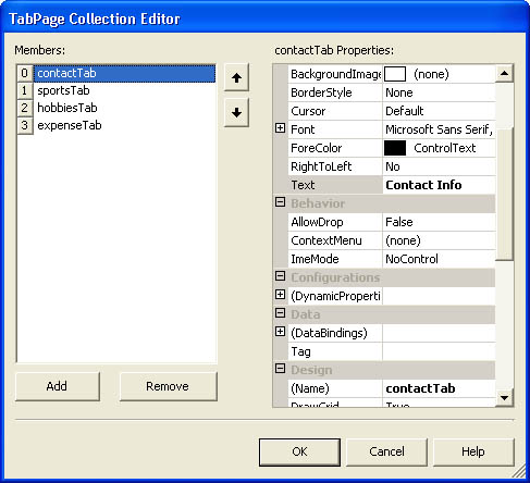 Figure 15-4.
Editing TabPage objects using the TabPage Collection Editor.
After a TabPage object has been added, controls can be added to the tab just as they are added to a dialog box.
The TabControl class exposes additional properties that can be used to manage TabControl controls, including the following:
-
Alignment A value from the TabAlignment enumeration that specifies which edge of the TabControl control hosts the tabs
-
Appearance A value from the TabAppearance enumeration that specifies how tabs are drawn
-
Multiline A Boolean value that specifies whether multiple rows of tabs can be displayed
-
SelectedIndex The index of the currently selected tab
-
SelectedTab A reference to the currently selected tab
-
SizeMode A value from the TabSizeMode enumeration that specifies how tabs are sized
-
TabCount The number of tabs contained by the control
The Alignment property enables you to specify which edge of the control will contain the tabs. Values from the TabAlignment enumeration are listed in Table 15-4.
|
Value |
Description |
|
Bottom |
Tabs are located along the bottom of the control. |
|
Left |
Tabs are located along the left edge of the control, and the Multiline property is automatically set to true. |
|
Right |
Tabs are located along the right edge of the control, and the Multiline property is automatically set to true. |
|
Top |
Tabs are located along the top edge of the control. This is the default value. |
Be aware that if you select an alignment option other than TabAlignment.Top, your choices for the TabAppearance property will be limited. The following code uses the Alignment property to align the tabs across the bottom edge of the control:
tabControl.Alignment = TabAlignment.Bottom;
The Appearance property specifies how individual tabs are drawn. Values from the TabAppearance enumeration are listed in Table 15-5.
|
Value |
Description |
|
Buttons |
The tabs are drawn as buttons. |
|
FlatButtons |
The tabs are drawn as flat buttons. This setting requires the Alignment property to be set to TabAlignment.Top. |
|
Normal |
The tabs are drawn as tabs. This is the default setting. |
As Table 15-5 indicates, the TabAppearance.FlatButtons value requires the Alignment property to be set to TabAlignment.Top. The following code uses the Appearance property to cause the tabs to be drawn as flat buttons:
tabControl.Appearance = TabAppearance.FlatButtons;
Occasionally, a TabControl control might contain more TabPage objects than can be displayed in a single row. The Multiline property specifies whether multiple rows of tabs can be displayed. If this value is true, multiple rows of tabs will be displayed, as shown in Figure 15-5.
 Figure 15-5.
If the Multiline property is set to false, some tabs will be clipped so that a single row of tabs is displayed and navigation arrows will be provided to access the hidden tabs, as shown in Figure 15-6.
 Figure 15-6.
The SizeMode property is used to specify how individual tabs are sized and is set to a value from the TabSizeMode enumeration, listed in Table 15-6. This property enables you to choose between displaying tabs that have a uniform size and displaying tabs that conserve space.
The following code uses the SizeMode property to set all the tabs to a consistent size:
tabControl.SizeMode = TabSizeMode.Fixed;


