UI Effects
UI Effects
Dynamic HTML is the notion of scripting DOM elements in the browser to do more interactive things. It is at the heart of AJAX. You dynamically update the page based on user actions. This goes beyond getting refreshed data from the server asynchronously. You can create rich animations and transitions from old to new data. The ASP.NET AJAX Toolkit makes it easy to declaratively compose a rich set of anima-tions into your application and to make the user interface better in ways typically associated with desktop applications. The following sections offer some examples of how you can push your application further through the use of the UI effects available in the Toolkit.
Animations
The ASP.NET AJAX Toolkit offers a broad set of animations that you can use programmatically and declaratively. You can attach the AnimationExtender directly to the control that will be affected, or you can animate a different control based on user input.
The standard set of animation events are OnLoad, OnClick, OnMouseOver, OnMouseOut, OnHoverOver, and OnHoverOut. The OnLoad animation occurs when the page is loaded. And, as you would expect, the OnClick animation happens when the user clicks the target control. The difference between the Mouse and Hover events is that the start of the OnHoverOver animation terminates the OnHoverOut animation and vice versa.
You should experiment with the ways that you can combine various animations to create the effect you want. There are animations for sizing, hiding, interpolating between values, moving, styling, fading, and more. In Listing 8-6 (Animation.aspx), I have some text in a panel that fades out when the user clicks it. It fades back in when the mouse is moved off the element, and it pulses briefly when the mouse hovers over it. As you can see, all of this is done with just a few lines of declarative code in the page. I didn’t have to write any JavaScript to control the DOM or modify the styles at all.
<%@ Page Language="C#" %>
<%@ Register
    Assembly="AjaxControlToolkit"
    Namespace="AjaxControlToolkit"
    TagPrefix="ajaxToolkit" %>
<!DOCTYPE html PUBLIC "-//W3C//DTD XHTML 1.0 Transitional//EN"
<html xmlns="http://www.w3.org/1999/xhtml" >
<head runat="server">
    <title>Animation</title>
</head>
<body>
    <form id="form1" runat="server">
    <asp:ScriptManager runat="server" ID="scriptManager" />
    <div>
    <asp:Panel runat="server" ID="thePanel" style="backgroundColor: #ffffff;
width:150px; border: solid 1px; padding: 15px; cursor: pointer">
    <h3>This is the animation target.</h3>
    </asp:Panel>

    <ajaxToolkit:AnimationExtender id="animationExtender"
TargetControlID="thePanel" runat="server"  >
    <Animations>
        <OnClick>
            <Sequence>
                <FadeOut Duration="1.0" Fps="20" />
            </Sequence>
        </OnClick>

        <OnHoverOut>
            <Parallel>
                <FadeIn Duration="1.0" Fps="20" />
            </Parallel>
        </OnHoverOut>

        <OnHoverOver>
            <Sequence>
                <Pulse Duration="0.2" Fps="20" Iterations="5"
MinimumOpacity="0.2" MaximumOpacity="1.0" />
            </Sequence>
        </OnHoverOver>


    </Animations>
    </ajaxToolkit:AnimationExtender>
    </div>
    </form>
</body>
</html>
The animations for an event can be defined to run all at once using the <parallel> element or to run one after another using the <sequence> element.
UpdatePanelAnimation
Animating an UpdatePanel as its content is being refreshed is a common scenario. The UpdatePanelAnimationExtender allows you to use the broad set of animations available in the Toolkit and will automatically coordinate playing them when the specified UpdatePanel is being updated or when the update has completed.
Listing 8-7 (UpdatePanelAnimation.aspx) is an example of using the UpdatePanelAnimationExtender. The TargetControlID is set to the UpdatePanel and the FadeIn and FadeOut animations attached to the <div> that contains the UpdatePanel.
<%@ Page Language="C#" %>
<%@ Register
    Assembly="AjaxControlToolkit"
    Namespace="AjaxControlToolkit"
    TagPrefix="ajaxToolkit" %>
<!DOCTYPE html PUBLIC "-//W3C//DTD XHTML 1.0 Transitional//EN"
"http://www.w3.org/TR/xhtml1/DTD/xhtml1-transitional.dtd">
<script runat="server">
    protected override void OnLoad(EventArgs e) {
        base.OnLoad(e);
        theLabel.Text = DateTime.Now.ToString();
        System.Threading.Thread.Sleep(2000);
    }
</script>
<html xmlns="http://www.w3.org/1999/xhtml" >
<head runat="server">
    <title>UpdatePanelAnimation</title>
</head>
<body>
    <form id="form1" runat="server">
    <asp:ScriptManager runat="server" ID="scriptManager" />
    <div style="background-color:#aaccee; padding-left:10px; padding:10px;
width:200px" id="UpdatePanelContainer" >
    <asp:UpdatePanel runat="server" ID="UpdatePanel1" >
    <ContentTemplate>
    <asp:label runat="server" id="theLabel" /><br />
    <input type="submit" value="Go" />
    </ContentTemplate>
    </asp:UpdatePanel>
    <ajaxToolkit:UpdatePanelAnimationExtender ID="UpdatePanelAnimation1"
runat="server" TargetControlID="UpdatePanel1" >
    <Animations>
        <OnUpdating>
            <Sequence duration=".25" Fps="30">
               <FadeOut
                AnimationTarget="UpdatePanelContainer"
                minimumOpacity="0.15" />
            </Sequence>
        </OnUpdating>

        <OnUpdated>
            <Sequence>
               <FadeIn
                AnimationTarget="UpdatePanelContainer"
                minimumOpacity="0.15" />
            </Sequence>
        </OnUpdated>
    </Animations>
    </ajaxToolkit:UpdatePanelAnimationExtender>

    </div>
    </form>
</body>
</html>
When the UpdatePanel begins updating, the div is faded. When the call to the server is complete, the animation to fade the div back into view is run.
DropShadow
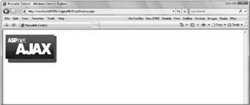
The DropShadowExtender allows you to add a DropShadow effect to an ASP.NET Panel on the page. You set the TargetControlID and can then control the Width, Opacity, and whether or not the corners should be Rounded. If the panel can be moved or resized, you can also set the TrackPosition property to true to indicate that JavaScript should run to track the panel and update the DropShadow as needed. This code adds a DropShadow to the image used in Listing 8-4 for the ResizableControl.
<ajaxToolkit:DropShadowExtender ID="DropShadowExtender1" runat="server"
    TargetControlID="Panel1"
    Opacity="0.6"
    Rounded="true"
    TrackPosition="true"
    Width="10"
/>
The result is shown in Figure 8-4.

Figure 8-4
RoundedCorners
The RoundedCornersExtender pads an existing element to achieve a rounding of the corners that you specify. The Corners property can be set to one of the following:
-
None
-
TopLeft
-
TopRight
-
BottomRight
-
BottomLeft
-
Top
-
Bottom
-
Right
-
Left
-
All
You can set the Radius property to a value other than its default value of 5, and you must set the TargetControlID. Listing 8-8 (RoundedCorners.aspx) demonstrates using the RoundedCornersExtender to shape a panel.
<%@ Page Language="C#" %>
<%@ Register
Assembly="AjaxControlToolkit"
Namespace="AjaxControlToolkit"
TagPrefix="ajaxToolkit" %>
<!DOCTYPE html PUBLIC "-//W3C//DTD XHTML 1.0 Transitional//EN"
"http://www.w3.org/TR/xhtml1/DTD/xhtml1-transitional.dtd">
<html xmlns="http://www.w3.org/1999/xhtml" >
<head runat="server">
<title>Rounded Corners</title>
</head>
<body>
<form id="form1" runat="server">
<asp:ScriptManager runat="server" ID="scriptManager" />
<div>
<asp:Panel ID="Panel1" runat="server"
style="text-indent5px;width:200px;height:100px;background-color:#aaccee">
Rounded corners are better.
</asp:Panel>
<ajaxToolkit:RoundedCornersExtender ID="RoundedCornersExtender1" runat="server"
TargetControlID="panel1"
Corners="All"
Radius="15"
/>
</div>
</form>
</body>
</html>


