Hack 42 Framing Your Auctions
![]()
![]()
Use tables and carefully aligned images to place decorative frames around your auction descriptions.
A little extra decoration will give your customers that warm, fuzzy feeling they need to open their wallets and bid a little higher, or so the theory goes. At the very least, frames may help your auctions look a little more polished and inviting.
|
4.11.1 The Table
It all starts with a single table, which positions the frame across the top, bottom, and sides, holding your content snugly inside. While you're designing the table, turn on the border so you can see more clearly what's going on.
<table style="width:100%" cellpadding=0 cellspacing=0 border=1>
<tr>
  <td width=25>top-left</td>
  <td>top-middle</td>
  <td width=25>top-right</td>
</tr>
<tr>
  <td width=25>left side</td>
  <td>

Your content goes here...

<br><br><br><br><br><br><br><br><br>

  </td>
  <td width=25>right side</td>
</tr>
<tr>
  <td width=25>bottom-left</td>
  <td width=25>bottom-middle</td>
  <td width=25>bottom-right</td>
</tr>
</table>
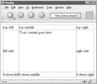
The resulting table shown in Figure 4-6 is our placeholder for the eventual design. Note the width=25 parameters in the left-hand and right-hand columns, which can be changed to accommodate whatever images are eventually placed inside.
Figure 4-6. This simple table provides the structure for a decorative frame around an auction description

|
4.11.2 The Images
In most cases, you'll need eight images ? one for each corner, and one for each side ? all hosted on an off-site server. See [Hack #59] for details.
The corner images stay put, but since the width of the browser window and the height of your content cannot be taken for granted, our side images (top, bottom, left, and right) should be designed so that they are either stretchable or repeatable.
To make an image stretch to fill its container (in this case, a table cell), specify 100% for the width if it's a top or bottom piece, or for the height if it's a left- or right-hand piece. For example, place this in the top-middle cell:
<img src="http://www.my.server/my_top_image.jpg" width=100% height=25>
Since the image will be stretched, you'll want to do this only with images comprised of solid colors, and nothing that will look bad if distorted in one direction.
|
On the other hand, you may want to have a single image repeat like wallpaper, which is accomplished by modifying the <td> tag, like this:
<td background="http://www.my.server/my_top_image.jpg">
Naturally, repeating images should be designed as such, with an edge that provides a smooth transition to the adjacent image.
4.11.3 Putting It Together
For the full effect, the theme of your decorative border should relate to the item being sold. When selling photographic equipment, for instance, a film-based theme, like the example that follows, would be appropriate.
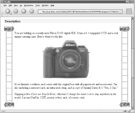
Uncut film makes an excellent border because it's comprised entirely of a very simple, repeating pattern. So the image need only contain a single frame, and the browser will do the rest. Figure 4-7 shows a completed border with four film canister images and film extending down the sides of the auction, accommodating long and short descriptions with ease.
Figure 4-7. The completed frame with four film canister images and a single film frame image repeated down both sides

Here's the code for this frame:
<table style="width:100%" cellpadding=0 cellspacing=0 border=0>
<tr>
<td width=60><img
src="http://www.ebayhacks.com/pictures/film_canister_top.jpg"></td>
<td></td>
<td width=60><img
src="http://www.ebayhacks.com/pictures/film_canister_top.jpg"></td>
</tr>
<tr>
<td width=60 background="http://www.ebayhacks.com/pictures/film.gif"
width=60> </td>
<td>
Your content goes here...
<br><br><br><br><br><br><br><br><br>
</td>
<td width=60 background="http://www.ebayhacks.com/pictures/film.gif"
width=60> </td>
</tr>
<tr>
<td width=60><img
src="http://www.ebayhacks.com/pictures/film_canister_bottom.jpg"></td>
<td></td>
<td width=60><img
src="http://www.ebayhacks.com/pictures/film_canister_bottom.jpg"></td>
</tr>
</table>
The canister images, film_canister_top.jpg and film_canister_bottom.jpg, are referenced by the <img> tags in the corner cells, providing a weird "scroll" effect. You could even replace two of the canisters with jagged film edges for more realism, if that's what you're after.
The film strip, film.gif, appears as the background of the two side cells. Note the use of the code (non-breaking space) in the side cells to convince browsers that there's content to display; otherwise, the cells (and their backgrounds) might not show up at all.
The widths of the left and right columns are set at 60 pixels to match the width of the film canister images. To get the 38-pixel-wide film to line up, 11 pixels of whitespace was added to each side. Make sure to get all the dimensions right, or unsightly gaps or misalignments could ruin the effect.


