Section 8.4. Style Properties
At the heart of the CSS2 specification are the many properties that let you control how the styles-conscious browser presents your documents to the user. The standard collects these properties into six groups: fonts, colors and backgrounds, text, boxes and layout, lists, and tag classification. We'll stick with that taxonomy and preface the whole shebang with a discussion of property values and inheritance before diving into the properties themselves.
You'll find a summary of the style properties in Appendix C.
8.4.1 Property Values
Most properties set a value to some characteristic of your document for rendering by the browser; for example, the size of the characters in a font or the color of level-2 headers. As we discussed earlier, when describing the syntax of styles, you give value to a CSS2 property by following the property's keyword with a colon (:) and one or more space- or comma-separated numbers or value-related keywords. For example:
color:blue

font-family: Helvetica, Univers, sans-serif
color and font-family are the properties in these two style examples; blue and the various comma-separated font names are their values, respectively.
There are eight kinds of property values: keywords, length values, percentage values, URLs, colors, angles, time, and frequencies.
8.4.1.1 Keyword property values
A property may have a keyword value that expresses action or dimension. For instance, the effects of underline and line-through are obvious property values. And you can express property dimensions with such keywords as small and xx-large. Some keywords are even relational: bolder, for instance, is an acceptable value for the font-weight property. Keyword values are not case-sensitive: Underline, UNDERLINE, and underline are all acceptable keyword values.
8.4.1.2 Length property values
So-called length values (a term taken from the CSS2 standard) explicitly set the size of a property. They are numbers, some with decimals, too. Length values may have a leading + or - sign to indicate that the value is to be added to or subtracted from the immediate value of the property. Length values must be followed immediately by a two-letter unit abbreviation, with no intervening spaces.
There are three kinds of length-value units: relative, pixels, and absolute. Relative units specify a size that is relative to the size of some other property of the content. Currently, there are only two relative units: em, which is the width of the lowercase letter "m" in the current font; and x-height, abbreviated ex, which is the height of the letter "x" in the current font.
Pixels are the tiny dots of colored light that make up the onscreen text and images on a computer-monitor or TV image. The pixels unit, abbreviated px, is equal to the minute size of 1 pixel, so you may express the size of some properties by how many pixels across or down they run.
Absolute property value units are more familiar to us all. They include inches (in), centimeters (cm), millimeters (mm), points (pt; 1/72 of an inch), and picas (pc; 12 points).
All of the following are valid length values, although not all units are recognized by the current styles-conscious browsers:
1in

1.5cm

+0.25mm

-3pt

-2.5pc

+100em

-2.75ex

250px
8.4.1.3 Percentage property values
Similar to the relative length-value type, a percentage value describes a proportion relative to some other aspect of the content. It has an optional sign, meaning it may be added to or subtracted from the current value for that property, and optional decimal portion to its numeric value. Percentage values have the percent sign (%) suffix. For example:
line-height: 120%
computes the separation between lines to be 120% of the current line height (usually relative to the text font height). Note that this value is not dynamic: changes made to the font height after the rule has been processed by the browser do not affect the computed line height.
8.4.1.4 URL property values
Some properties also accept, if not expect, a URL as a value. The syntax for a CSS2 URL property value is different from that in HTML/XHTML:
url(service://server.com/pathname)
With CSS2 properties, the keyword url is required, as are the opening and closing parentheses. Do not leave any spaces between url and the opening parenthesis. The url value may contain either an absolute or a relative URL. However, note that the URL is relative to the style sheet's URL. This means that if you use a url value in a document-level or inline style, the URL is relative to the HTML document containing the style document. Otherwise, the URL is relative to the @imported or <link>ed external style sheet's URL.
8.4.1.5 Color property values
Color values specify colors in a property (surprised?). You can specify a color as a color name or a hexadecimal RGB triple, as for common HTML/XHTML attributes, or as a decimal RGB triple unique to style properties. Both color names and hexadecimal RGB triple notation are described in Appendix G.
With CSS2, too, you may assign just one hexadecimal digit instead of two to the red, green, and blue (RGB) components of a color. That digit is simply doubled to create a conventional six-digit triple. Thus, the color #78C is equivalent to #7788CC. In general, three-digit color values are handy only for simple colors.
The decimal RGB triple notation is unique:
rgb(red, green, blue)
The red, green, and blue intensity values are decimal integers in the range 0 to 255, or integer percentages. As with a URL value, do not leave any spaces between rgb and the opening parenthesis.
For example, in decimal RGB convention, the color white is rgb(255, 255, 255) or rgb(100%, 100%, 100%), and a medium yellow is rgb(127, 127, 0) or rgb(50%, 50%, 0%).
8.4.1.6 Angle, time, and frequency property values
A few properties require a value that expresses an angle, such as the heading of a compass. These properties take a numeric value followed by the units deg (degrees), grad (gradations), or rad (radians). Similarly, express time values as numbers followed by either ms (milliseconds) or s (seconds) units.
Finally, frequency values are numbers followed by Hz (Hertz) or kHz (kiloHertz). Interestingly, there is no corresponding mHz unit, because frequencies in CSS2 refer to audio, not TV, radio broadcast, or other electromagnetic waves.
8.4.2 Property Inheritance
In lieu of a specific rule for a particular element, properties and their values for tags within tags are inherited from the parent tag. Thus, setting a property for the <body> tag effectively applies that property to every tag in the body of your document, except for those that specifically override it. So, to make all the text in your document blue, you need only say:
body {color: blue}
rather than creating a rule for every tag you use in your document.
This inheritance extends to any level. If you later created a <div> tag with text of a different color, the styles-conscious browser would display all the text contents of the <div> tag and all its enclosed tags in that new color. When the <div> tag ends, the color reverts to that of the containing <body> tag.
In many of the following property descriptions, we refer to the tag containing the current tag as the "parent element" of that tag.
8.4.3 Font Properties
The loudest complaint that we hear about HTML and its progeny, XHTML, is that they lack font styles and characteristics that even the simplest of text editors implement. The various <font> attributes address part of the problem, but they are tedious to use, because each text font change requires a different <font> tag.
Style sheets change all that, of course. The CSS2 standard provides seven font properties that modify the appearance of text contained within the affected tag: font-family, font-size, font-size-adjust, font-style, font-variant, font-stretch, and font-weight. In addition, there is a universal font property in which you can declare all the font values.
Please be aware that style sheets cannot overcome limitations of the user's display/document-rendering system, and the browser cannot conjure effects if the fonts it uses do not provide the means.
8.4.3.1 The font-family property
The font-family property accepts a comma-separated list of font names. The browser uses the first font named in the list that also is installed and available for display on the client machine for text display.
Font-name values are for specific font styles, such as Helvetica or Courier, or a generic font style, as defined by the CSS2 standard: serif, sans-serif, cursive, fantasy, or monospace. The browser defines which font it actually uses for each generic font. For instance, Courier is the most popular choice for a monospace font.
Because fonts vary wildly among browsers, you should usually provide several choices when specifying a font style, ending with a suitable generic font. For example:
h1 {font-family: Helvetica, Univers, sans-serif}
causes the browser to look for and use Helvetica, and then Univers. If neither font is available for the client display, the browser uses the generic sans-serif typeface.
Enclose font names that contain spaces ? New Century Schoolbook, for example ? in quotation marks. For example:
p {font-family: Times, "New Century Schoolbook", Palatino, serif}
With inline styles, that extra set of double quotation marks causes problems. The solution is to use single quotation marks in an inline style:
<p style="font-family: Times, 'New Century Schoolbook', Palatino, serif">
In practice, you don't have to use quotation marks, because font-name values are comma-separated, so the browser normally ignore spaces. Hence:
p {font-family: Times, New Century Schoolbook, Palatino, serif}

<p style="font-family: Times, New Century Schoolbook, Palatino, serif">
are both legal. Nonetheless, we recommend that you use quotation marks. It's a good habit to get into, and it makes things that much less ambiguous.
8.4.3.2 The font-size property
The font-size property lets you prescribe absolute or relative length values, percentages, and keywords to define the font size. For example:
p {font-size: 12pt}

p {font-size: 120%}

p {font-size: +2pt}

p {font-size: medium}

p {font-size: larger}
The first rule is probably the most used, because it is the most familiar: it sets the font size for text enclosed in your document's paragraph(s) to a specific number of points (12 in this example). The second example rule sets the font size to be 20% larger than the parent element's font size. The third increases the font's normal size by 2 points.
The fourth example selects a predefined font size set by the browser, identified by the medium keyword. Valid absolute-size keywords are xx-small, x-small, small, medium, large, x-large, and xx-large; these usually correspond to the seven font sizes used with the size attribute of the <font> tag.
The last font-size rule selects the next size larger than the font associated with the parent element. Thus, if the size were normally medium, it would be changed to large. You can also specify smaller, with the expected results.
None of the current browsers handles the incremented font size correctly. Rather, they ignore the increment/decrement sign and use its value as an absolute size. For instance, in the middle example in this section, the font size would end up as 2 points, not 2 points larger than the normal size.
8.4.3.3 The font-stretch property
In addition to different sizes, font families sometimes contain condensed and expanded versions, in which the characters are squeezed or stretched, respectively. Use the font-stretch property to choose more compressed or stretched-out characters from your font.
Use the property value of normal to select the normal-sized version of the font. The relative values wider and narrower select the next-wider or next-narrower variant of the font's characters, respectively, but not wider or narrower than the most ("ultra") expanded or contracted one in the family.
The remaining font-stretch property values choose specific variants from the font family. Starting from the most condensed and ending with the most expanded, the values are ultra-condensed, extra-condensed, condensed, semi-condensed, semi-expanded, expanded, extra-expanded, and ultra-expanded.
The font-stretch property, of course, assumes that your display fonts support stretchable fonts. Even so, the currently popular browsers ignore this property.
8.4.3.4 The font-size-adjust property
Without too many details, the legibility and display size of a font depend principally on its aspect ratio: the ratio of its rendered size to its x-height, which is a measure of the font's lowercase glyph height. Fonts with aspect ratios approaching 1.0 tend to be more legible at smaller sizes than fonts with aspect ratios approaching 0.
Also, because of aspect ratios, the actual display size of one font may appear smaller or larger than another font at the same size. So, when one font is not available for rendering, the substituted font may distort the presentation.
The font-size-adjust property lets you readjust the substituted font's aspect ratio so that it better fits the display. Use the property value of none to ignore the aspect ratio. Otherwise, include your desired aspect ratio (a decimal value less than one), typically the aspect ratio for your first-choice display font. The styles-conscious browser computes and displays the substituted font at a size adjusted to your specified aspect ratio:
s = (n/a) * fs
where s is the new, computer font size for display of the substituted font, calculated as the font-size-adjust value n divided by the substituted font's aspect ratio a times the current font size fs.
For example, let's imagine that your first-choice font is Times New Roman, which has an aspect ratio of 0.45. If it's not available, the browser may then substitute Comic Sans MS, which has an aspect ratio of 0.54. So that the substitution maintains nearly equivalent sizing for the font display ? say, at an 18-px font size ? with the font-size-adjust property set to 0.45, the CSS2-compliant browser would display or print the text with the substituted Comic Sans MS font at the smaller size of (0.45/0.54 x 18 px) = 15 px.
Unfortunately, we can't show you how the popular browsers would do this, because they don't support it.
8.4.3.5 The font-style property
Use the font-style property to slant text. The default style is normal and may be changed to italic or oblique. For example:
h2 {font-style: italic}
makes all level-2 header text italic. Netscape 4 supports only the italic value for font-style; Netscape 6 and Internet Explorer 4 and later support both values, although it is usually difficult to distinguish italic from oblique.
8.4.3.6 The font-variant property
The font-variant property lets you select a variant of the desired font. The default value for this property is normal, indicating the conventional version of the font. You may also specify small-caps to select a version of the font in which the lowercase letters have been replaced with small capital letters.
Netscape 6 and Internet Explorer 6 support this property. Internet Explorer versions 4 and 5 incorrectly display small-caps as all uppercase letters.
8.4.3.7 The font-weight property
The font-weight property controls the weight or boldness of the lettering. The default value of this property is normal. You may specify bold to obtain a bold version of a font or use the relative bolder and lighter values to obtain a version of the font that is bolder or lighter than the parent element's font.
To specify varying levels of lightness or boldness, set the value to a multiple of 100, between the values 100 (lightest) and 900 (boldest). The value 400 is equal to the normal version of the font, and 700 is the same as specifying bold.
Internet Explorer and Netscape 6 fully support this property.
8.4.3.8 The font property
More often than not, you'll find yourself specifying more than one font-related property at a time for a tag's text content display. A complete font specification can get somewhat unwieldy. For example:
p {font-family: Times, Garamond, serif;

   font-weight: bold;

   font-size: 12pt;

   line-height: 14pt}
To mitigate this troublesome and potentially unreadable collection, use the comprehensive font property and group all the attributes into one set of declarations:
p {font: bold 12pt/14pt Times, Garamond, serif}
The grouping and ordering of font attributes is important within the font property. The font style, weight, and variant attributes must be specified first, followed by the font size and the line height separated by a slash character, and ending with the list of font families. Of all the properties, the size and family are required; the others may be omitted.
Here are some more sample font properties:
em {font: italic 14pt Times}

h1 {font: 24pt/48pt sans-serif}

code {font: 12pt Courier, monospace}
The first example tells the styles-conscious browser to emphasize <em> text using a 14-point italic Times face. The second rule has <h1> text displayed in the boldest 24-point sans-serif font available, with an extra 24 points of space between the lines of text. Finally, text within a <code> tag is set in 12-point Courier or the browser-defined monospace font.
We leave it to your imagination to conjure up examples of the abuses you could foster with font styles. Perhaps a recent issue of Wired magazine, notorious for avant-garde fonts and other print-related abuses, would be helpful in that regard?
8.4.4 Font Selection and Synthesis
The original cascading style sheet standard, CSS1, had a simplistic font-matching algorithm: if your specified font does not exist in the local client's font collection, substitute a generic font. Of course, the results are often less than pleasing to the eye and can wreak havoc with the display. Moreover, there are often more suitable font substitutes than generic ones. The CSS2 standard significantly extends the CSS1 font-matching model and includes a new at-rule that lets authors define, download, and use new fonts in their documents.
8.4.4.1 CSS2 font-matching steps
The CSS2 font-matching algorithm has four steps. The first step is simply to use the specified font when it is found on the user's machine; this could be one of several font families specified in the style-sheet rule, parsed in their order of appearance.
The second step, taken when none of the fonts specified in the rule exist on the user's machine, has the browser attempt to find a close match among similar local fonts. For example, a request for Helvetica might wind up using Arial, a similar sans-serif font.
The third step in the CSS2 font-matching algorithm has the browser try to synthesize a font, taking a local font and changing it to match the specified one. For example, a request for 72-point Helvetica might be satisfied by taking the local 12-point Arial font and scaling it up to match the desired size.
Failing all, the browser may take a fourth step and download the desired font, provided the author has supplied suitable external font definitions. These external font definitions are created with the @font-face at-rule, whose general syntax is:
@font-face {

   descriptor : value;

   ...

   descriptor : value

   }
Each @font-face at-rule defines a new font to the browser. Subsequent requests for fonts can be satisfied by these new fonts. The browser uses the various descriptor values to ensure that the font supplied matches the font requested.
8.4.4.2 Basic font descriptors
The basic font descriptors that you use in the @font-face at-rule correspond to the CSS2 font properties and accept the same values as those properties. Thus, you can use the font-family, font-style, font-variant, font-weight, font-stretch, and font-size descriptors and their associated values to define a new font to the browser. For example:
@font-face {

   font-family : "Kumquat Sans";

   font-style : normal, italic;

   src : url("http://www.kumquat.com/foundry/kumquat-sans")

   }
defines a font named Kumquat Sans that is available for download from kumquat.com. Within that downloadable font, both the normal and italic versions of Kumquat Sans are available. Since no other font descriptors are provided, the browser assumes that all other font properties (weight, variant, etc.) can be satisfied within this font.
In general, omitting a font descriptor lets the browser match any value provided for that descriptor. By providing one or more values for a font descriptor, you are restricting the browser to matching only those values in later font requests. Hence, you should be as specific as possible when defining a font this way, to better ensure that the browser makes good matches later. For example, if a font does not contain an italic version and you fail to tell the browser, it may use an incorrect font when attempting to fulfill a request for an italic style of that font.
8.4.4.3 The src descriptor
The src descriptor in the @font-face at-rule tells the browser where to retrieve the font. For downloadable fonts, the value of this descriptor is its document URL, expressed in CSS2 syntax with the url keyword. You can also reference locally installed fonts ? ones stored on the user's machine ? with src, but use the keyword local instead of url and supply the local name of the font instead.
The src descriptor's value may also be a list of locations, separated by commas. In our previous example, we might have used:
src : url("http://www.kumquat.com/foundry/kumquat-sans"), local("Lucida Sans")
to tell the browser to try to download and use Kumquat Sans from kumquat.com and, if that fails, to look for a locally installed copy of Lucida Sans.
You can even provide hints to the browser. CSS2 is decidedly nonpartisan when it comes to the format of the font file. Recognizing that a number of different font formats exist, the standard lets you use any format you want, presuming that the browser can make sense of it. To provide a format hint, use the keyword format followed one or more format names, such as:
src : url("http://www.kumquat.com/foundry/kumquat-sans") format("type-1"),

    local("Lucida Sans") format("truetype", "intellitype")
In this case, the external font is in Type 1 format, while the local flavors of Lucida Sans are available in both TrueType and Intellifont formats. Other recognized font formats include truedoc-pfr, opentype, embedded-opentype, truetype, truetype-gx, and speedo.
8.4.4.4 Advanced font descriptors
In addition to the standard font descriptors, CSS2 supports a number of more esoteric descriptors that further refine the defined font. Typical page designers do not have much need for these descriptors, but more discriminating typographers may find them useful.
The unicode-range descriptor accepts a comma-separated list of Unicode values, each beginning with U+ followed by a hexadecimal value. Ranges of values can be specified by adding a dash and another hexadecimal value; the question mark matches any value in that position.
The purpose of the unicode-range descriptor is to define exactly which character glyphs are defined in the font. If characters used in your document are not available, the browser does not download and use the font. For example, a value of U+2A70 indicates that the font contains the glyph at that position in the font. Using U+2A7? represents characters in the range 2A70 to 2A7F, while U+2A70-2A9F defines a broader range. For the most part, this descriptor is used to restrict the use of special symbol fonts to just those symbols defined in the font.
The units-per-em descriptor accepts a single numeric value defining the size of the font's em area. This value is important if you specify the values of other descriptors using em units.
The panose-1 descriptor accepts exactly 10 integer values, separated by spaces, corresponding to the Panose-1 characterization of this font. Defining the actual Panose-1 values is well beyond the scope of this book; interested authors should refer to appropriate documentation for the Panose-1 system for more information.
The stemv and stemh descriptors define the thickness, in ems, of the vertical and horizontal strokes of the font. Similarly, the cap-height and x-height descriptors define the height of the upper- and lowercase glyphs in the font. Finally, the ascent and descent descriptors define the font's maximum height and depth. If you use any of these descriptors, you must also specify the units-per-em descriptor.
The slope descriptor defines the slope of the vertical stroke of the font. This is important for matching italic and oblique versions of a font.
The baseline, centerline, mathline, and topline descriptors define the conventional baseline, center baseline, mathematical baseline, and top baseline of the font. All accept a numeric value expressed in ems. All require that you specify the units-per-em descriptor, too.
The bbox descriptor accepts exactly two coordinate (x, y) pairs, specifying the lower-left and upper-right corners of the font's bounding box. The bbox descriptor is important if the browser chooses to synthesize a font based on this font. By specifying the size of the bounding box, you ensure that the synthesized font occupies the same space as the desired one.
The widths descriptor accepts a comma-separated list of Unicode ranges, followed by space-separated that values which define the widths of the characters in the indicated range. If you supply one value for a range, all the characters in that range have the same width. Multiple values are assigned to successive characters in a range. Like the bbox descriptor, the widths descriptor is used to ensure good fidelity between a synthesized font and its requested counterpart.
Finally, the optional definitions-src descriptor provides the URL of a file that contains all of the descriptors for a font. This is handy if you need to define a font in great detail. Rather than including the lengthy descriptors in each document or style sheet that uses the font, you define the descriptors once in a separate file and reference that file using the definitions-src descriptor.
8.4.5 Color and Background Properties
Every element in your document has a foreground and a background color. In some cases, the background is not one color, but a colorful image. The color and background style properties control these colors and images.
The children of an HTML/XHTML element normally inherit the foreground color of their parent. For instance, if you make <body> text red, the styles-conscious browser also displays header and paragraph text in red.
Background properties behave differently, however ? they are not inherited. Instead, each element has a default background that is transparent, allowing the parent's background to show through. Thus, setting the background image of the <body> tag does not cause that image to be reloaded for every element within the body tag. Instead, the browser loads the image once and displays it behind the rest of the document, serving as the background for all elements that do not themselves have an explicit background color or image.
8.4.5.1 The background-attachment property
If you specify a background image for an element, use the background-attachment property to control how that image is attached to the browser's display window. With the default value scroll, the browser moves the background image with the element as the user scrolls through the document. A value of fixed prevents the image from moving.
Both Netscape 6 and Internet Explorer support this style property.
8.4.5.2 The background-color property
The background-color property controls the (you guessed it!) background color of an element. Set it to a color value or to the keyword transparent (the default value). The effects should be obvious.
While you may have become accustomed to setting the background color of an entire document through the special attributes for the <body> tag, the background-color style property can be applied to any element. For example, to set the background color of one item in a bulleted list, you could use:
<li style="background-color: blue">
Similarly, all the table header cells in a document could be given a reverse video effect with:
th {background-color: black; color: white}
If you really want your emphasized text to stand out, paint its background red:
em {background-color: red}
Earlier versions of Netscape (pre-Version 6) do not explicitly support this CSS2 property, but you can achieve the same effects through its support of the general background property, as discussed in Section 8.4.5.6.
8.4.5.3 The background-image property
The background-image property puts an image behind the contents of an element. Its value is either a URL or the keyword none (the default value).
As with background colors, you can place a background image behind the entire document or behind selected elements of a document. With this style property, effects such as placing an image behind a table or selected text are now simple:
<table style="background-image: url(backgrounds/woodgrain.gif)">

li.marble {background-image: url(backgrounds/marble.gif)}
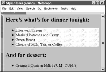
The first example uses an inline style to place a woodgrain finish behind a table. The second defines a list-item class that places a marble background behind <li> tags that use the class=marble attribute. For example, this XHTML snippet:
<h2>Here's what's for dinner tonight:</h2>

<ul>

   <li class="marble">Liver with Onions</li>

   <li class="marble">Mashed Potatoes and Gravy</li>

   <li class="marble">Green Beans</li>

   <li class="marble">Choice of Milk, Tea, or Coffee</li>

</ul>

<h2>And for dessert:</h2>

<ul>

   <li>Creamed Quats in Milk  (YUM! YUM!)</li>

</ul>
produces a result like that in Figure 8-4.
Figure 8-4. Placing a background image behind an element
If the image is larger than the containing element, it is clipped to the area occupied by the element. If the image is smaller, it is repeated to tile the area occupied by the element, as dictated by the value of the background-repeat attribute.
You control the position of the image within the element with the background-position property. The scrolling behavior of the image is managed by the background-attachment property.
While it may seem that a background color and a background image are mutually exclusive, you should usually define a background color even if you are using a background image. That way, if the image is unavailable ? for example, when the user doesn't automatically download images ? the browser displays the background color instead. In addition, if the background image has transparent areas, the background color is used to fill in those areas.
8.4.5.4 The background-position property
By default, the styles-conscious browser renders a background image starting in the upper-left corner of the allotted display area and tiled (if necessary) down and over to the lower-right corner of that same area. With the background-position property, you can offset the starting position of the background image down and to the right of that default point by an absolute (length) or relative (percentage or keyword) offset. The resulting image fills the area from that offset starting point, and tiling (if specified) occurs left to right and top to bottom from this point to fill the display space.
You may specify one or two values for the background-position property. If you use a single value, it applies to both the vertical and horizontal positions. With two values, the first is the horizontal offset and the second is the vertical offset.
Length values (with their appropriate units; see Section 8.4.1.2) indicate an absolute distance from the upper-left corner of the element behind which you display the background image.
For example:
table {background-image: url(backgrounds/marble.gif);

       background-position: 10px 20px}
offsets the marble background 10 pixels to the right and 20 pixels down from the upper-left corner of any <table> element in your document.
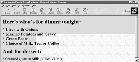
Percentage values are a bit trickier but somewhat easier to use. Measured from 0-100% from left to right and top to bottom, the center of the element's content display space is at 50%, 50%. Similarly, the position one-third of the way across the area and two-thirds of the way down is at 33%, 66%. So, to offset the background for our example dinner menu to the center of the element's content display space, we use:
background-position: 50% 50%
Notice that the browser places the first marble.gif tile at the center of the content display area and tiles to the right and down the window, as shown in Figure 8-5.[7]
[7] Interestingly, this property worked as advertised with Internet Explorer Versions 4 and 5 but is broken in Version 6, as it is with Netscape 6: the offset works only if you set the background-repeat property.
Figure 8-5. Marbled background offset to the center of the display
However, why use a number when a single word will do? You can use the keywords left, center, and right, as well as top, center, and bottom, for 0%, 50%, and 100%, respectively. To center an image in the tag's content area, use:
background-position: center center
You can mix and match length and percentage values,[8] so that:
[8] That is, if the browser supports the value units. So far, Internet Explorer and Netscape support only a meager repertoire of length units ? pixels and percents.
background-position: 1cm 50%
places the image one centimeter to the right of the tag's left edge, centered vertically in the tag's area.
8.4.5.5 The background-repeat property
Normally, the browser tiles a background image to fill the allotted space, repeating the image both horizontally and vertically. Use the background-repeat property to alter this "repeat" (default value) behavior. To have the image repeat horizontally but not vertically, use the value repeat-x. For only vertical repetition, use repeat-y. To suppress tiling altogether, use no-repeat.
A common use of this property is to place a watermark or logo in the background of a page without repeating the image over and over. For instance, this code places the watermark image in the background at the center of the page:
body {background-image: url(backgrounds/watermark.gif);

      background-position: center center;

      background-repeat: no-repeat

     }
A popular trick is to create a vertical ribbon down the right-hand side of the page:
body {background-image: url(backgrounds/ribbon.gif);

      background-position: top right;

      background-repeat: repeat-y

     }
8.4.5.6 The background property
Like the various font properties, the many background CSS2 properties can get cumbersome to write and hard to read later. So, like the font property, there is also a general background property.
The background property accepts values from any and all of the background-color, background-image, background-attachment, background-repeat, andbackground-positionproperties, in any order. If you do not specify values for some of the properties, those properties are explicitly set to their default values. Thus:
background: red
sets the background-color property to red and resets the other background properties to their default values. A more complex example:
background: url(backgrounds/marble.gif) blue repeat-y fixed center
sets all the background image and color properties at once, resulting in a marble image on top of a blue background (blue showing through any transparent areas). The image repeats vertically, starting from the center of the content display area, and does not scroll when the user scrolls the display. Notice that we include just a single position value (center), and the browser uses it for both the vertical and horizontal positions.
8.4.5.7 The color property
The color property sets the foreground color for a tag's contents ? the color of the text lettering, for instance. Its value is either the name of a color, a hexadecimal RGB triple, or a decimal RGB triple, as outlined in Section 8.4.1.5. The following are all valid property declarations:
color: mauve

color: #ff7bd5

color: rgb(255, 125, 213)

color: rgb(100%, 49%, 84%)
Generally, you'll use the color property with text, but you may also modify non-textual content of a tag. For example, the following example produces a green horizontal rule:
hr {color: green}
If you don't specify a color for an element, it inherits the color of its parent element.
8.4.6 Text Properties
Cascading style sheets make a distinction between font properties, which control the size, style, and appearance of text, and text properties, which control how text is aligned and presented to the user.
8.4.6.1 The letter-spacing property
The letter-spacing property puts additional space between text letters as they are displayed by the browser. Set the property with either a length value or the default keyword normal, indicating that the browser should use normal letter spacing. For example:
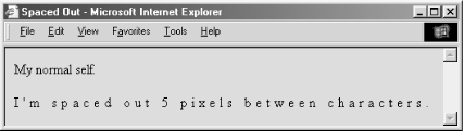
blockquote {letter-spacing: 2px}
puts an additional 2 pixels between adjacent letters within the <blockquote> tag. Figure 8-6 illustrates what happens when you put 5 pixels between characters.
Figure 8-6. The letter-spacing property lets you stretch text out
Internet Explorer and Netscape both support this property.
8.4.6.2 The line-height property
Use the line-height property to define the minimum spacing between lines of a tag's text content. Normally, browsers single-space text lines ? the top of the next line is just a few points below the last line. By adding to that line height, you increase the amount of space between lines.
The line-height value can be an absolute or relative length, a percentage, a scaling factor, or the keyword normal. For example:
p {line-height: 14pt}

p {line-height: 120%}

p {line-height: 2.0}
The first example sets the line height to exactly 14 points between baselines of adjacent lines of text. The second computes the line height to 120% of the font size. The last example uses a scaling factor to set the line height to twice as large as the font size, creating double-spaced text. The value normal, the default, is usually equal to a scaling factor of 1.0 to 1.2.
Keep in mind that absolute and percentage values for line-height compute the line height based on the value of the font-size property. Children of the element inherit the computed property value. Subsequent changes to font-size by either the parent or child elements do not change the computed line height.
Scaling factors, on the other hand, defer the line-height computation until the browser actually displays the text. Hence, varying font sizes affect line height locally. In general, it is best to use a scaling factor for the line-height property so that the line height changes automatically as the font size changes.
Although it is usually considered separate from font properties, you may include this text-related line-height property's value as part of the shorthand notation of the font property. [Section 8.4.3.8]
8.4.6.3 The text-align property
Text justified with respect to the page margins is a rudimentary feature of nearly all text processors. The text-align property brings that capability to HTML for any block-level tag. (The W3C standards people prefer that you use CSS2 text-align styles rather than the explicit align attribute for block-level tags like <div> and <p>.) Use one of four values: left, right, center, or justify. The default value is, of course, left.[9] For example:
[9] For left-to-right locales. In right-to-left locales, the default is right.
div {text-align: right}
tells the styles-conscious browser to align all the text inside <div> tags against the right margin. The justify value tells the browser to align the text to both the left and right margins, spreading the letters and words in the middle to fit.
8.4.6.4 The text-decoration property
The text-decoration property produces text embellishments, some of which are also available with the original physical style tags. Its value is one or more of the keywords underline, overline, line-through, and blink. The value none is the default, which tells the styles-conscious browser to present text normally.
The text-decoration property is handy for defining different link appearances. For example:
a:visited, a:link, a:active {text-decoration: underline overline}
puts lines above and below the links in your document.
This text property is not inherited, and non-textual elements are not affected by the text-decoration property.
Netscape and Internet Explorer support the text-decoration property but, thankfully, not its blink value.
8.4.6.5 The text-indent property
Although less common today, it is still standard practice to indent the first line of a paragraph of text.[10] And some text blocks, such as definitions, typically "out-dent" the first line, creating what is called a hanging indent.
[10] But not, obviously, in this book.
The CSS2 text-indent property lets you apply these features to any block tag and thereby control the amount of indentation of the first line of the block. Use length and percentage values: negative values create the hanging indent, and percentage values compute the indentation as a percentage of the parent element's width. The default value is 0.
To indent all the paragraphs in your document, for example, you could use:
p {text-indent: 3em}
The length unit em scales the indent as the font of the paragraph changes in size on different browsers.
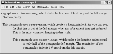
Hanging indents are a bit trickier, because you have to watch out for the element borders. Negative indentation does not shift the left margin of the text; it simply shifts the first line of the element left, possibly into the margin, border, or padding of the parent element. For this reason, hanging indents work as expected only if you also shift the left margin of the element to the right by an amount equal to or greater than the size of the hanging indent. For example:
p.wrong {text-indent: -3em}

p.hang  {text-indent: -3em; margin-left: 3em}

p.large {text-indent: -3em; margin-left: 6em}
creates three paragraph styles. The first creates a hanging indent that extends into the left margin, the second creates a conventional hanging indent, and the third creates a paragraph whose body is indented more than the hanging indent. All three styles are shown in use in Figure 8-7.
Figure 8-7. The effects of text-indent and margin-left on a paragraph
Both Internet Explorer and Netscape support the text-indent property.
8.4.6.6 The text-shadow property
The text-shadow property lets you give your text a three-dimensional appearance through the time-honored use of shadowing. Values for the property include a required offset and optional blur-radius and color. The property may include more than one set of values, separated with commas, to achieve a stack of shadows, with each subsequent set of values layered on top the previous one but always beneath the original text.
The property's required offset is comprised of two length values: the first specifies the horizontal offset, and the second specifies the vertical offset. Positive values place the shadow to the right and below the respective length distance from the text. Negative values move the shadow left and up, respectively.
The optional blur-radius is also a length value that specifies the boundaries for blurring, an effect that depends on the rendering agent. The other shadow value is color. This, of course, may be an RGB triple or color name, as for other properties, and specifies the shadow color. If you don't specify this value, text-shadow uses the color value of the color property. For example:
h1 {text-shadow; 10px 10px 2px yellow}

p:first-letter {text-shadow: -5px -5px purple, 10px 10px orange}
The first text-shadow example puts a 2-pixel blurred-yellow shadow behind, 10 pixels below, and 10 pixels to the right of level-1 headers in your document. The second example puts two shadows behind the first letter of each paragraph. The purple shadow sits 5 pixels above and 5 pixels to the left of that first letter. The other shadow, like in the first example (although orange in this case), goes 10 pixels to the right and 10 pixels below the first letter of each paragraph.
Unfortunately, we can't show you any of these effects, because none of the popular browsers support this property.
8.4.6.7 The text-transform property
The text-transform property lets you automatically convert portions or all of your document's text into uppercase or lowercase lettering. Acceptable values are capitalize, uppercase, lowercase, or none.
capitalize renders the first letter of each word in the text into uppercase, even if the source document's text is in lowercase. The uppercase and lowercase values repectively render all the text in the corresponding case. none, of course, cancels any transformations. For example:
h1 {text-transform: uppercase}
makes all the letters in level-1 headers, presumably titles, appear in uppercase text, whereas:
h2 {text-transform: capitalize}
makes sure that each word in level-2 headers begins with a capital letter, a convention that might be appropriate for section heads, for instance.
Note that while uppercase and lowercase affect the entire text, capitalize affects only the first letter of each word in the text. Consequently, transforming the word "htMl" with capitalize generates "HtMl."
The text-transform property is supported by both Netscape and Internet Explorer.
8.4.6.8 The vertical-align property
The vertical-align property controls the relative position of an element with respect to the line containing the element. Valid values for this property include:
- baseline
-
Align the baseline of the element with the baseline of the containing element.
- middle
-
Align the middle of the element with the middle (usually the x-height) of the containing element.
- sub
-
Subscript the element.
- super
-
Superscript the element.
- text-top
-
Align the top of the element with the top of the font of the parent element.
- text-bottom
-
Align the bottom of the element with the bottom of the font of the parent element.
- top
-
Align the top of the element with the top of the tallest element in the current line.
- bottom
-
Align the bottom of the element with the bottom of the lowest element in the current line.
In addition, a percentage value indicates a position relative to the current baseline, so that a position of 50% puts the element halfway up the line height above the baseline. A position value of -100% puts the element an entire line-height below the baseline of the current line.
Netscape supports all values except middle for text elements and all but the sub value when applying the vertical-align property to the <img> tag or other non-text inline elements. Internet Explorer supports only sub and super when applied to text elements and all values when applied to non-text inline elements.
8.4.6.9 The word-spacing property
Use the word-spacing property to add space between words within a tag. You can specify a length value, or use the keyword normal to revert to normal word spacing. For example:
h3 {word-spacing: 25px}
places an additional 25 pixels of space between words in the <h3> tag.
Netscape and Internet Explorer Version 6, but not earlier versions, support the word-spacing property.
8.4.7 Box Properties
The CSS2 model assumes that HTML and XHTML elements always fit within rectangular boxes. Using the properties defined in this section, you can control the size, appearance, and position of the boxes containing the elements in your documents.
8.4.7.1 The CSS2 formatting model
Each element in a document fits into a rectangular space or box. The CSS2 authors call this box the "core content area" and surround it with three more boxes: the padding, the border, and the margin. Figure 8-8 shows these boxes and defines some useful terminology.
Figure 8-8. The CSS2 formatting model and terminology
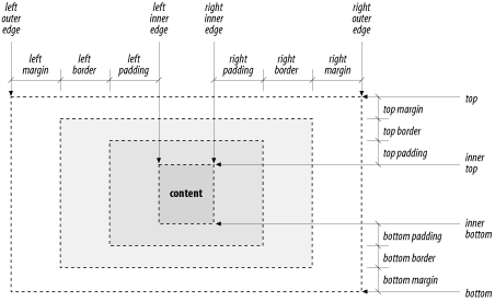
The top, bottom, left-outer, and right-outer edges bound the content area of an element and all of its padding, border, and margin spaces. The inner-top, inner-bottom, left-inner, and right-inner edges define the sides of the core content area. The extra space around the element is the area between the inner and outer edges, including the padding, border, and margin. A browser may omit any and all of these extra spaces for any element, and for many, the inner and outer edges are the same.
When elements are vertically adjacent, the bottom margin of the upper elements and the top margin of the lower elements overlap, so that the total space between the elements is the greater of the adjacent margins. For example, if one paragraph has a bottom margin of 1 inch, and the next paragraph has a top margin of 0.5 inches, the greater of the two margins, 1 inch, is placed between the two paragraphs. This practice is known as margin collapsing and generally results in better document appearance.
Horizontally adjacent elements do not have overlapping margins. Instead, the CSS2 model adds together adjacent horizontal margins. For example, if a paragraph has a left margin of 1 inch and is adjacent to an element with a right margin of 0.5 inches, the total space between the two is 1.5 inches. This rule also applies to nested elements, so that a paragraph within a division has a left margin equal to the sum of the division's left margin and the paragraph's left margin.
As shown in Figure 8-8, the total width of an element is equal to the sum of seven items: the left and right margins, the left and right borders, the left and right padding, and the element's content itself. The sum of these seven items must equal the width of the containing element. Of these seven items, only three (the element's width and its left and right margins) can be given the value auto, indicating t


