5.4 Properties
The three levels of CSS define so many properties, I can't cover them all here. There are over 120 in level 2 alone. Instead, I'll cover the basic categories you are likely to encounter and leave more exhaustive descriptions to books specializing on the topic.
5.4.1 Inheritance
CSS properties can be passed down from a container element to its child. This inheritance principle greatly simplifies stylesheet design. For example, in the document element rule, you can set a font family that will be used throughout the document. Wherever you want to use a different family, simply insert a new property for a rule and it will override the global setting.
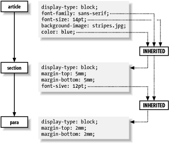
In Figure 5-9, a para inherits some properties from a section, which in turn inherits from an article. The properties font-family and color are defined in the property set for article, and inherited by both section and para. The property font-size is not inherited by section because section's explicit setting overrides it. para does inherit this property from section.
Figure 5-9. Element-inheriting properties

Inheritance is forbidden for some properties where it wouldn't make sense to pass that trait on. For example, the background-image property, which causes an image to be loaded and displayed in the background, is not inherited. If every element did inherit this property, the result would be a complete mess, with every paragraph and inline element trying to display its own copy of the image in its rectangular area. It looks much better if only one element has this property and its children don't. Display type and margins are other examples.
5.4.2 Units of Measurement
Many properties involve some kind of measurement: the width of a rule, a font size, or a distance to indent. These lengths can be expressed in several different kinds of units. Absolute measurements use units that have a predefined size, such as inches, points, or picas. Relative measurements use percentages and fractions of some variable distance, such as the height of the current font.
You can measure an absolute length with a ruler because the units never change. A millimeter is the same no matter what font you're using or which language you're speaking. Absolute units used in CSS include millimeters (mm), centimeters (cm), and inches (in), as well as units specific to the world of print, such as points ( pt) and picas (pc).
Relative units are nonfixed, scaling values that depend on some other measurement. For example, an em is defined as the size of the current font. If that font happens to be 12 points, then an em is 12 points. If the font size changes to 18 points, so does the em. Another relative unit is an ex, defined to be the x-height of a font (the height of a lowercase x). This is a fraction of the em, usually around a half, but it changes depending on the font. Different fonts can have different x-heights even if their em sizes are the same.
Relative measurements can also be expressed as percentages. This type of measurement relies on another element's value of the same property. For example:
b { font-size: 200% }
means that the b element has a font size that is twice its parent's.
In general, relative measurements are better than absolute. Relative units don't have to be rewritten when you adjust the default properties. It's much easier to write a stylesheet for multiple scenarios when you define the base size in only one place, and everything else is relative.
5.4.3 Display Types
Most elements fit into one of three categories of formatting: block, inline, and none. These designations, listed here, govern how the content is packaged in the formatted document:
- block
-
A block is a rectangular region of text isolated from the content preceding and following it by spacing. It begins on a new line, often after some whitespace, and it has boundaries (called margins) that keep the text in the rectangular shape. The text wraps at the margin, meaning it stops and then restarts on the next line. Blocks can contain other, smaller blocks, as well as inlines. Examples of blocks in traditional documents are paragraphs, titles, and sections.
- inline
-
An inline is content that doesn't interrupt the flow of text in a block. It wraps at the margin of the block it resides in like ordinary character data. It can set properties that don't affect the flow, such as font-family and color, but cannot have properties related to blocks, such as text alignment and text indentation. Examples of inlines are emphasis, keywords, and hypertext links.
- none
-
Any element defined as display: none will be skipped by the CSS processor. It's a convenient way to "turn off" large portions of a document for faster processing. It also happens to be the only display setting that is inherited, since all the children of the element are ignored too.
Every element is assigned a display property that tells the CSS processor how to format it. If display is set to block, the element begins on its own line. If it's set to inline, the element begins on the line that the previous element or character data finished on. The value none indicates that the element is invisible.
This model breaks down for complex objects like tables. A table is a unique formatting structure with cellular regions that can contain blocks or inlines. The discussion of this formatting is too complex for the scope of this chapter.
|
5.4.4 Blockish Properties
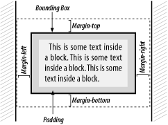
Around every block is an invisible box that shapes its content and keeps a healthy distance from its neighbors. Figure 5-10 shows all the parts of this box model. Immediately surrounding the content of the block is a rectangular buffer of space called the bounding box. Its distance from the content is known as padding. The perimeter of this region, called the boundary, is sometimes displayed as a rule or border on one, two, three, or all four sides. The thickness of these rules is measured outward. Outside the boundary is another envelope of space, defined by four widths called margins.
Figure 5-10. The CSS box model

A block's boundaries hold content while separating the block from sibling blocks. Any background image or color is confined to the area within the boundary, while text and nested boxes are confined to an even smaller area, the rectangle determined by the boundary minus padding. If the boundary is not displayed, the padding is often set to zero. Margins demarcate a rectangular region outside the box that keeps other boxes away.
5.4.4.1 Margins
A common way to adjust space around an element is to set its margins. A margin is the distance between the bounding box of an element and that of any neighboring (or containing) element. The four sides of a box have their own margin property: margin-left, margin-right, margin-top, and margin-bottom. The value can be a length or a percentage of the containing element's width.
The margin property is shorthand for defining all four sides of the margin. Its value is a space-separated list containing between one and four lengths or percentages. If only one value is specified, that value applies to all four sides. If there are two values, the first sets the top and bottom margins and the second sets the left and right margins. If there are three values, the first assigns the top margin, the second assigns both the left and right margins, and the third assigns the bottom margin. Finally, if four values are specified, they correspond to the top, right, bottom, and left margins, respectively. Unspecified margins default to zero. Thus the following rules are equivalent:
para { margin-left: 10em; margin-right: 10em; margin-top: 5% }
para { margin: 5% 10em 0 }
In both cases, the <para> element is defined with left and right margins of 10 ems, a top margin of 5% of the containing element's height, and no bottom margin. Negative values are acceptable. The result of a negative margin is to push the bounding box outside its container's box by the value given. To create the effect of text spilling outside a colored region, we use this stylesheet for an HTML file:
body { background-color: silver }
p { right-margin: -15% }
Margins often overlap. For example, paragraphs in a column touch at their top and bottom sides. Instead of adding the margins to make a bigger space, the smaller margin is discarded and the bigger one is used in its place. This is called collapsing the margins. So, if a paragraph has a top margin of 24 points and a bottom margin of 10 points, the actual distance between two paragraphs is 24 points. The rules of collapsing margins are actually a little more complex than this, but a full explanation is beyond the scope of this chapter.
5.4.4.2 Borders
It's often appealing to surround an element with a rectangular outline to make it stand out. The warning example used previously would catch readers' attention better if it were enclosed in a border. With the border property, you can create many kinds of effects, from dotted lines enclosing a block to rules on any side.
It takes three parameters to define the border you want. The width can be an absolute or relative measurement, or one of three preset values:
- thin
- medium (the default)
- thick
The next parameter is style. Eight styles are provided in CSS2:
- solid
- dashed
- dotted
- groove
- ridge
- double
- inset
- outset
The final parameter is color. Put all the parameters together in a space-separated list, in any order. Some examples:
border: thin solid green;
border: red groove thick;
border: inset blue 12pt;
5.4.4.3 Padding
One thing is still missing. Recall that this border is just inside the margins, putting it right against the text of the block. As a result, we need some extra space inside the border to keep it from crowding the text. The padding property lines the inside of the border with space to compact the text and keep the border from colliding into it. The value of this property is a space-separated list of between one and four length measurements. The application of lengths to sides is the same as it is with the margin property.
Let's expand on our previous warning example by giving it a border, shown in Figure 5-11:
warning {
  display: block;
  border: thick solid gray;
}
warning:before {
  content: "WARNING!";
  font-weight: bold;
  color: red }
Figure 5-11. A warning inside a border

5.4.4.4 Alignment and indentation
text-align is a property that defines the alignment or justification of lines in a paragraph. Sometimes you may want a crisp border on both the left and right sides of a column. At other times you may want a ragged right or left, or centered text. The following values are supported:
- left
-
Align text with the left border (ragged right).
- right
-
Align text with the right border (ragged left).
- center
-
Center each line within the block (ragged left and right).
- justify
-
Expand each line to reach both left and right borders of the block.
Left justification is used by default in most CSS processors. Note that left and right are absolute and independent of text direction.
The text-indent property indents the first line of a block. A positive or negative absolute length can be specified, or the indent can be given as a percentage of the width of the block.
5.4.5 Text Properties
So far, we've talked about blocks as containers of text. Now let's focus on the text itself. This section lists some properties for controlling how character data looks and behaves, such as font types, font styles, and color.
5.4.5.1 Font family
A typeface has several parameters that control its appearance, such as size, weight, and style. The most important, however, is the font family (e.g., Courier, Helvetica, and Times). Each family comes in different styles and weights, such as italic, bold, and heavy.
The font-family property is declared with a comma-separated list of font preferences, starting with the most specific and desirable, and finishing with the most generic. This list provides a series of alternatives in case the user agent doesn't have access to the specific font you request. At the very end of the list should be a generic font class, essentially allowing the user's software to decide which font matches best. Some generic font classes are:
- serif
-
Fonts that have decorative appendages, or serifs, fit in this category. Some common serif fonts include Palatino, Times, and Garamond.
- sans-serif
-
These fonts, lacking serifs, are relatively plain in comparison to the serif fonts. Helvetica and Avant-Garde are in this group.
- monospace
-
In these fonts each character occupies the same amount of space, unlike most fonts, where letters are packed together in varying widths. This font type is typically used to render computer programs, teletype simulations, and ASCII art.[1] Examples of monospace fonts are Courier and Monaco.
[1] See http://www.textfiles.com/art/.
- cursive
-
Fonts that connect characters in a simulation of calligraphy or handwriting fall in this group. Such typefaces are often used on wedding invitations and diplomas. Since this is not a standard font category on most systems, you should use it rarely, if ever.
- fantasy
-
This collects all the oddball fonts like Comic Strip, Ransom Note, and Wild West. Again, most users are not likely to have access to this kind of font, so use this category sparingly.
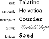
Examples of these typefaces are shown in Figure 5-12.
Figure 5-12. Generic font families

Let's say you want to select the typeface Palatino. Zapf's Humanist 521 is generally held to be a high-quality variant of Palatino. Book Antiqua, a clone from the Monotype foundry, is not as carefully designed, but it's fairly sturdy. There are also cheap knock-offs variously called Palisades or Palestine. If neither Palatino nor any of its kin can be found, Times New Roman is a handy substitute. (It doesn't have much in common with Palatino other than being another serif font, but at least it's closer than Helvetica.) Times New Roman is sometimes found as Times Roman, TmsRmn, or Times.
Now you must decide how to order your list. There is a trade-off between including Palatino clones of doubtful quality, or keeping the list short in favor of radically different, but higher-quality, alternative typefaces. Three approaches might be:
font-family: Palatino, "BT Humanist 521", "Book Antiqua", Palisades,
    "Times New Roman", "Times Roman", Times, serif;

font-family: Palatino, "Times New Roman", serif;

font-family: "BT Humanist 521", Palatino, serif;
Note that font names with spaces must be quoted. Capitalization is not necessary.
The first option offers the most alternatives, but by including Palisades it risks diminishing the appearance of the document. The second is much shorter, and says, "If I can't have Palatino, then just use Times New Roman." The third ambitiously strives for BT Humanist 521, but will settle for common Palatino. All of these include the serif generic as a last resort, letting the system pick any serif font if all else fails.
5.4.5.2 Font size
The size of a font is determined by the font-size property. The value can be given in absolute units (points, usually) or relative units (percentages or ems of the parent's font). You can also use semi-absolute keywords:
- xx-small
- x-small
- small
- medium
- large
- x-large
- xx-large
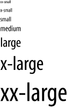
The CSS specification recommends that CSS processors display each size 1.2 times larger than the previous one (so that xx-large would be 3.6 times the size of xx-small), but the actual sizes are left to user preference. This provides a nice way to specify sizes relative to your audience's comfort levels, at the cost of losing absolute precision. Figure 5-13 shows how these different font sizes might look.
Figure 5-13. Font sizes

Relative keywords are also available:
- larger
- smaller
These move the size up or down by a size factor.
5.4.5.3 Line height and font size adjustment
Whereas font-size determines the size of characters being displayed, the line-height property affects the total height of the font plus the whitespace above it. If the line-height is greater than the font-size, the difference is made up by adding space evenly to the top and bottom of each line. This makes the block look either looser or more condensed.
In the following example, we have specified single space, double space, and one-and-one-half space between lines:
para1 { line-height: 1 }
para2 { line-height: 2 }
para3 { line-height: 1.5 }
Fonts with the same point size can look bigger or smaller, depending on various characteristics summarily referred to as the eye of the font. Chief among these is the x-height, or ex. In Latin (read: European) fonts, ex is the height of a lowercase x. (Other fonts use different criteria, but it's always a fraction of the font size, or em.) As a result, some fonts appear bigger than others.
For the obsessive designer, there is a way around this problem. The font-size-adjust property can be used to tweak the sizes of fonts in the font-family property. The aspect value is the ratio of the x-height to the font size. If you provide the aspect value of your desired font, expressed as a decimal fraction, as the value of font-size-adjust, the browser can adjust substitute fonts to have the same apparent size as the desired font.
5.4.5.4 Font style and weight
Font families contain variants that allow an author to add emphasis or meaning to parts of the text. There are two kinds of variants: font style (italic, oblique) and font weight (light, bold).
The font-style property has four possible settings:
- normal
-
The traditional, upright version of the font.
- italic
-
An italic version of the font, if available, or the oblique version.
- oblique
-
The oblique version, if available, or the normal font with a slight slant effect.
- inherit
-
Whatever setting the parent element has.
The CSS specification is not clear on the effect of italic on languages without a tradition of italics; as a result, it is probably best to specify an alternative typeface for other languages:
em { font-style: italic }
em:lang(ja) { font-family: ...;
              font-style: normal }
The font-weight property controls how bold or light a font is. The following keyword values are defined:
- light
-
A light and airy version of the font, if available. Otherwise, the user's system may generate one automatically.
- normal
-
The standard variant of the font.
- bold
-
A darker, heavier version of the font, if available. Otherwise, the user's system may generate one automatically.
There are also relative keywords, which decrease or increase the weight with respect to the parent's property:
- lighter
-
Decreases the weight by one increment.
- bolder
-
Increases the weight by one increment.
Nine weight increments are available, so lighter and bolder can fine-tune weight by 1/9 of the range. Alternatively, a numeric value can be used, ranging from 100 to 900 (in steps of 100). Not every font has nine weights, so changing the number by 100 may not have a visible effect. The value 400 corresponds to normal, and bold is set to 700. Figure 5-14 shows some font styles and weights.
Figure 5-14. Font styles and weights

5.4.5.5 Color
Color is an important feature for text, especially with computer displays. Text has two color properties: color for the foreground, and background-color for the background.
There is a bevy of predefined colors you can call by name. Alternately, you can specify a color using a three-number code where the numbers correspond to values for red, green, and blue (RGB). These numbers can be percentages, integers from 0 to 255, or hexadecimal values from #000000 to #ffffff. Some examples are given in Table 5-1.
|
Preset Name |
Percentages |
Integers |
Hexadecimal |
|---|---|---|---|
|
aqua |
rgb(0%,65%,65%) |
rgb(0,160,160) |
#00a0a0 |
|
black |
rgb(0%,0%,0%) |
rgb(0,0,0) |
#000000 |
|
blue |
rgb(0%,32%,100%) |
rgb(0,80,255) |
#0050ff |
|
fuchsia |
rgb(100%,0%,65%) |
rgb(255,0,160) |
#ff00a0 |
|
gray |
rgb(65%,65%,65%) |
rgb(160,160,160) |
#a0a0a0 |
|
green |
rgb(0%,100%,0%) |
rgb(0,255,0) |
#00ff00 |
|
lime |
rgb(0%,65%,0%) |
rgb(0,160,0) |
#00a000 |
|
maroon |
rgb(70%,0%,32%) |
rgb(176,0,80) |
#b00050 |
|
navy |
rgb(0%,0%,65%) |
rgb(0,0,160) |
#0000a0 |
|
olive |
rgb(65%,65%,0%) |
rgb(160,160,0) |
#a0a000 |
|
purple |
rgb(65%,0%,65%) |
rgb(160,0,160) |
#a000a0 |
|
red |
rgb(100%,0%,32%) |
rgb(255,0,80) |
#ff0050 |
|
silver |
rgb(90%,90%,90%) |
rgb(225,225,255) |
#d0d0d0 |
|
teal |
rgb(0%,65%,100%) |
rgb(0,160,255) |
#00a0ff |
|
white |
rgb(100%,100%,100%) |
rgb(255,255,255) |
#ffffff |
|
yellow |
rgb(100%,100%,0%) |
rgb(255,255,0) |
#ffff00 |
5.4.6 Generated Text
Automatically generating text is an important capability of stylesheets. We have seen an example where a warning sidebar was created with an automatically generated "WARNING!" header. The general form of a text-generating property is:
content: string1 string2 ...
Each string is either a quoted value (like "WARNING!") or a function that creates text. Some of these text-creating functions are:
- url( locator)
-
This function opens a file at a URL given by locator and inserts the contents of the file at that point in the text. This is useful for including boilerplate text.
- attr( attname)
-
This function inserts the value of an attribute with name attname.
- counter( name)
-
This useful function reads the value of an internal counter with the label name and converts it to text.
5.4.6.1 Counters
Counters in CSS are variables that hold numeric values. They are used for chapter numbers, ordered lists, and anything else that needs to be labeled with a number. To use a counter, you have to give it a name and tell CSS when to increment it using the property counter-increment. You can get the value of the counter any time with the counter( ) function. For example:
chapter { counter-increment: chapnum }
chapter > title:before { content: "Chapter " counter(chapnum) ". " }
Here, we create a counter called chapnum and increment it every time the CSS processor sees a new chapter. The title element is rendered with this number just before it, like this:
Chapter 3. Sonic the Hedgehog
counter-reset is another property that affects counters. It sets the counter value back to zero when the element is processed. This can be used for things like numbered lists, where you want each list to start at 1 instead of incrementing through the whole document:
numberedlist { counter-reset: list_item_number; }
listitem { counter-increment: list_item_number; }
listitem:before { content: counter(list_item_number) ". "; }
Now, each list will start counting at 1:
First list:
  1. Alpha
  2. Bravo
  3. Charlie
  4. Delta

Second list:
  1. Fee
  2. Fi
  3. Fo
  4. Fum


