Using the DateTimePicker Control
The DateTimePicker control offers a more compact user interface than the MonthCalendar control by displaying the current date in a text box that’s similar to a drop-down combo box control. When the user clicks the down arrow, a MonthCalendar control is displayed. Unlike the MonthCalendar control discussed in the previous section, the DateTimePicker control displays only a single month at a time, as shown in Figure 15-8.
 Figure 15-8.
The date reflected by the control is available through the Value property, which is typed as a DateTime object, as shown here:
DateTime selectedDate = startTimeDatePicker.Value;
In addition to the Value property, which can be used to set or read the current status of the DateTimePicker control, the Value property’s type has the following read-only properties, which can be used to retrieve time and date components:
-
Year
-
Month
-
Day
-
DayOfWeek
-
Hour
-
Minute
-
Second
-
Millisecond
Two additional properties are used to control the visual appearance of the DateTimePicker control:
-
ShowCheckBox Specifies whether a check box should be displayed inside the control. When the check box is selected, the control is enabled. When the check box is cleared, the control appears to be disabled.
-
ShowUpDown Specifies whether the down arrow should be replaced by an up-down control that’s used to scroll individual components of the time and date.
The DateTimePicker control supports several formatting options for displaying the date and time. By default, the formatting displays the date in the long format, as in Thursday, May 13, 2004. (This format will vary slightly depending on the culture and date format preferences set by the user.) The display format is controlled by the control’s Format property, using one of the values from the DateTimePickerFormat enumeration, listed in Table 15-7.
To display the date in the short format, set the Format property to DateTimePickerFormat.Short, as shown here:
startTimeDatePicker.Format = DateTimePickerFormat.Short;
When the Format property is set to DateTimePickerFormat.Custom, you’re expected to provide a custom format string. The CustomFormat property specifies the manner in which the date and time are displayed in the text portion of the control. The CustomFormat property is set to a string value that contains a combination of the values listed in Table 15-8.
The following code sets the DateTimePicker control to display both the time and date in a custom format:
startTimeDatePicker.Format = DateTimePickerFormat.Custom;
startTimeDatePicker.CustomFormat = "HH:mm:ss MMMM d, yyyy";
The custom format string passed to the CustomFormat property can be a mixture of strings from Table 15-8 and text displayed in the control. You can take advantage of this capability to add new text to display a more descriptive string, as shown in the following code:
startTimeDatePicker.Format = DateTimePickerFormat.Custom;
startTimeDatePicker.CustomFormat = "'The time is' HH:mm:ss MMMM d, yyyy";
A control that uses this custom format is shown in Figure 15-9.
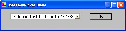 Figure 15-9.


