Hack 67 Hide Low-Quality Settings
![]()
![]()
Increase performance and maintain visual appearance by hiding the effects of a reduction in rendering quality.
There is an inherent trade-off between rendering quality and performance, and Flash offers several rendering modes. Understanding the issues at hand can help you to both make the appropriate choice and work around some of the limitations of the built-in rendering options.
The Flash rendering engine optionally uses antialiasing to smooth out vector edges and increase apparent quality by hiding aliasing errors (a.k.a. "staircasing" or "jaggies"). Antialiasing tends to hide sharp edges between contrasting areas by blending in pixels of intervening shades. In Figure 9-4, the curve on the left exhibits aliasing errors that show up as jagged edges caused by our pixels being too large to faithfully reproduce the curve. The one on the right is antialiased and looks smoother.
Figure 9-4. An aliased curve (left) and an antialiased curve (right)
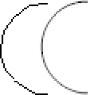
Note that antialiasing doesn't fix aliasing errors but rather hides them from the human eye by using similar colors to smooth the transition between adjacent, contrasting colors.
Antialiasing can be processor-intensive, and you may prefer to turn it off to get the benefit of increased performance.
You can turn antialiasing off globally (i.e., for all content seen in the Flash Player) with the following line:
_quality = "LOW";
You can also set the rendering quality to Low under
File Publish SettingsHTMLQuality. Note
that the MovieClip._quality,
Button._quality, and
TextField._quality properties are merely synonyms
for the global _quality property and therefore
affect antialiasing globally. Quality cannot be set on a per-instance
basis.
Publish SettingsHTMLQuality. Note
that the MovieClip._quality,
Button._quality, and
TextField._quality properties are merely synonyms
for the global _quality property and therefore
affect antialiasing globally. Quality cannot be set on a per-instance
basis.
In addition to "LOW", you can set the
_quality property to "AUTOLOW",
"MEDIUM", "AUTOHIGH",
"HIGH", or "BEST". In the
higher quality settings, text, bitmaps, and vectors are antialiased.
At the lowest quality setting, none are antialiased. The exact
details of each level of quality can be found in the Help panel
(HelpHelp or F1) if you search for
"_quality." In practical terms, use
the highest quality that your content and target
audience's machines allow. This generally means
using "BEST" for largely static sites,
"HIGH" or "MEDIUM" for most
general content, and "LOW" where speed is a
priority, such as in games.
You can also make Flash selectively turn antialiasing off via the Auto High and Auto Low quality settings. At those settings, the Flash Player automatically switches between antialiased and aliased rendering depending on the playback performance of the machine on which it is running. The Auto High setting starts with antialiasing on and turns it off if overall performance suffers (i.e., the frame rate slows down unacceptably), whereas the Auto Low setting starts with antialiasing off but turns it on if the target frame rate is achieved.
The Auto quality settings are not often used because the change from high to low quality is usually very obvious and disconcerting to the user. For best performance, the trick is to permanently set the quality to Low and then try to hide, as far as possible, the resulting low-quality rendering.
Use Noncontrasting Colors
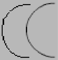
Given that antialiasing is needed most when contrasting colors are adjacent to each other, one solution is to use noncontrasting colors to begin with. In Figure 9-5, the aliased line (on the left) should look less blocky than in Figure 9-4 because the black curve is similar in color to the gray background (the difference is more apparent on screen than in print). Of course, by definition, reducing the contrast makes the curve harder to distinguish from the background, so don't make the background too similar in color. If necessary, you can improve contrast by making the line thicker or darker.
Figure 9-5. Aliased (left) and antialiased (right) curves on a low-contrast background
When attempting to improve apparent quality by using noncontrasting colors, you should avoid some color combinations:
Black on white and black on yellow are the two most contrasting color combinations and should be avoided. Black and yellow is the most contrasting (which is why bees and hornets have black and yellow stripes as a warning coloration and why the phone company chose it for the yellow pages).
The human eye is most sensitive to green and can differentiate between close shades of green better than shades of red or blue. Other things being equal, avoid greens when using low quality settings.
There are several types of color blindness (and infinite variations along the spectrum), but the most common deficiency is an inability to perceive the difference between red and green. So avoid red-on-green or green-on-red color schemes. For more information on color schemes appropriate for color-blind users, see Toledo-Bend (http://www.toledo-bend.com/colorblind ), which discusses various color perception deficiencies.
Use Horizontal/Vertical and Fast-Moving Shapes
Other ways to hide low-quality (aliased) vectors include making sure your Flash movie assets, whenever possible, use rectangular fills, are moving quickly, or consist of horizontal and vertical lines only.
Horizontal and vertical lines, including the edges of rectangles, do not need antialiasing, and you simply can't see the aliasing on something that is moving quickly. The latter point can be used in Flash video games. When you are at the title screen or game instructions, a quality setting of High or Best can be used without compromising performance, but once you get into the game, fast graphics become important, so you will be more likely to switch to Low quality. Additionally, if your game is moving fast enough (and you have only horizontal- and vertical-shaped static graphics, such as the Pacman maze), the user may not even notice the switch in quality.
Some caveats, however: if designing output for video, avoid 1-pixel horizontal lines. Because video for broadcast TV is interlaced, lines should be at least 2 pixels thick to avoid flickering. Even for online video playback, certain compression schemes have trouble with extremely thin lines. So perform tests before committing to your final design.
Also, even perfectly horizontal and vertical edges can benefit from aliasing to soften their edges. This is especially true for vibrant colors (particularly the primary colors when shown on a white background), which appear to bleed when given a hard edge.
Use Pixel Fonts
Turning on text antialiasing (which occurs to varying degrees when using any quality setting except Low), especially for large amounts of text or moving text, can really tax the processor. On the other hand, using aliased text in fonts designed for printing can result in poor onscreen appearance. Conversely, antialiasing can make text harder to read at small point sizes (below, say, 8-point text, depending on the font).
If using a lot of text or small text, you should use pixel fonts, which are fonts designed for onscreen that look better without antialiasing, as shown in Figure 9-6.
Figure 9-6. Pixel fonts and small fonts look better without antialiasing
For general information on pixel fonts, see the Web Page Design for Designers site's pixel font FAQ (http://www.wpdfd.com/pffaq.htm) and primer on pixel font typography (http://www.wpdfd.com/wpdtypo3a.htm).
There are a number of free resources dedicated to Flash-specific pixel fonts, including:
miniml (http://www.miniml.com) offers miniml fonts, a collection of vector-based pixel fonts.
Fonts for Flash (http://www.freepixelfonts.com/faqs.html) has a Flash-specific FAQ on pixel fonts.
Best Flash (http://www.bestflashanimationsite.com/pixel-fonts) offers links to Flash-related pixel font resources.
Final Thoughts
As you will realize when trying to create complex animations with Flash, there are limits to how fast Flash can render vectors. Reducing the image quality by turning off antialiasing (using a quality setting of Low) is one of the quickest ways to improve performance, but it seriously affects those crisp vector edges for which Flash is famous. As we have seen here, you have several options to minimize or hide the effects of this loss of quality. You might even incorporate the aliasing into your design to give it a retro feel. Of course, changing the rendering quality isn't your only option. The remaining hacks in this chapter present other ways to optimize performance.


