Creating Shadows
Going several steps beyond most word processors that simply offer a shadow feature, Premiere lets you define your shadows' characteristics to the nth degree.
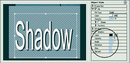
The Shadow tools are in the bottom drop-down menu within the Object Style window. I've highlighted them in Figure 8.17. Here they are, in order:
Opacity? Usually shadows are less opaque (more transparent) than the text "throwing" the shadows.
Color? Intuitively shadows are black or dark gray, but in real life shadows falling on grass have a green hue. You can mimic that by the selection of the shadow's color.
Angle? The shadow's direction is relative to the text in degrees. You'd think that 0 (or 360) degrees would throw the shadow above the text, and 90 degrees would mean the shadow would fall perpendicularly to the right. But Premiere takes a different view. Not only do the angles move counterclockwise but 0 degrees is to the right (at what most of us would consider 90 degrees?east of the text), 90 degrees is up (go figure), 180 is left (west), and 270 is down (south).
Distance? This is how far the shadow falls from the text. A setting of 10 is a good starting point.
Size? Self-explanatory. A setting of 0 equals the size of the original text. Each unit of 10 about doubles the width of the shadow.
Spread? This helps you replicate soft lighting. Sharply focused light sources create clearly defined shadows. Soft lighting throws less distinct shadows. Increasing the spread softens the shadow by diffusing it. It also gives the illusion that it's falling a bit farther back from the text.
Figure 8.17. The Shadow tools.

Task: Experiment with the Shadow Effect
Start by turning off the Show Video button. This makes it easier to see the shadows. By step 7, your text should look like Figure 8.18. Here are the steps for this task:
Either change your currently selected text into a solid color or create some solid-color text.
Turn the Shadow effect on by checking its box. Note that all the default values are 0 (except Opacity) so no shadow should appear under your text just yet.
The first order of business is to set a distance for your shadow; otherwise, it will remain out of sight "behind" your text. A setting of 10 is a good starting point.
Set an angle. A "comfortable" angle is 315 degrees (falling down and to the right).
Set the size at something greater than 0 but not too large. A setting of 5 is a good starting point. It's just a little larger than the text.
Set the opacity at something less than 100% (50% looks "realistic").
Change the Spread setting. A value of 20 takes the hard edge off your shadow. Changing the opacity has a similar effect but does not give your shadow that realistic soft edge achieved when using Spread.
Figure 8.18. Text with full shadow effects.