Configuring Component Properties
As you're well aware by now, most graphical elements used in a Flash application have configurable properties that ActionScript can access and change while the application is running. For example, movie clip instances have properties that allow you to change their position, rotation, and transparency. Because components are usually nothing more than enhanced movie clips, it's obvious that they too have configurable properties that can be accessed and changed while a movie plays; however, due to their enhanced nature, working with component properties is slightly different from working with standard movie clip instance properties.
Component properties can be categorized into two groups: properties that are common to all component instances (to Macromedia-based components, at least), and properties that are unique to each type of component. Let's look at both.
NOTE
You may have installed some third-party components that don't abide by the following guidelines. This discussion focuses on the use and capabilities of the components that come pre-installed with Flash.
Common Properties
In Lesson 7, "Creating Custom Classes," you learned about object-oriented programming. In this lesson, you put that information to use. How? Well, as already mentioned, most component instances have a set of common properties. This is because most components inherit properties from the UIComponent class, which itself inherits properties from the UIObject class. Both of these object classes are automatically and invisibly added to your project whenever you add a component instance. Let's break down this concept by looking at the Button component.
First, UIObject is an object class that defines a number of properties:
UIObject.bottom

UIObject.left

UIObject.right

UIObject.scaleX

UIObject.scaleY

UIObject.top

UIObject.visible

UIObject.width

UIObject.x

UIObject.y
The programming that gives these properties meaning exists within the UIObject class definition.
Next, the UIComponent class is set up to extend (inherit) all the functionalities of the UIObject class. This means that any properties of the UIObject class become available as properties of the UIComponent class. But the UIComponent class doesn't just inherit all of the properties of the UIObject class; it also defines some of its own:
UIComponent.enabled

UIComponent.tabIndex
As a final step, most component classes (CheckBox, Alert, RadioButton, and so on) inherit or extend the UIComponent class. This means that most component classes not only inherit the enabled and tabIndex properties of the UIComponent class, but also all of the properties of the UIObject class, because the UIComponent class extends the UIObject class. In the end, this means that most component instances you place in your project have the properties x, y, visible, top, bottom, enabled, tabIndex, and so on. Again, this entire inheritance process occurs invisibly whenever you place a component instance in a project.
Because most component instances share these common properties, it's easy to affect any component instance using a common syntax, as the following example demonstrates:
myButton_pb.enabled = false;

myRadioButton_rb.enabled = false;

myListBox_lb.enabled = false;
No matter what kind of component instance you're scriptingButton, RadioButton, or some other component instancethe enabled property is used in the same way and affects the component instance in the same manner across the board.
Component properties let you control various aspects of a component instance, including its size, position, and visibility; or they can be used to access property information pertaining to a particular component instance. For example, the following script assigns a value to myVariable based on the rightmost position of the component instance named myButton_pb:
var myVariable:Number = myButton_pb.right;
Component-Specific Properties
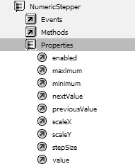
In addition to common properties, each component class has its own set of unique properties that allow you to work with an instance of that component class in specific ways. For example, the NumericStepper component class has properties named maximum, minimum, and stepSize. These properties have meaning only in the context of scripting NumericStepper instances. Attempting to use the stepSize property in relation to a RadioButton instance is an exercise in futility. It just won't do anything.
NOTE
There are too many component-specific properties to list here. For a complete listing of the properties of a component class, look up its entry in the ActionScript dictionary. Component-specific properties can also be found under each component listing in the Actions Toolbox section of the Actions panel.

Using ActionScript in the following exercise, you'll set the initial property settings for most of the components in an application.
Open Components1.fla in the Lesson10/Assets folder.
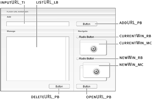
This project contains three layers: Background, Components, and Actions. The Background layer contains all the non-component content in the project. This includes a static image of the URL manager's interface as well as two movie clip instances named currentWin_mc and newWin_mc. The Components layer contains all the components used in the project. A TextInput component named inputURL_ti accepts text input from the user; a List component instance named listURL_lb displays a list of items; three Button component instances named addURL_pb, deleteURL_pb, and openURL_pb work similarly to buttons; and a couple of RadioButton component instances named currentWin_rb and newWin_rb work in the same manner as HTML radio buttons.

Although certain component instance properties can be configured within the authoring environment by using either the Component Inspector or the Property Inspector, the component instances in this project have only been given instance names. We'll use ActionScript to completely configure these instances, including their initial properties. Before you begin scripting, it's important for you to have a general idea of how this application will work.
When the application is finished and played within a browser window, the user can enter a URL (www, ftp, or mailto) into the inputURL_ti component instance and then click the addURL_pb component instance, which displays the URL in the listURL_lb component instance. All added URLs appear in the listURL_lb component instance. When the user selects a URL from the listURL_lb component instance, he or she has two choices: clicking the openURL_pb component instance opens the URL in either the current browser window or a new one (depending on whether the currentWin_rb or newWin_rb radio button is selected); clicking the deleteURL_pb component instance deletes the selected URL from the list. As the user interacts with the application, these various component instances are enabled and disabled dynamically, depending on the task the user is trying to accomplish. The finished application will have a few more capabilities, as you'll discover the further we progress.
To help you see how an unscripted version of the project looks and feels, let's do a quick test.Choose Control > Test Movie.
Within the testing environment, notice that the application doesn't look any different now than it did in the authoring environment. All the Button component instances display the word Button, and each of the RadioButton instances displays the words Radio Button. If you try to interact with any of the elements, some of them glow green (dubbed haloGreen by the folks at Macromedia) when you move the pointer over the element or click it; otherwise, they don't do much. Over the next several exercises, this application will come to life in many ways. Along the way, you'll also be swapping the green glow effect for another effect.
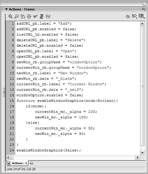
We have a lot of work to do, so let's get started.Close the test movie and return to the authoring environment. With the Actions panel open, select Frame 1 of the Actions layer and add the following script:
addURL_pb.label = "Add";

addURL_pb.enabled = false;
These two lines of script set the label and enabled properties of the addURL_pb Button component instance. The label property controls the text displayed on the button. Setting the enabled property to false disables the button. You can't interact with the button in this state; it appears dimmed, indicating to the user that the button is disabled, much like operating system interface elements appear in a disabled state.
The reason we're disabling this button initially is because it has no use until the user types a URL into the inputURL_ti TextInput component instance. When the movie first plays, that instance is devoid of any text; therefore, it makes sense that the addURL_pb instance should be disabled. Later, we'll add scripts that enable and disable this instance, depending on how the user interacts with the interface.Add the following script at the end of the current script:
listURL_lb.enabled = false;

deleteURL_pb.label = "Delete";

deleteURL_pb.enabled = false;

openURL_pb.label = "Open";

openURL_pb.enabled = false;
These five lines of script do nearly the same thing as the two lines of script in Step 3 of this exercise. The first line disables the listURL_lb List component instance; the remaining four lines set the label values for and disable the deleteURL_pb and openURL_pb Button component instances, respectively.Add the following script at the end of the current script:
newWin_rb.groupName = "windowOption";

currentWin_rb.groupName = "windowOption";

newWin_rb.label = "New Window";

newWin_rb.data = "_blank";

currentWin_rb.label = "Current Window";

currentWin_rb.data = "_self";

windowOption.enabled = false;
These seven lines of script set the initial properties of the two radio buttons named newWin_rb and currentWin_rb.
NOTE
You may have noticed that the script in Step 5 sets the New Window button before setting the Current Window button, yet they appear in the opposite order in the application, with the Current Window button on top. Scripting is an abstract process that really has little to do with the way things are positioned on the stage.
The first two lines set the groupName property for each radio button instance. Radio buttons in most programming environments (including Flash) are designed to work within groups. Clicking a particular radio button in the group automatically deselects the previously selected button in the group, thus allowing only a single radio button in the group to be selected at any time. To facilitate this functionality, each radio button must be associated with a group. The groupName property sets the association. Both of our application's RadioButton component instances are assigned to the windowOption group. This group didn't exist before, and is created by using this script. As a result of associating the two RadioButton instances to the same group, only one can be selected at any time. The purpose of these instances is to allow the user to choose whether to open a URL in the current browser window or open a new window. This is important to remember as we discuss the remaining lines of the script.
NOTE
By default, all RadioButton instances added to a project belong to the same group (named radioGroup). Therefore, the RadioButton component instances in our project initially had the single-selection functionality that we just discussed.
The next four lines set the label and data properties for the newWin_rb and currentWin_rb instances. Similar to the label property for Button component instances, the label property for RadioButton instances allows you to set the text that appears next to the instance. The data property lets you assign a value to the instance. This value is assigned to the group of which the instance is part whenever that instance is selected. This can be a tricky concept to understand, so let's look at it a bit more closely.
Remember that both of the RadioButton component instances are assigned to the windowOption group. Because the newWin_rb instance is given a data property value of "_blank", selecting that instance assigns that value as the windowOption group value. Thus, the following script:
var myVariable:String = windowOption.getValue();
assigns a value of "_blank" to myVariable. The significance of this fact will be explained later in this lesson.
The last line in the script disables both the radio button instances. We could have disabled each instance individually using this syntax:
newWin_rb.enabled = false;

currentWin_rb.enabled = false;
but we can easily disable all instances belonging to our group with a single line of code because they're both part of the windowOption group.
As a result of the code we've added so far, all the component instances within our project, except for inputURL_ti, will initially be disabled. The only interface elements left to disable are the two movie clip instances named newWin_mc and currentWin_mc, which are graphical elements associated with our radio buttons. We want these movie clip instances to always appear in the same state (enabled or disabled) as our radio buttons. Because they're movie clip instances and not component instances, they don't have built-in enabled properties that can be set. We can get around this limitation, however, with a function.Add the following function definition at the end of the current script:
function enableWindowGraphics(mode:Boolean){

  if(mode){

    currentWin_mc._alpha = 100;

    newWin_mc._alpha = 100;

  }else{

    currentWin_mc._alpha = 30;

    newWin_mc._alpha = 30;

  }

}
This function, named enableWindowGraphics(), accepts a single parameter value of true or false. A conditional statement within the function checks this value when the function is called and makes the movie clip instances completely opaque if the function is true, but nearly transparent if it's false (which will cause the movie clip instances to appear dimmed, similar to a disabled component instance). This function is an acceptable substitute for the missing inherent enable property.Add the following function call at the end of the current script:
enableWindowGraphics(false);

This function call will cause our two movie clip instances to initially appear disabled, similar to the component instances we scripted in Steps 35.
Let's test our project up to this point.Choose Control > Test Movie.
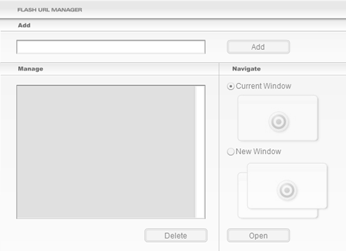
Several things occur as soon as the movie begins to play. Most of the interface elements are disabled intitially, and the various component instances with label properties display the text labels we assigned to them.
As you can see from this exercise, working with properties of component instances is simple and straightforward.
Close the test movie and save your file as Components2.fla.
We'll continue building on this file in the exercises that follow.


