Manual Kerning
|
To adjust kerning manually, insert your Type Tool between two characters. Press Option+Left/Right Arrow (Alt+Left/Right Arrow) to decrease or increase the kerning between two characters. This method kerns using the increment specified in your Units and Increment Preferences. The default kern increment is 20/1000 of an em, which is too coarse. Do yourself a favor and change this increment to 5 in your application Preferences. Because these adjustments are in relative units, a kerning or tracking adjustment made at one point size will have proportionally the same effect at any other point size. Holding down Cmd (Ctrl) when using these keystrokes multiplies the kerning increment by five. To adjust tracking manually, follow the same steps but with a range of text selected. As your type gets larger, any irregular spacing between characters becomes more noticeable. Manual intervention may be required. Possible candidates for kerning include:
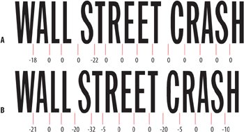
Figure 5.6. A headline in Franklin Gothic Condensed with Metrics Kerning (example A) and with manual kerning added (example B).
Figure 5.7. A script typeface without manual kerning (example A) and with manual kerning (example B).
|