Tracking
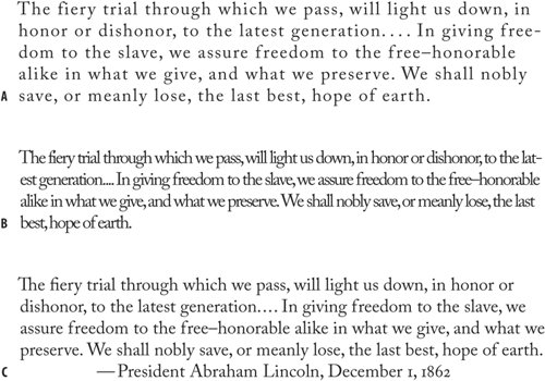
This chapter is also about trackingadjusting the letter spacing across a range of characters. Tracking can be applied as part of a style sheet definition. Tracking, a cousin to kerning, is an overall increase or decrease in letter spacing over a range of characters. Tracking can also be applied locally to fix widows and orphans by (imperceptibly) tightening the letter spacing across a range of words and "pulling back" a short line. Tracking values can also be applied "globally" as part of a style definition to give the type a denser or airier look (Word and Character space options in the Justification dialog can give you the same effect). Remember, when you do this you are overriding what the type designer, who slaved long and hard over his or her font, considered the optimum character spacing. Tracking body text is like taking a musician's composition and playing it at a different tempo. Track your body text and you could be breaking some poor font designer's heart. If you do use negative tracking as part of a style definition, pay careful attention to what happens to pairs like rn; tracked too tight these might look like an "m," ri might look like an "n," and cl like a "d." Then there is the other extreme. Track type too loosely and you disrupt the relationships between the letters that readers rely on. The letters no longer form the familiar shapes of words or phrases, but are merely a scattershot of disconnected characters. Spacing your letters too loosely might not seem like such a big deal to a lay person, but typographers get quite upset about such practices. The American typographer Frederick Goudy famously said, "Men who would letter-space lower case would steel sheep." Reputedly, that's the sanitized version of the quote. Figure 5.9. Type tracked too loosely (example A), too tightly (example B), and without tracking (example C).
Tracking is best used in moderation. If you're tempted to use tracking often, consider using a condensed typeface that has been designed with the efficient use of space in mind. Note Kerning and tracking are cumulative; they don't cancel each other out. You can use tracking to adjust the overall look of your type, and use kerning to adjust particular letter combinations. To track a range of type, highlight the type and press Option+Left Arrow (Alt+Left Arrow) to go tighter, Option+Right Arrow (Alt+Right Arrow) to go looser. As with kerning, the default increment of 20/1000 of an em is too coarse, so it's a good idea to change this in your application Preferences. |