Chapter 17. Text Wraps: The Good, the Bad, and the Ugly
|
TEXT WRAPS ARE A FANTASTIC WAY to add emphasis to a picture and create a lively page design. An uninteresting picture can become an intriguing shape; a boxy layout can become unique and exciting. However, like most tricks, text wraps should be used sparingly. It's shockingly easy to make a bad text wrap. Once you start looking out for them you realize they are everywhere. What frequently seems to get overlooked is that when you place a graphic inside a block (or blocks) of type, you narrow the column measure. All your careful planning of type size to column width ratio goes out the window. So while it doesn't require rocket science to make a good text wrap, it does take some considerationand often some tweaking. Figure 17.1. Different Types of Text Wraps:A. None B. Wrap Around Bounding Box creates a rectangular wrap around the bounding box of the wrap object. C. Wrap Around Object Shape creates a text wrap around the contours of the wrap object. D. Jump Object keeps text from appearing to the right or left of the wrap object. E. Jump to Next Column forces all text below the wrap object to the next column or text frame. F. Offset determines distance between wrap object and text. Positive values move the wrap away from the edges of the frame. Negative values position the wrap boundary inside the edges of the frame or object. [View full size image] 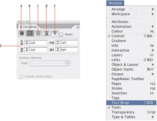
|


