A Typical Style Sheet
|
This type of style sheet would be appropriate for a magazine or newspaper publication. These are just the basic styles; typically there would be styles defined for all standard type elements. Head1Heads will likely be in the bold or even black weight. Depending on the typeface, they may be negatively tracked and tightly leadedcontributing to a dark type color. The purpose of the Head1 headline is to make the reader want more. Typically such headlines do this by posing a question or telling partthe best partof the story. Head2A secondary level head or subhead will be in the same typeface as the first-level head, its size reduced to indicate a lower level on the hierarchy and space added before (and possibly after) to separate it from the preceding text. The secondary level head will help the reader navigate the body text and break it up into chunks to provide visual relief. Head3A third level of heading could be a run-in head, one in which the heading is part of the same paragraph as the body text that follows. The run-in head would need to be a Character Style, which could be nested in the paragraph style definition. BodyThis will likely (though not necessarily) be a serif face in the regular or book weight at a size of 8 to 11 points. First line indents indicate the beginning of a new paragraph. Body No IndentBased on Body, with first line indent set to 0. Body FirstBased on Body, with no first line indent and with some kind of drop cap treatment. BylineThe author's credit, typically based on body style, differentiated by bold weight and paragraph spacing above and/or below. CaptionWith so many competing demands on peoples' time, captions may be what people read first, so a caption should provide enough information for the browsing reader to decide whether to continue reading. More than just stating the obvious, a caption should clearly establish the relationship between the image and the text. IntroIn magazines, to create an entry point for the reader the opening paragraph, or the first lines of the opening paragraph, are often set in larger type, possibly in bold type, possibly in a contrasting font. Often this intro paragraph will be set over a wider measure than the body text. Sometimes the byline will be incorporated into this first paragraph. Picture CreditCan be as small as 5 or 6 points, often rotated 90 degrees. Pull QuoteA pull quote is an excerpt "pulled" from the text and used as a graphic element. Pull quotes are intended to catch and hold the reader's interest. They should be thought-provoking and succinct. Pull quotes also add visual interest to a layout, especially when you have few photographs or illustrations to work with. The pull quote is display text. It should offer a strong visual contrast to your body text and be positioned to catch the eye of a potential reader who's skimming or flipping pages. The pull quote should be positioned on or before the page where the excerpted text appears. Long sentences should be edited into tight, provocative pull quote versions. They can be set off with rules, be reversed, set in a contrasting color, or combined with decorative quotations marks. If you put your pull quote in quotation marks, make sure you are not distorting the meaning of the text. See the next chapter for information on formatting pull quotes using Object Styles and Chapter 17: "Text Wraps" for information on how to anchor a pull quote to a specific portion of text. Tip: Getting Rid of Unwanted Styles When you import Word text or Styles from other InDesign documents, you'll likely end up with several unwanted styles in your styles palettes. Leaving these around is apt to create confusioneither for you or for anyone else who may work on the document. You can get rid of them on a case-by-case basis, but the quickest way to zap them all at once is to choose Select All Unused in the Styles palette menu, and then click the Trash button. It gives you that same satisfying feeling you get after clearing out your closets. SidebarAn article that, as the name suggests, typically runs by the side of the main article, though it can mean any supplementary article. It is graphically separate from the main text but contextually linked to it. Sidebar HeadThe heading of a sidebar article. Figure 13.16. Purging those unused (and probably unwanted) styles.[View full size image] 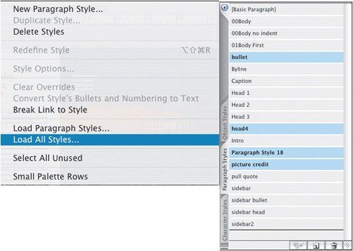
Figure 13.13. Spread showing all in use.[View full size image] 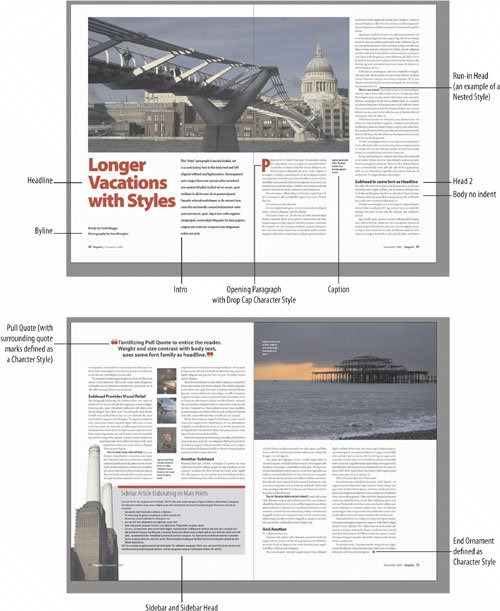
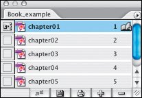
Tip: Printing Out a Style Sheet from Word InDesign offers no facility for printing out the specifications of your Style Sheet, but you can do this using Microsoft Word. In InDesign, create as many blank paragraphs as you have styles. Assign each of your styles to one of these blank paragraphs. Choose File > Export and choose RTF as the file format. Open the text file in Word and choose File > Print. In the Print dialog box, choose Styles from the Print What pop-up menu. Figure 13.14. Book.
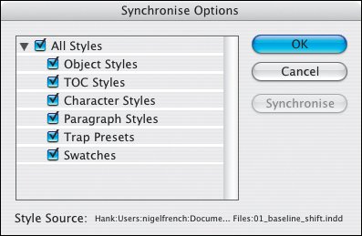
Figure 13.15. In Synchronize Options specify which styles and swatches are copied from the Style Source to the other booked documents, and then choose Synchronize.
Importing Styles from a Microsoft Word DocumentWhen you place a Word document, checking Show Import Options allows you to determine how to handle any Style name conflicts. You can use the InDesign Style Definition (the default) or you can choose to redefine the InDesign Style with the incoming Word definition. For more control, choose Custom Style Import to map specific Word styles to specific InDesign styles. If you already have a style with the same name as the Word style, the style is not imported. Text in the Word document takes on the formatting of the InDesign style with the same name. A nice workflow feature is the ability to save a preseta big time-saver if you import Word files that always use the same style names. Tip Use the same style names in Word and InDesign document and you'll minimize the amount of time you need to spend on reformatting text. Figures 13.17A and 13.17B. Word Import Options A and B.[View full size image] 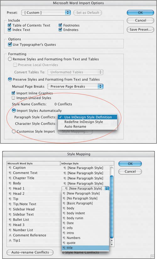
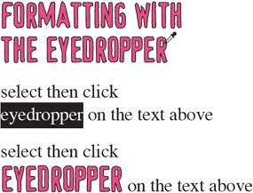
Using the Eyedropper to Create Pseudo StylesNeed to quickly apply the formats of one paragraph to another but don't want to create a style? You can use the eyedropper to sample the character and paragraph formats from one piece of text and apply them to a selected range of text. Simply select the text you want to copy the formats to, then choose the Eyedropper tool and click on the text you want to copy the formats from. This also works with object formats. Note, there is no relationship between the two pieces of text beyond the visual. They are not thereafter controlled by the same style sheet. Figure 13.18. Using the Eyedropper. Select a range of text, and then click with the eyedropper on piece of text to copy its formats. To copy the paragraph attributes only, hold Shift.
|