Assessing the Site: Business Processes
Many clients are unaware of how well their code stacks up against current standards, and it is unlikely that you'll get many projects where the client is willing to pay you simply to upgrade the code from HTML 4.0 to XHTML. In fact, most Web redesign jobs occur because the current site no longer fits the business needs of the site owner. Common examples of a mismatch between the business needs and the site are as follows:
The navigation is confusing. Site users can't find what they are looking for.
Updating the site is too difficult. Many small businesses don't have large IT departments that can update the site. Small-business owners need to update site content, but they lack the knowledge and tools to do so. The site begins to fall behind the business, or the business has to spend disproportionate money to pay for IT human resources.
The look is outdated. Graphic design, like fashion, goes through cycles, and what was cutting-edge a few years ago may look stale today. An outmoded look communicates the wrong message to the business' target constituencies.
The business wants to migrate certain services to the Web that are currently handled through other resources. Many clients want their sites to provide sufficient information to the public to decrease the number of phone calls coming in. For example, many companies deploy Web Knowledge Bases to decrease technical-support calls, while others provide online pricing and sales to decrease sales calls and/or to provide 24-hour service without hiring a whole night crew.
The business is expanding or changing its offerings. If a business offers a whole new class of products or services, the Web site needs to reflect that. In such situations, adding a paragraph or two to an existing page isn't going to cut it. The site needs many new pages, requiring a new site map, navigation system, and so on.
This list, obviously, is not exhaustive, but it illustrates some of the relationships that exist between business processes and Web sites. In most cases, the client wants a site upgrade for many of these kinds of reasons. Ultimately, it is this information that should drive the entire site-revision process. It should enable you and your client to identify the scope of the upgrade as well as each of the particulars about what you should do.
TIP
Take the time to get this information from the client. Some clients are a little lazy about defining what they want. If you don't prompt them for more information, the site you deliver may not meet their needs. Do not expect them at that point to be self-critical enough to recognize that they were not sufficiently forthcoming: The burden is on you to work out all of this up front.
In this task, you'll take a guided tour of the site as it exists. Along the way, I'll role-play the client and point out some of the shortcomings of the site. In this way, this task represents meeting with the client and identifying how the site is out of sync with business needs and processes. As these problems are identified, solutionsthe specific changes and enhancements that you need to make to the sitebegin to materialize. This way, the primary force driving the site upgrade process is the needs of the client, and not something else, such as your own opinion about what the site could be or, as is too often the case, the hottest technology on the market.
Still viewing index.htm, press F12 to open the site in a browser.
The F12 shortcut automatically opens the active file in a browser. Given that what the browser displays often varies from what you see in Dreamweaver, especially when you are working on dynamic content, you need to test often. The F12 shortcut is one of the most used keyboard shortcuts in all of Dreamweaver.
Look over the main homepage.
Graphically, the site design is not bad. The client is not intending to overhaul the look. This particular design is also used in several print advertisements, so the client wants the site to reinforce that branding.
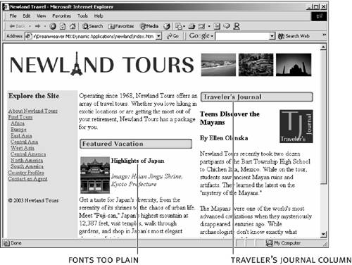
One design aspect that could be improved, though, is the type. The site sticks to HTML tags at their defaults, and as a result, they look a little plain. The client would like the headings to be a little more prominent and possibly in color.
Aside from the design, the page has a significant practical problem. The column entitled "Traveler's Journal" needs to be updated about once a week. Sometimes the owners update this column, other times travel agents update the column. Not everyone knows how to work with the code or upload the files to the site. In addition, the owner does not want to give out the password to enable people to upload new pages. Currently, the journal is written in a word processor and handed off to one of the travel agents who knows how to revise and upload the pages. But this bottleneck prevents the site from being updated promptly, especially when that one agent is busy or not in the office. The client would like to find a way to make the weekly posting of the Traveler's Journal easy enough for everyone to contribute to it, without compromising security.
In the navigation bar on the left side of the screen, click the About Newland Tours link.
Beyond the font issues, discussed previously, this page doesn't need to change. Its content is almost never changed, and the client is happy with it as-is. Beyond upgrading the code to XHTML, a change that won't be visible in most browsers, this is the one page you won't change at all.
In the navigation bar at the top of the screen, click Find Tours. Scroll up and down the page, or use the internal navigation links near the top, to look over the tours.
This page is problematic in many different ways.
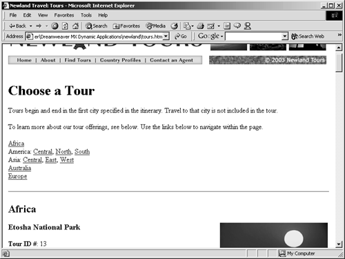
Let's start with the problems that the client faces with a page like this. Once again, the page is hard to maintain, because Newland Tours doesn't have an IT department. This issue is a severe problem from the client's point of view, because the information on this page is the primary source of information users have about the tours. The business problem that the client faces is that the tours changesome get added, some get removed. Worse, prices fluctuate so often that the client decided not to post them at the site, given the difficulty of keeping them up to date and the consequences if they did not. In addition, Newland Tours offers several tours that are not listed here, but no one has had the opportunity to add them. This means that the client is losing business, thanks to the difficulty of maintaining the Web site.
From the user's standpoint, the page is not very usable. It is extremely long, and it is hard to find tours of interest. There is no way to filter tours, other than checking out the tours listed in a particular region. For example, Newland Tours offers some tours that are exercise-intensive and others that are not; users have no way to filter out only those that are exercise-intensive. And, of course, the fact that the prices aren't listed doesn't give the users any way of knowing how much the tours cost, unless they make a phone call.
As developers, we should observe that much of the information on this page is structurally redundant. That is, every tour has a title, an image, a description, and so on. Such a predictable structure should make us think that this information would be better stored in a database and pulled in on the fly. This would simplify maintenance and create the possibility of filtering, which would enhance the page's usability.
In the navigation bar at the top of the page, click the Country Profiles button.
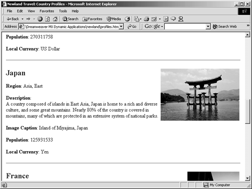
Almost every problem identified on the previous page also exists here. The page is hard to maintain, making it hard for Newland Tours staff to add countries to which they now offer tours. Users may incorrectly assume that Newland Tours doesn't offer any tours to, say, Italy, because it's not on this list. But Newland Tours does offer a tour to Italy, so the Web site is sending a counter-productive message to its users.
The problems also persist for users. Few users will want to learn about all of the countries that Newland Tours serves; they'll just want to see the ones they are interested in. Again, a simple filtering mechanism would make all the difference.
Another usability issue is that to go from a tour about Namibia's Etosha National Park to the Namibia country profile, the user has to scroll back up to the navigation bar, click Country Profiles, and scroll down to Namibia. It would be nice to automatically link from the Etosha National Park information to the Namibia country profile. But that would require extra coding using static HTML.
Return to the navigation bar, and click the Contact an Agent link.
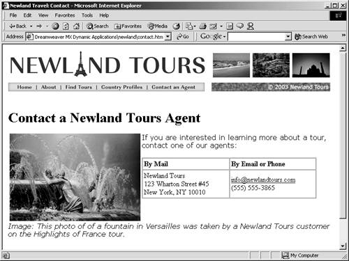
This simple table doesn't change very often, and it's easy enough to use. But the client isn't happy with it for a couple of reasons. This email address is automatically forwarded to every agent, regardless of their area of specialty.
At Newland Tours, each agent specializes in a geographical region. If someone has a question about a tour to South America, there is no need for the agent who serves East Asia to get that email message. As a result, the staff is getting bombarded with email messages, and occasionally an email message gets overlooked, because everyone assumes that someone else will get it.
Exacerbating this problem is that about a month after they posted this email address on the Web page, spammers started flooding the account with weight loss, debt reduction, and other less savory messages.
Another problem is that some of Newland Tours' customers don't have email clients automatically configured or were confused when the email client opened.
The client would like some way for customers to be able to contact Newland Tours without having to rely on an email client configuration. The email message should automatically go to the correct agent, and not to anyone else. Finally, the client would like to find a way to discourage spammers from flooding the accounts with junk.
The solution, of course, is to use a Web form. A form is perfect because it demands very little of the user, it makes it possible to filter the messages to the correct agent, and it is possible to hide the email address, which will prevent spam bots (automated programs that crawl the Web "harvesting" email addresses for spammers) from finding Newland Tours agents' email addresses.