Chart Elements
Before you begin to create charts, you need to be familiar with the chart elements shown in Figure 12.1. Take a few moments to look over the elements of a chart. Figure 12.1 shows a basic column chart with various elements identified.
Figure 12.1. Chart elements.
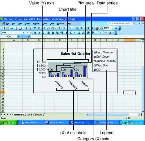
Table 12.1 lists the chart terms and provides an explanation of each chart element that you need to keep in mind when you're working with charts.
Element | What It Is |
|---|---|
Data series | The bars, pie wedges, or other elements that represent plotted values in a chart. Often, the data series corresponds to rows of data in your worksheet. |
X-axis | The number of elements in a series. For most two-dimensional charts, categories are plotted along the Category (X) axis, which is usually horizontal. Categories generally correspond to the columns that you have in your chart data, with the category labels coming from the column headings. |
Y-axis | For most two-dimensional charts, data values are plotted along the Value (Y) axis, which is usually vertical. The y-axis reflects the values of the bars, lines, or plot points. In a two-dimensional bar chart, the axes are reversed, with the values being plotted on the x-axis and the categories on the y-axis. In a 3D chart, the z-axis represents the vertical plane, and the x-axis (distance) and y-axis (width) represent the two sides on the floor of the chart. |
Legend | The element that designates the separate categories of a chart. For example, the legend for a column chart shows what each column of the chart represents. |
Gridlines | The lines that depict the x-axis and y-axis scale of the data series. For example, major gridlines for the y-axis help you follow a point from the x- or y-axis to identify a data point's exact value. |


