Starting Up Illustrator and Revving It a Little
Starting Up Illustrator and Revving It a Little
To get Illustrator running, choose Illustrator from the Start menu (Windows) or double-click the application’s icon (Mac). (The latter method also works in Windows, if you’re a Mac user who happens to be using Windows. Don’t worry; I won’t tell a soul. Honest.)
The Illustrator startup process displays the splash screen — an image to look at while the program is cranking up.
As Illustrator continues the startup process, the flower image disappears and is replaced with something entirely new for Version CS: The Welcome to Adobe Illustrator dialog box, shown in Figure 1-1. The Welcome to Adobe Illustrator dialog box gives the following options to start using Illustrator:
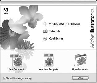
Figure 1-1: The Welcome ?to Adobe Illustrator dialog box.
-
What’s New in Illustrator: This option displays all the new features in the most recent version, with handy tips on how to get the most out of each new feature.
-
Tutorials: A video runs, showing both new features as well as basic ?concepts.
-
Cool Extras: This option takes you to special features in the product ?you may not find otherwise.
-
New Document: Click this icon to display the New Document dialog box (as shown in Figure 1-2).
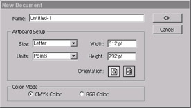
Figure 1-2: The New Document Dialog Box -
New from Template: Illustrator ships with an amazing array of professional templates to get you started creating all sorts of snazzy documents, from logos to brochures to DVD box artwork.
-
Open Document: This option takes you straight to the Open dialog box, so you can open existing artwork in Illustrator.
Before you start a new document, you have to answer a few questions in the New Document dialog box about the name, page size, units of measurement, orientation, and color mode that you plan to use.
What’s in a Name (field)?
You can give your new document a name in the Name field. If you don’t, Illustrator names it Untitled-1, and every new document you create is titled sequentially — Untitled-2, Untitled-3, and so on, until you quit the program. When you relaunch, you’ll be right back at Untitled-1. If you don’t give a name to the new document, you get another chance when you save it. The advantage to naming your document is that if you accumulate a whole bunch of unsaved files (not recommended!), you can’t tell them apart. Besides, you see the name of the document at the top of the document in the Title bar, so you don’t forget what you’re doing.
Page size, units, and orientation
You set your page size by choosing a predefined size from the Size drop-down menu or by typing values into the Height and Width fields. Your page size truly matters only when you’re printing your document directly out of Illustrator. Otherwise, it just exists as a point of reference — a guide to show you how far things are apart from each other. One great thing about Illustrator: For the most part, size doesn’t matter (no, really). When you create graphics for the Web, you can determine the size of the graphic when you save it. When you’re creating graphics for print, most of the time you’ll be creating graphics to be imported into page layout applications, such as QuarkXPress, PageMaker, or InDesign. In the latter case, although it’s always best to size your image in Illustrator, you can scale the graphic to the size you need it in your page layout. In either case, the Web browser or page layout application recognizes your Illustrator drawing, ignoring the page size.
Page size is good for two things: proofing and conceptualization. Often you’ll want to print your artwork on paper directly from Illustrator to get an idea of what it looks like. In this case, set the Size to the size paper you’ve loaded in your printer. While creating graphics, keep in mind the size of the page or browser window that you’re creating for — in this case, set the Height and Width to whatever the target output is. For example, if you’re creating for the Web, you may want to set the size to 640 pixels x 480 pixels, which is a fairly standard size for computer screens, to help you visualize the final artwork. Actually, you can change the size of the artwork to be anything you want, at any time, and that’s one of the great things about creating in Illustrator.
| Tip? |
By default, Illustrator measures image size in points (1 point = 1/72 inch). If that unit of measurement is unfamiliar to you, be sure to select a different unit from the Units drop-down menu. Your ruler also changes (when you choose View→ Show Rulers) units to the type you selected. And although it won’t change the ruler units, you can also type the unit of measurement along with the number when you specify values for page size in the Height and Width fields. When you open a new document, it comes up showing a width in points — say, for instance, 612 pt. If you want to specify a width of 10 inches or 30 centimeters, just type (respectively) 10 in or 30 cm in the Width field. If you don’t know the standard abbreviation for a unit of measurement, you can type the whole word out (for example, 10 inches or 30 centimeters). Illustrator understands what you mean and does the conversion for you. And it will do so wherever you enter a unit of measurement, not only in the New Document dialog box. Smart, very smart! |
CMYK or RGB?
CMYK or RGB? In Illustrator, this question is a bit more significant than the ubiquitous question, “Paper or plastic?” To understand why you have to answer Illustrator’s question, you need a little more history and some technobabble. (Sorry, I’ll try to keep this brief.)
Illustrator has been around for a long time, back when putting color images on the Web was impossible and interactive multimedia was little more than a buzzword. In those days, the main reason for creating documents in color on the computer was so you could print them out in color. Color printing almost always uses a CMYK process — for Cyan, Magenta, Yellow, and blacK inks (the K stands for black because RGB has dibs on B, which stands for blue). These four colors, blended in different amounts, produce the full range of colors you see in printed material. So back then, Illustrator used only CMYK colors because nobody needed to do anything in color besides print.
Then along came interactive multimedia — in effect, the “lights, camera, sound, and action” for computer users. Shortly after that came the Web. Because images used for multimedia and the Web appear only on the computer screen, a need emerged for RGB images. So what’s RGB, already? Okay, I’m getting to that: Computer screens create the colors you see by using electrons to make a coating of phosphors glow Red, Green, or Blue (hence RGB) in different intensities. If you’re creating content for multimedia applications or for the Web, you need RGB images that look good on-screen. You probably don’t give two hoots about CMYK. So Illustrator, trying to please everyone, added the capability to create colors in RGB.
Unfortunately, this new feature didn’t quite please everyone. In fact, it upset some people quite a lot. And left a wake of money wasted, deadlines blown, marriages ruined, lives lost and empires crushed. (Well, okay, that’s a little exaggeration, but only a little.) CMYK and RGB just didn’t get along.
Printing in color meant using the standard four-color printing process: Every image had its own percentage of cyan, magenta, yellow, and black, so four sets of films were made (one for each of those colors); the final printed image combined the colors. Each set consisted of only four single-color plates (C, M, Y, and K) — and that’s all you’d expect to print out. But if your Illustrator file contained any RGB elements (even a few pixels’ worth), you had big trouble: Three additional films would print out — frequently at a cost of $100 or more per film — for every page that contained any RGB colors. If you weren’t paying attention, one mistake like that could cost thousands of dollars. And a lot of people weren’t paying attention because they’d never had to worry about RGB colors in an Illustrator file before. (You can bet they did after that!) To prevent this sort of uproar from happening again, Adobe wisely removed the capability to combine CMYK and RGB colors in the same document. That’s why you have to specify CMYK or RGB before you start a new document. Sure, it’s a hassle, but you’re so much better off having this hassle now, rather than spending money for it later!
So which do you choose, CMYK or RGB? You may think it safe to assume ?that RGB is for multimedia or the Web and CMYK is for print. Okay, that’s a safe assumption, but not necessarily the best assumption. If you aren’t sure where you’re going to output, pick RGB. You can always change to CMYK later if you’re required to, and you’ll be able to print directly to color printers just fine that way.
For the sake of your creativity, choose RGB when
-
You’re creating for the Web or for multimedia: In this situation, you’re always creating work that’s going to be viewed in RGB and you’ve no practical reason whatever to use CMYK.
-
You’re creating for print BUT do not need precise CMYK colors: If you don’t have to specify exact CMYK values while you work, choose RGB. (You can convert to CMYK by using File→Document Color Mode before you print — just don’t forget to, okay?) I know that approach sounds like asking for trouble, but I can give you three good reasons for using RGB this way:
-
Some of Illustrator’s coolest features (including many Photoshop filter effects) only work with RGB color.
-
When you work in RGB, you can use the full range of colors — millions of them — that are possible on the computer. (CMYK only supports mere thousands of colors.) If you’re creating content for both print and the Web, creating the image in RGB gives you the maximum color range possible in both CMYK and RGB.
-
Some desktop inkjet color printers print well in RGB. For example, Epson six color printers print a wider range (gamut) of colors in RGB than in CMYK.
-
For the sake of accuracy, choose CMYK when
-
You need precise CMYK colors: Some artists who create for print use a swatch book of printed CMYK colors. They use only the specific CMYK colors they see in the book because they feel (and rightly so) that this is the only way to get a good idea of what that color will look like when it finally prints. If your designs have to meet such specific requirements, you should always work in CMYK. Some companies specify the exact CMYK colors they want in their publications. If you’re working on a project for one of those companies, use CMYK.
-
You’re creating for grayscale or black and white print: In RGB, shades of gray exist by default as blends of red, green, and blue. If you’re printing with black ink, this blending is a hassle because you always have to work with three colors instead of one. In CMYK, however, you can create shades of gray as percentages of black ink, ignoring all other colors (which you may as well do if they won’t be visible anyway).
After you answer the three magic New Document questions (name, page specs, and color choice), click OK and behold: A blank page opens, inviting you to realize your creative potential. You’re ready to start illustrating. If blank-page syndrome doesn’t faze you and you want to dig into the good stuff right away, thumb over to Chapter 2.


