Part III: Taking Your Paths to Obedience School
Part III: Taking Your Paths to Obedience School
Chapter List
- Chapter 12: Pushing, Pulling, Poking, and Prodding
- Chapter 13: Organizing Efficiently
In this part . . .
Half the battle in Illustrator is creating stuff. The other half is modifying and organizing the stuff you create. This part focuses on manipulating your creations into exactly what you want them to be. You start by selecting and moving pieces of artwork and the individual parts that make up the artwork. Then you can rotate, scale, skew, or mash your art around in a variety of ways. For a really exciting time (adventures in unbridled mutation), you transform one piece of artwork into another by using the Blend tool. Finally, Illustrator reveals a secret of the ages: Organizing is a fun and exciting activity (instead of a tedious chore that devours time like a slo-mo shark) when you use delightful innovations, such as layers, the Align palette, grid tools, and guides.
Color Plate 1
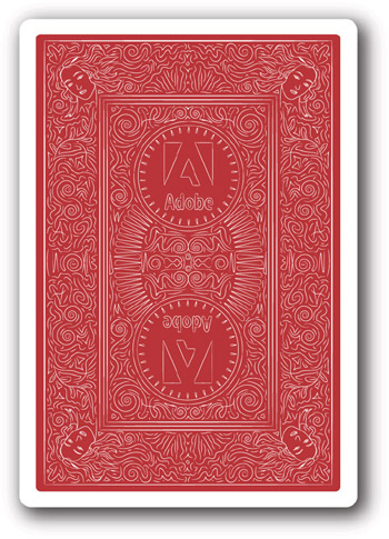
This artwork is created in Illustrator by using the Transform effect set to copy certain sections of artwork and reflect them at the same time. In this way, an object in a corner is modified, and the art in the other three corners changes in real time. The artwork was created for several decks of cards given out as gifts to the Illustrator team at Adobe.
Color Plate 2
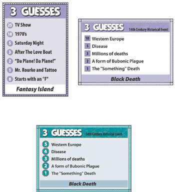
The evolution of game card design. While the actual design went through several iterations, these images capture the major shifts in both design and game play. A variety of fairly complex techniques are used, including the Convert to Shape effect for the circles/squares behind the numbers.
Color Plate 3
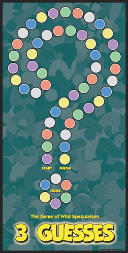
The background is made up of question marks turned into symbols and sprayed in a dense pattern, while the colored circular spaces are individual styles (one style per color). The colors can be changed quickly without affecting the number of each color (which is important to game play).
Color Plate 4
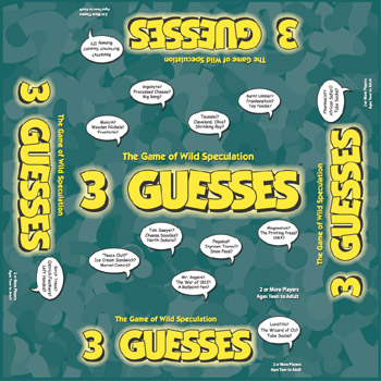
Packaging for boxes is often designed in this way: A flat version is printed and then glued onto the actual box. In other cases, the box artwork is printed directly on the packaging material.
Color Plate 5
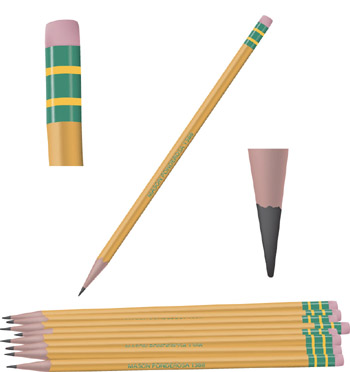
This pencil is created out of a few very basic mesh objects. The pencils at the bottom are slight variations of the original pencil.
Color Plate 6
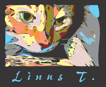
This eye-catching image is created by scanning a close-up cat photo and then posterizing the image in Photoshop. In Illustrator, the Pencil tool is set to a loose setting, and shapes are drawn around the posterized areas. The colors are changed to pastels, and the result is rather stunning.
Color Plate 7

This logo has one aspect that is incredibly difficult to figure out for most Illustrator users: How does the ring go around the planet? You can't create it with 3D, and you can't create it “normally.” The trick is to cheat: Create two gradient “rings,” putting one in front of the planet and one behind. The one in front is masked in half, and the result is a ring that appears to go around the planet!
Color Plate 8
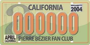
The notable characteristic of this license plate is the sense of depth you get from it. By using subtle beveling (copies of objects offset slightly and darkened and/or lightened), the image gains a tremendous amount of depth and realism.
Color Plate 9
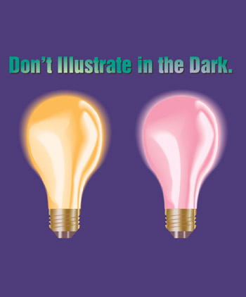
The light on the text is created by using the text as a mask on a glowing background. The detail in the light bulbs is created by using shape blends.
Color Plate 10

These clouds are created entirely with a single mesh object. Each point on the object is pulled, pushed, and colorized to achieve the final effect.
Color Plate 11
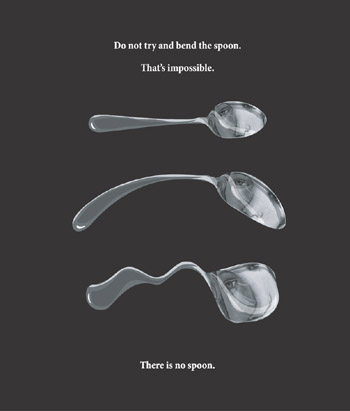
The first spoon is made of basic vector shapes with a masked image of Botticelli’s Venus. The next two spoons are the same object with an Arc warp applied and the Warp Liquify tool applied, respectively.
Color Plate 12
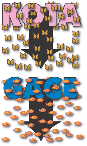
This poster is done in “two up” mode for a large format (36” wide) printer. In order to give a finished look to a simplistic illustration, drop shadows are liberally used on the symbols and the names.
Color Plate 13
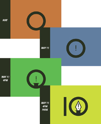
These posters displayed over the course of four weeks, starting at the upper left and working down to the lower right. They unveiled Illustrator 10 to Adobe employees.
Color Plate 14

The background for this image is created by roughening strips of color in several rows and then placing them on top of each other at different angles with different transparency blend mode settings. A drop shadow used on the white text area makes the type “pop” more.
Color Plate 15
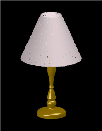
The base and shade of the lamp are created with the Illustrator 3D feature, but each is created separately in order to get the surface qualities right.
Color Plate 16
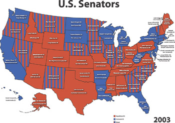
Illustrator is often used for graphical representation of data, such as this map showing the senators from each state and a colored representation of each state’s senatorial alignment.


