The Color Palette
The Color Palette
The Color palette is as close as Illustrator gets to a real-world artist’s palette. You use it to create new colors by blending. Instead of mixing splotches of pigment and linseed oil with a brush (and getting half of it on your jeans), you move sliders to adjust how much of each component color goes into your new color.
Parts of the palette
The Color palette (see Figure 5-9) has several cool features, in addition to the color sliders, that make creating colors easier.
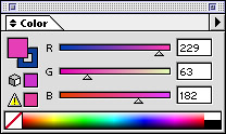
Figure 5-9: The Color palette is the closest you can ?get to a ?real artist’s palette in Illustrator.
Here’s a list of Color palette features:
-
Fill and Stroke boxes: These function identically to the Fill and Stroke boxes in the Toolbox. They’re available here in the Color palette for your convenience.
-
Color sliders and Color Value boxes: You can create a new color by dragging these sliders to the left or right. The color in the Fill or Stroke box (whichever is in front) updates to reflect the change, as does any selected artwork. To specify an exact amount of a particular color, type a number into the Color Value box to the right of each color slider.
-
None: Click the None button to choose a Stroke or Fill value of None.
-
Black-and-white: You guessed it! Click Black to make the color black, and White to make it white. (Wait a minute. Was that a trick question?)
-
Spectrum bar: In this little rectangle are all the colors that you can possibly create. Click anywhere on the Spectrum bar to choose a color. Well, okay, the spectrum is tiny; almost nobody picks exactly the right color on the first click. Use the spectrum to get a color that’s in the right ballpark. Then use the sliders to make the color precisely what you want.
-
Out-of-gamut color warnings: As you create colors, tiny color boxes appear, warning you whether the color is outside the color gamut for print or the Web. (The gamut is the total range of colors that a method can create without having to alter any of the colors.) For the Web, the gamut is 216 colors; for print, it’s several thousand. If you choose a color outside this range, that color can shift to another color. The Out-of-Web Color Warning is a square of color with a little cube beside it; the Out-of-Gamut Warning for Print is a square with an exclamation point inside a triangle beside it. Click the square to choose a color within the gamut that’s closest to the color you chose. If you’re creating for the Web, you can ignore the print gamut warning — and vice versa if you’re creating for print.
To create a new color by using the Color palette, follow these steps:
-
Choose Window→Color.
The Color palette appears.
-
From the Color palette pop-up menu, choose a color model.
See the upcoming section, “Modes and models,” for more information.
-
Click the Fill or Stroke box in the palette.
-
Move the sliders of each component color to the left or to the right until the color you want appears in the Stroke or Fill box.
Of course, if you actually want to use the colors that you create in the Color palette (what a concept), you can do so in a couple of ways:
-
Use the color while you use the palette. Anything already selected when you create a new Fill or Stroke color is filled or stroked with that color. (For example, you can fill a selected pterodactyl with pteal or pturquoise.)
-
Save the new color for later. After you create the new color, you can save it to use again later. Here’s how:
-
Open the Swatches palette by choosing Window→Swatches.
The Swatches palette appears.
-
Click the Fill or Stroke box (whichever you just created) in either the Toolbox or the Color palette.
-
Drag the Fill or Stroke box onto the Swatches palette.
Don’t worry, you won’t damage the Color palette when you drag away the Fill or Stroke box. Instead, you get a ghostly outline of ?the box while you drag it away. Release that outline on top of the Swatches palette to add the Fill or Stroke to the palette.
-
-
After you release the mouse, the color shows up in the Swatches palette for you to use again and again! (Pteal pterodactyls ptravel in flocks? Who knew?)
With the new color in the Swatches palette, you can double-click it to open the Swatch Options dialog box. Here you can give it a name, make it a global color, or use any of the options I describe in the earlier section, “Swatch options for super colors.”
Modes and models
Mode and model are the Illustrator terms to define color. Color mode is the language of color your document speaks — either CMYK or RGB. Color model is a way of describing how to form the colors in the mode (color-language) your document uses.
All the colors used in the document (except spot colors) exist in one particular color mode, no matter what color model you use to create them. When you open a new document, you must decide whether to work in RGB or CMYK color. (See Chapter 1 for the tale of two color modes.) Choose a color model from the Color palette pop-up menu (accessed by clicking the little triangle in the upper-right of the palette); see Figure 5-10 for a mug shot.
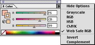
Figure 5-10: Different color models within the Color palette ?pop-up menu.
Suppose, for example, that you want a shade of gray while you’re working in RGB mode. Shades of gray are hard to create in RGB because you have to drag all three red, green, and blue sliders to get the color you want. To dodge that complexity, switch the color model to Grayscale in the Color palette pop-up menu. Then you have just one slider to deal with and you can quickly create the exact shade of gray you want.
The Color palette is where you create the colors you need, using a variety of color models: Grayscale, RGB, HSB, CMYK, and Web Safe RGB. Each has a specific purpose, but really these different colors exist only to help you visualize the color that you’re trying to create. The Color palette enables you to mix colors in any color model, but as soon as you apply them, they convert to the color mode you’re using.
The following list describes these color models and the best ways to use each:
-
Grayscale: Colors express everything as a shade of gray. This model is handy when you’re creating a black-and-white printing or just want a quick way to specify a shade of gray. Grayscale is measured in terms of ink values, with black as 100 percent — the most ink possible.
-
RGB: Colors are based on the three colors (red, green, and blue) used by your monitor to generate all the colors that you see on-screen. These colors are designed for on-screen use, such as graphics for the Web. The amounts that you see in the Color Value boxes range from 0 to 255. They correspond to the intensity of the light projected by your computer screen. Computer screens use tiny red, green, and blue phosphors that glow with different intensities to create the colors that you see. The higher the value, the brighter the glow. Specifying 255 for all colors gives you pure white; a 0 value for all colors gives you pitch black. These numbers, however, are less important than your practical results. Pay attention to the Fill or Stroke boxes when you drag the sliders and see the color that results.
-
HSB: Colors are seen in terms of hue, saturation, and brightness. Think of an HSB color in terms of a crayon. Hue is the color of the crayon, such as red. Saturation is how red that crayon is, such as brick red versus cherry red. Brightness is equivalent to how hard you press down when you use that crayon. This way of thinking may seem weird, but many painters and traditional artists find it very intuitive.
-
CMYK: Colors are based on the four colors (cyan, magenta, yellow, and black) used in process printing. (Cyan is a light, bright blue; magenta is ?a bright purple color that’s almost pink. You’re on your own for yellow and black.) CMYK colors are designed to specify colors for print. Process printing enables people to achieve a wide variety of colors (including photographic-looking images) using only those four colors. CMYK colors work the opposite of the way RGB colors work: The more of each individual color, the darker the total color becomes. For instance, 0 percent of cyan, magenta, yellow, and black results in white; 100 percent of cyan, magenta, yellow, and black results in black. But nobody who knows better would ever create black for print by using 100 percent of all four colors — that would put way too much ink on the paper, resulting in a sticky mess.
Tip? Well, okay, in theory you could create black by using 100 percent of cyan, magenta, and yellow — but printing inks (for the most part) are designed to be partially transparent, so they mix together better. The result would be a dark gray mess, not a crisp black. To create a black that really looks black, you have to add black to cyan, magenta, and yellow (fortunately, black ink is cheaper than those colors). Try using 100 percent black for black, adding just a little of the other three colors to make it look really black. (Such complications of even a basic concept may have driven some folks to make graphics only for the Web.)
-
Web Safe RGB: Most folks are probably used to working with the 16.7 million colors that most computer monitors can display these days. Of those colors, however, only 216 of them display consistently on Windows, Unix, and Macintosh computers. This reduced range of color is because of differences in operating systems, Web browsers, and color cards. Colors outside this range of 216 can dither when displayed on a system that can’t really show them properly. Dithering is the computer’s attempt to create the missing colors by using dots of two colors it can display, creating an optical illusion that the missing color is there. Dithering usually looks awful. (See Chapter 16 for more on dithering.)
Tip? Use Web Safe RGB when you need colors that look their best on as many different computers and browsers as possible. (A corporate logo is a classic example.)
-
Hide Options, Invert, and Complement: The remaining choices aren’t color models at all. Hide Options collapses the Color palette so that just the Spectrum, Black and White, and None show. Invert changes the selected color into its opposite, as if you had taken a color photograph of it and were looking at a negative. To understand Complement, think back to art class and the color wheel: Complementary colors are the colors on opposite sides of the color wheel. (Orange, for example, is the complementary color to blue. Roughly. Blue never looks bluer than when it’s next to orange, and vice versa.) Put another way, choosing Complement chooses the one color that will contrast the most with the currently selected artwork.


