Making Objects Partially Transparent and Blending Colors
Making Objects Partially Transparent and Blending Colors
By default, Illustrator creates objects that hide whatever is behind them. However, the Transparency palette enables you to change this situation. By using the Opacity option, you can fade objects so that the underlying objects show through them. You can also blend the colors in the top graphics with the underlying graphics (in an astonishing variety of ways) by using blend modes.
One of the powerful features of the Transparency palette is that everything you do in it is live — your paths suffer no permanent changes after you make them transparent. You can change opacity again and again — or remove it altogether if you want — without changing your path data. This capability gives you tremendous room to play and experiment with different opacities.
Fade away with opacity
In Figure 10-8, a solid black oval faded-out to 40% opacity partly reveals an image behind it.

Figure 10-8: The oval at its original opacity (left) and faded to 40% (right) to reveal an image beneath.
To make something partially transparent, follow these steps:
-
Select the object (or objects) that you want to fade.
When you select multiple objects, they all get the same opacity setting.
-
Choose Window→Transparency.
The Transparency palette appears, as shown in Figure 10-9.
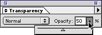
Figure 10-9: The Transparency palette. -
In the Transparency palette, drag the Opacity slider until it shows the percentage of opacity you want to give to the selected object(s).
After you release the mouse button, the selected objects become partially transparent.
| Tip? |
By default, transparency applies evenly to both the fill and stroke. To assign the fill and the stroke independent Opacity values, use the Appearance palette. See Chapter 11 for details. |
Big fun with math! Blending graphics with blend modes
Pssst! Listen very, very carefully while I tell you what’s really going on with blend modes. Here’s the scoop: Forget the math and pay attention to what the resulting artwork looks like.
| Technical Stuff? |
Illustrator defines every color mathematically. You see that math when you drag sliders in the Color palette. A bright red color may be defined as R:216, G:20, and B:7 (in RGB) or C:20%, M:95%, Y:95%, and K:5% (in CMYK). Each of these numbers reflects a different amount of a component color; every different color has its own color value. |
Blend modes take the colors in an object and mix them with the colors in underlying objects, performing a mathematical calculation using numbers that identify the colors of the objects. Therefore, if the top object is red, the underlying object is blue, and you have the blend mode set to Multiply, red’s number gets multiplied by blue’s number. The resulting color is what you see. Other modes do more complex calculations. What does that mean? What’s blue times red? What’s the difference between yellow and mauve? What’s the sound of one hand clapping?
In short, it doesn’t matter. What the result looks like is what matters! Try this approach for yourself: Select the top object and choose a different blend mode. Blend modes hang out in the Transparency palette’s Blend Mode menu, as shown in Figure 10-10.

Figure 10-10: The Blend Mode pop-up menu in the Transparency palette.
Figure 10-11 shows three different blend modes at work on the same image — and they’re completely changeable. If you try one and don’t like it, just choose another from the menu.
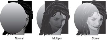
Figure 10-11: Three of the 16 possible blend modes in Illustrator.


