All about Way-Scary Separations
All about Way-Scary Separations
Separations print a separate page for each color of ink that you use in a document. Printing separations is a good way to double-check your work before you send it to a service bureau to be made into film or plates. If you never do that, skip this section.
| Technical Stuff? |
If you do send your work to a service bureau to be made into film or plates, printing separations can save you a lot of time. For example, suppose you plan to print a job using black ink and the spot color Pantone 185. After printing separations, you get pages for cyan, magenta, yellow, and Pantone 185, rather than just pages for black and Pantone 185. You know immediately that some of the colors you used were created as cyan, magenta, yellow, black (CMYK) process colors, not as spot colors. (Read more on spot colors later in this section.) On closer examination of the pages, you see that the black type you used exists on all pages, and you know that the type was specified as Registration, not as Black. Registration and Black look identical on-screen, but Registration is a special color that’s used exclusively by printers (for those little marks that help center the content on the page). Registration is totally unsuitable for artwork. (Ack! No! Don’t print that ink drawing in Registration! You’ll only get a page full of gunk.) |
I could fill a book with information about looking at separations to find out information about potential problems in your artwork. The book would be painfully long and boring, however, and one I don’t want to write. My advice: Print separations and leave it at that. Perhaps the best place to find out more about separations is your service bureau. The people there can help you examine your separations. In fact, many service bureaus require that you provide laser print separations when you place a print order so they know the file is properly prepared.
The concept behind printing separations from Illustrator is straightforward. Because printing in color requires different inks, which are applied to paper sequentially on a printing press, each ink gets its own printing plate. Illustrator generates film, paper, or even the individual plates themselves — one for each color of ink.
Traditionally, full-color artwork is printed using four different inks (and therefore four plates): cyan, magenta, yellow, and black (CYMK). If you have a CMYK document in Illustrator, you’re working in the environment that’s perfect for full-color printing. Check out Figure 15-4 for a composite image and the four separations used to create it. (All are shown here in black and white, of course.)
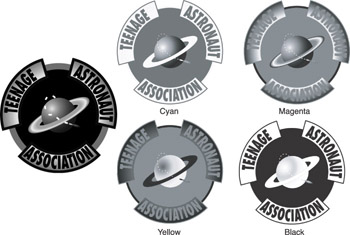
Figure 15-4: The original artwork (left) shown as four separations (right).
Remember, separations are not in color
Separations don’t print in color; they print in black and white. It doesn’t matter to the printing press what color each plate is; the color is determined by the ink that’s used with a particular plate.
Printing separations
Okay, anybody except a jet pilot may find the Output section of the Print dialog box (shown in Figure 15-5) a bit intimidating. But don’t panic at the sight of all those controls. Instead, create the artwork that you want to separate. (Be sure to save any changes before you continue.) Then use the following steps to set up your document for separation printing:
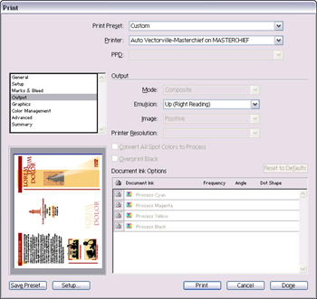
Figure 15-5: Use the Output section of the Print dialog box for printing separations.
-
Choose File→Print and click Output.
The output options in the Print dialog box appear.
-
Choose the Separations (Host-Based) option in the Mode drop-down menu.
The ink check boxes are now enabled.
-
Make sure that the settings (Emulsion, Image, and Printer Resolution) are correct.
If you aren’t sure whether they’re correct, leave the default settings as they are and check with the representative from your offset printing company.
-
Click the icon to the left of any color that you want to print.
-
Click the Print button after you finish making changes.
By the way, if you need a quick refresher on the uses of CMYK and RGB (red, green, blue), sneak a peek at Chapter 1. I won’t tell a soul.


