Exploring Size, Leading, and Other Mysterious Numbers
Exploring Size, Leading, and Other Mysterious Numbers
The world of type has a lot of measuring associated with it. You have to keep in mind point size, leading, x-height, kerning, baseline shift, tracking, horizontal scale, vertical scale, em-width, and other arcane matters that only the Secret Brotherhood of Typesetters really cares about. All these numbers affect the appearance of your type. Some of these measurements are important; some of them aren’t. The following sections let you in on which is which — and on how to understand and use each type setting in Illustrator. Figure 14-10 shows where to find some of these measurements on the letters themselves.
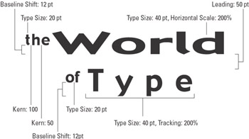
Figure 14-10: Measurements for letters.
Measuring can be just plain odd
The size of type is measured in points. An inch has 72 points. A quarter-inch has 18 points. That’s the easy part. The hard part is that type isn’t measured from top to bottom. Rather, type is measured from its ascenders and descenders for the entire font. You know those cute little tails that hang down from the lowercase g, j, p, q, and y? Well, those tails are called descenders; the ascenders are the upper parts of letters, such as the tall parts of lowercase d and k and of UPPERCASE letters.
Words, such as anon (all lowercase, no ascenders or descenders), seem to have a smaller type size than words such as Mr. Ripley, even though they’re the same type size. Type is measured from the uppermost point to the lowermost point that is possible to create using that font. Even if you aren’t using any ascenders and descenders in the words that you’re typing, the font size has to leave room for them (see Figure 14-11) in case words, such as Rumpelstiltskin or syzygy, show up in the sentence.
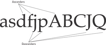
Figure 14-11: Font size allows enough space to accommodate all the possible ascenders and descenders in a font.
Things get really wacky when you mix different fonts. Each font can have completely different heights for its ascenders and descenders, creating the appearance of completely different font sizes, even though the actual space from the topmost point to the lowest point for both entire alphabets is identical.
| Tip? |
For another example, sneak a peek at the mishmash of fonts I stuck in “The biggest Don’t Do It that I can think of” section (earlier in this chapter): They’re all 12-point fonts. |
You can set the point size of your type in the Character palette, right below the font. Pick a value from the pop-up menu or type in a value in the field provided and press Enter (Windows) or Return (Mac).
A good guideline is that capital letters are about two-thirds the point size, and that lowercase letters without descenders or ascenders (like the lowercase a) are about one-half the point size. So if you want a letter a that’s one inch (72 points) high, you have to specify it as 144 pt (two inches) tall.
Measuring can be just plain annoying
The space between rows (lines) of letters has an even stranger story. First, the space is called leading. Second, the space is measured not between the descenders of the line you’re on and the ascenders of the line below (which would make sense), but rather between the baseline of the line you’re on and the baseline of the line above the line you’re on. The baseline is the line on which most letters rest (those that don’t have descenders). Figure 14-12 shows how leading appears in a typical paragraph.

Figure 14-12: Leading is the space between the baselines of type.
You set the leading in the spot to the right of the font size in the Character palette. If a number appears in parentheses, that’s the automatic value of the leading — 120 percent of the point size, rounded up to the next half point.
| Tip? |
If the amount of leading matches the point size, the descenders of one line touch the ascenders of the line below. In the majority of cases, that’s a large no-no. |
Spacing out while staring at type
Yet another thing to worry about (or ignore, if you choose to) is the space between individual letters that are next to each other. This space can be called two things (specifically to confuse the novice):
-
UTracking: The space between letters in a series of letters
-
UKerning: The space between two specific characters
Figure 14-13 shows the difference (sorta) between these two.

Figure 14-13: Tracking and kerning in Illustrator
Change the kerning by placing your cursor where you want to change the space between two characters. Change the tracking by highlighting a series of characters. Then change the appropriate field in the Character palette, as indicated in Figure 14-14.

Figure 14-14: Changing the kerning and tracking values in the Character palette.
Typically, you can leave these values alone. However, when setting short sets of large type, for example, the type can look much better when it’s kerned more tightly. Many rules and guidelines exist for proper kerning and tracking, but the best designers set these by eye. If the type looks good, it’s probably kerned correctly.
Putting type on the rack
You can stretch your type to make it wider or taller. By changing the values in the Vertical Scale and Horizontal Scale boxes (shown in Figure 14-15), you can reshape type into all manner of oddness.

Figure 14-15: Vertical Scale and Horizontal Scale text boxes in the Character palette, along with examples in type.
| Tip? |
In general, this sort of modification is frowned upon, unless used sparingly and only to produce a small degree of change. |
Moving on up and down
Whereas leading sets how far apart the lines of text are, the baseline shift controls the vertical position of the text after it’s been moved via the leading value. Use the field at the bottom of the Character palette to change the baseline shift. Positive numbers move selected text up; negative numbers move selected text down. Figure 14-16 shows a paragraph with a word of text that has a shifted baseline.
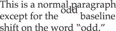
Figure 14-16: Using baseline shift within a paragraph.


