The Swatches Palette
The Swatches Palette
Illustrator stores colors in the Swatches palette for quick and easy access — and no matter how fast you grab a color, you never have to worry about splattering paint. The Swatches palette comes with a whole set of colors that are ready to use just by clicking them in the palette.
Additionally, Illustrator comes with many swatch libraries — sets of colors created for special purposes — so if your first-grade crayon box never seemed to have enough colors, you’re in luck. You can even create your own custom colors by using the Color palette (see the later section, “The Color Palette”) and adding them to the Swatches palette.
Using the Swatches palette (shown in Figure 5-7) is almost as easy as looking at it. Select an object with any selection tool, click the Stroke or Fill box in the Toolbox, choose Window→Swatches so that the Swatches palette appears, and then click any square in the Swatches palette to choose that color. The selected fill or stroke updates the instant you click the new color. No fuss, no muss, no melted crayons.
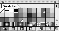
Figure 5-7: Choose colors from the Swatches palette.
All the colors in the rainbow and then some
The Swatches palette contains several different types of color swatches, each with its own range of purposes and uses. Here’s the lineup:
-
Process color: This is your run-of-the-mill, straight-up color with no added bells or whistles. You can make a color for use on-screen or for print by mixing varying amounts of red, green, and blue (RGB) or cyan, magenta, yellow, and black (CMYK). For more information on using RGB versus CMYK colors, see Chapter 1. These appear as solid color squares.
-
Spot colors: (Nope, not for creating polka dots or Dalmatians.) Spot colors are used exclusively in printing. The four-color CMYK printing process can create only a limited range of colors from its four basic color ingredients. To compensate, the process can also use spot colors of specified inks that come in a particular color. Many companies make spot colors, but most countries have one dominant company that sets the standards for spot-color printing in that country. (In the United States, it’s Pantone; in Japan, it’s TOYO.) The range of all colors that a company produces is its library. Illustrator includes swatch libraries from all the swatch-producing companies. Spot colors show up in the Swatches palette with little triangles in their lower right-hand corners; these triangles have a tiny spot in their corners.
-
Registration: Registration is a special Illustrator color that uses 100 percent of all inks — but although it looks like black on-screen, it’s not for artwork. Registration (as a color, at least) exists for a very specific technical purpose: creating the Registration marks used by commercial printers to get things in proper alignment on press. If you aren’t a commercial printer or haven’t been specifically told to do so by a commercial printer, you should never use Registration. Registration looks like a crosshair in the Swatches palette.
Warning? If you use Registration to color your artwork, you get an unprintable sticky mess that will probably stink (chemically, at least), waste ink, ?and never dry.
-
None: This color choice differs from White (which tells a printer to put no ink in a particular space, on the assumption that the paper itself supplies the white color). None, on the other hand, is the complete absence of color. In a picture, a white object is opaque; it blocks your view of any objects behind it. (You can’t see the electric outlet behind a white refrigerator.) An object with a color of None is transparent — invisible. If you want to use a stroke but also want other objects to show through the fill (or let the fill show through the objects), choose None for the specific on-screen area you want to see through. None appears in the Swatches palette as a white square with a diagonal red line through it.
-
Gradients: Gradients combine two or more colors in a smooth transition that shades from one color into the other.
-
Patterns: If you really love wallpaper, you can use one or more objects ?in a tiled pattern to fill other objects.
The icons at the bottom of your palette (refer to Figure 5-7) allow for different swatch viewing options.
Swatch options for super colors
Swatches are a quick way to retrieve colors, but they do more. Double-click any swatch in the palette to open the Swatch Options dialog box, shown in all its useful glory in Figure 5-8.
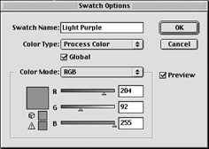
Figure 5-8: The Swatch Options dialog box.
The Swatch Options dialog box keeps you busy with choices and gives you creative possibilities. Here’s the list:
-
Swatch Name: Here you can give the color a distinctive name (such as Maine Blueberry) or change its name.
-
Color Type: You can change a spot color to its closest CMYK or RGB equivalent. This is a handy option when your client provides you with a logo rendered in spot colors (“Metallic puce? You’re not kidding?”) and you have to produce an image in CMYK or RGB.
Remember? Unfortunately, you can’t go the other way around. Trying to change a process color into a spot color doesn’t give you the closest spot color equivalent from the Pantone, TOYO, or any other color library. (For more about color libraries, see the following section, “Swatch libraries.”)
-
Global: After you select (check) this option, Illustrator remembers everything you color with a particular swatch. When you change the color of the swatch, everything with the old swatch’s color updates to the new color. (Mercifully, Adobe didn’t call this feature The Old Swatcheroo.) This feature’s a great timesaver when you want to change a color scheme. You don’t have to go back, reselect, and recolor everything — very handy, indeed.
-
Color Mode, gamut warnings, and color sliders: These features are especially powerful when used with Global color. They all work just like the Color palette except that they apply your changes only to the currently selected swatch. See more on this palette in the section, “The Color Palette,” later in this chapter.
Swatch libraries
Illustrator comes loaded with color choices in the form of swatch libraries — sets of color swatches created for specific purposes. (Pantone, for example, has several libraries devoted just to spot colors.) The libraries you get with Illustrator draw from all the major spot-color sources in the world. A Web library provides tried-and-true colors that work best on the Internet. To peruse these libraries, click Window→Swatch Libraries. If you turn up a color that you simply must have, add it to your Swatches palette: Open the specific library you need, find the color you want, and click it. Instantly the color shows up in your Swatches palette, ready for you to use.
| Tip? |
Some libraries contain hundreds of swatches, which can make finding a ?particular color difficult. Fortunately, swatch libraries have a Find field at the very top of the window. For example, if a client wants a logo done on a report cover in Pantone 185, just open one of the Pantone libraries (by choosing Window→Swatch Libraries→Pantone Coated). When the swatch library appears, type 185 in its Find field (the empty white rectangle at the top of the palette) to highlight Pantone 185C (the C is for coated) automatically — you don’t have to press any other key! Click Pantone 185C to add it to your Swatches palette and you’re good to go. |
| Tip? |
If you need to choose spot colors for a project that will be offset printed, make sure to select your color from a printed swatch book manufactured by your chosen ink company. Never select the colors based on your on-screen view of the swatches in the library. Because of many variables, your screen can give you only its best match of the printed color. It will never be exact and frequently will be quite different. |


