When White Isn't Nothing
When White Isn’t Nothing
Double negatives aside, here’s a little tip that can save you beaucoup bucks whenever you use gradients and spot colors in artwork you’re creating for print.
If you work with print publishing, you come to think of the color white as being nothing. In most of the familiar printing techniques, specifying the color white means don’t put down any ink (or toner, or dye, or any of the methods for putting color on paper) for anything colored white. White ink doesn’t exist (except in rare situations) — and no, correction fluid doesn’t count. The white that you see in print publications is just the white of the paper.
| Tip? |
This approach depends on an actual, tangible piece of paper to provide the white for the image. To save yourself untold woe, don’t use the technique I describe here if your artwork is destined to live on the Web. It’s strictly a hard-copy issue. |
Suppose you’re creating a two-color publication using black ink and a nice blue Pantone 273 ink. The publication may be pretty dull in only two colors, but that’s all you have a budget for, so you decide to spice things up by using gradients. You create lovely gradients by blending Pantone 273 into white (assuming that white means no ink). Unfortunately, in terms of gradients, Illustrator thinks of a blend as a whole new CMYK (cyan, magenta, yellow, black) color (see Chapter 1) — so the blend between white and a spot color, such as Pantone 273, involves much more complicated instructions to the computer than you may have intended.
Sure, your graphics look perfect, but unbeknownst to you, your job has mutated from a two-color job to a five-color job. Usually, you discover this after your job is already at the printer, and then you have to pay hundreds of extra dollars for a mistake you didn’t even know you made.
The trick is to use the same Pantone color for all steps of the gradient (see Figure 18-2). Just follow these steps:
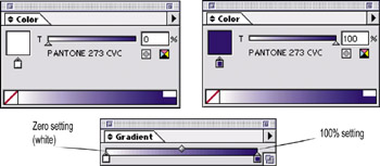
Figure 18-2: The same color is used at two different tint percent-ages, specified in the Color palette.
-
Choose Window→Gradient.
The Gradient palette appears.
-
Choose Window→Swatch Libraries→Pantone Coated (or another swatch library of your choice).
The Pantone swatch library opens.
-
Click the color of your choice in the Pantone library and drag the color from the library onto a color stop in the Gradient palette.
A color stop is the icon that looks like a little house; it represents a color in the gradient.
Repeat this until all color stops in the Gradient palette are the same color. (See Chapter 10 for more information on gradients.)
At this point, the gradient is one solid color. Not a gradient at all, really. But wait!
-
Double-click a color stop in the Gradient palette.
The Color palette opens, showing the Pantone color set to 100%.
-
Set the tint of the Pantone color to 0%.
This action gives you true, one-ink spot-color gradients that use the paper as “white” in that good old traditional way. See Chapter 10 for more info on gradients.


