Navigation bars
Navigation bars
A navigation bar consists of an image (or set of images) whose display changes based on the actions of a user. Navigation bars often provide an easy way to move between pages and files on a site.
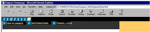
A navigation bar element can have four states:
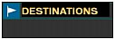
- Up: the image that appears when the user hasn’t yet clicked or interacted with the element.
For example, the element in this state looks like it hasn’t been clicked.
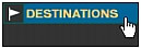
- Over: the image that appears when the pointer is moved over the Up image. The element’s appearance changes (for example, it may get lighter) to let users know they can interact with it.
- Down: the image that appears after the element has been clicked.
For example, when a user clicks an element, a new page loads and the navigation bar is still displayed, but the clicked element is darkened to show that it’s been selected.
- Over While Down: the image that appears when the pointer is rolled over the Down image after the element has been clicked.
For example, the element appears dimmed or gray. You can use this state as a visual clue to users that this element cannot be clicked again while they are in this part of the site.
You don’t have to include navigation bar images for all four of these states; for example, you may just want Up and Down states.
Related topics
- Using navigation bars
 |  |


